When teams are flooded with ideas, data, or feedback, it’s easy to lose clarity. That’s where Affinity Diagram Examples come in handy. These visual tools help you organize information into logical groups, making it easier to identify patterns, prioritize tasks, and drive decisions.
Whether you’re in education, healthcare, or product design, using the right Affinity Diagram Templates can supercharge collaboration and simplify complex information. Below, we explore 10 practical and versatile Affinity Diagram Examples to help you structure your next brainstorming session or project meeting.
What Is an Affinity Diagram?
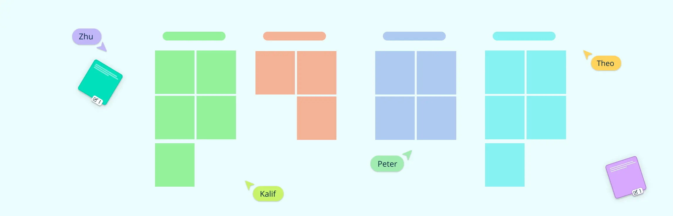
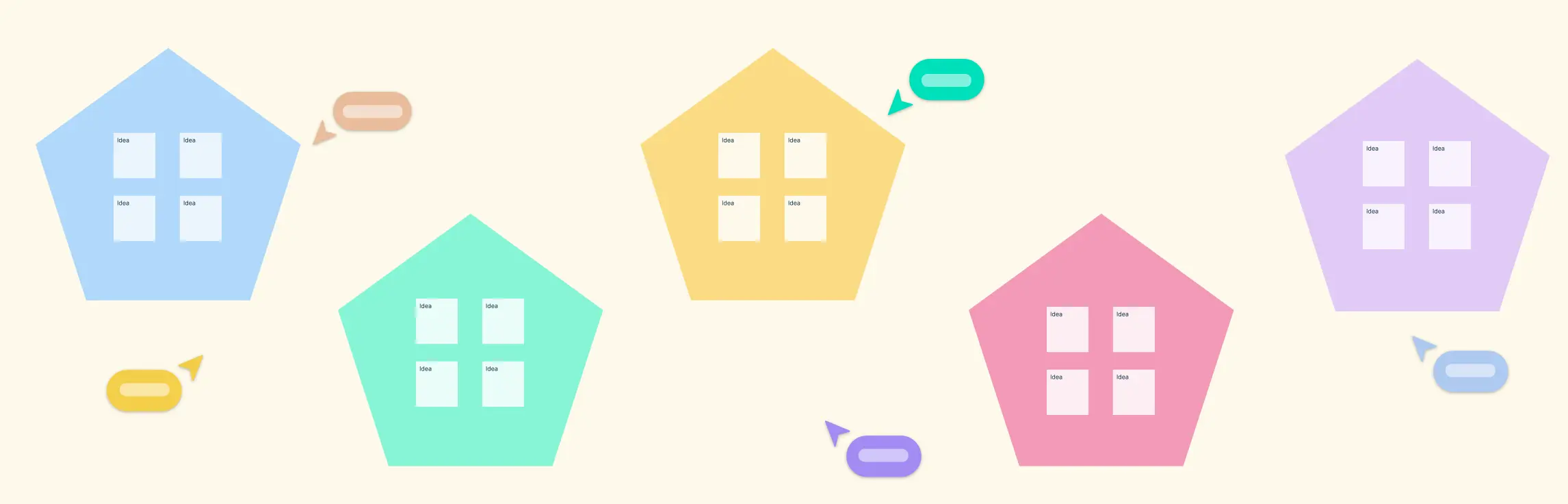
An Affinity Diagram is a visual brainstorming tool used to organize ideas, data, or insights into related groups based on natural relationships. It helps teams make sense of large volumes of unstructured information—like feedback, research findings, or project issues—by clustering similar items into themes. Often used in problem-solving, UX research, and strategic planning, affinity diagrams promote clarity, collaboration, and better decision-making. Whether you’re identifying root causes or synthesizing user feedback, Affinity Diagram Examples serve as a go-to method for turning chaos into clarity.
1. AI Affinity Diagram Template
Best for: Teams looking for a fast, intelligent, and data-driven approach to affinity diagramming
Use case: Automatically generating affinity diagrams from raw data, ideas, or research insights using AI-powered prompts
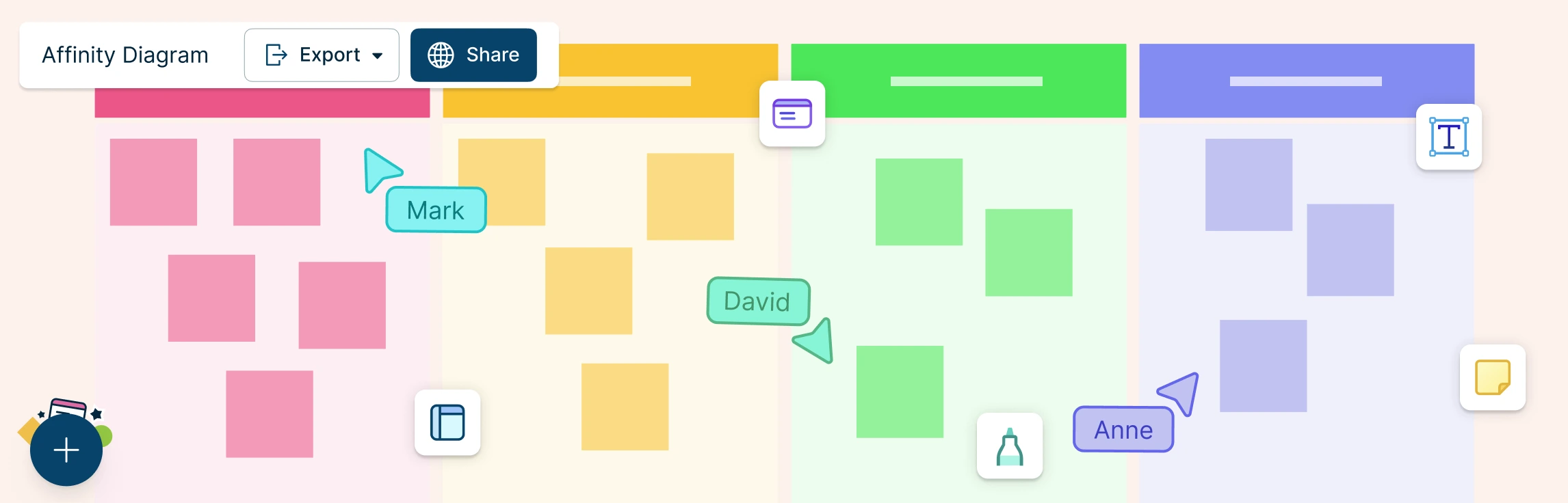
As the world of data analysis and team collaboration evolves, Creately’s AI Affinity Diagram feature takes traditional brainstorming and categorization to the next level. With just a prompt, you can quickly generate a structured, visual affinity diagram based on raw data—whether it’s from user feedback, survey results, research insights, or project notes.
Using AI, Creately can analyze and cluster unstructured information into meaningful categories and themes, saving you time and effort in the organization process. Whether you’re looking to group feedback from a customer survey, categorize pain points from a usability test, or sort ideas from a brainstorming session, the AI-powered Affinity Diagram does the heavy lifting for you.


This tool is especially helpful for teams that deal with large volumes of data and need a fast, efficient way to turn that data into actionable insights. Instead of manually grouping ideas or feedback, the AI can instantly identify patterns, similarities, and relationships between data points, creating a cohesive diagram that reflects key themes and connections.
For teams that need a fast, smart, and data-driven way to categorize and analyze ideas, feedback, or research, the AI Affinity Diagram is an invaluable tool to boost productivity, collaboration, and insight generation.
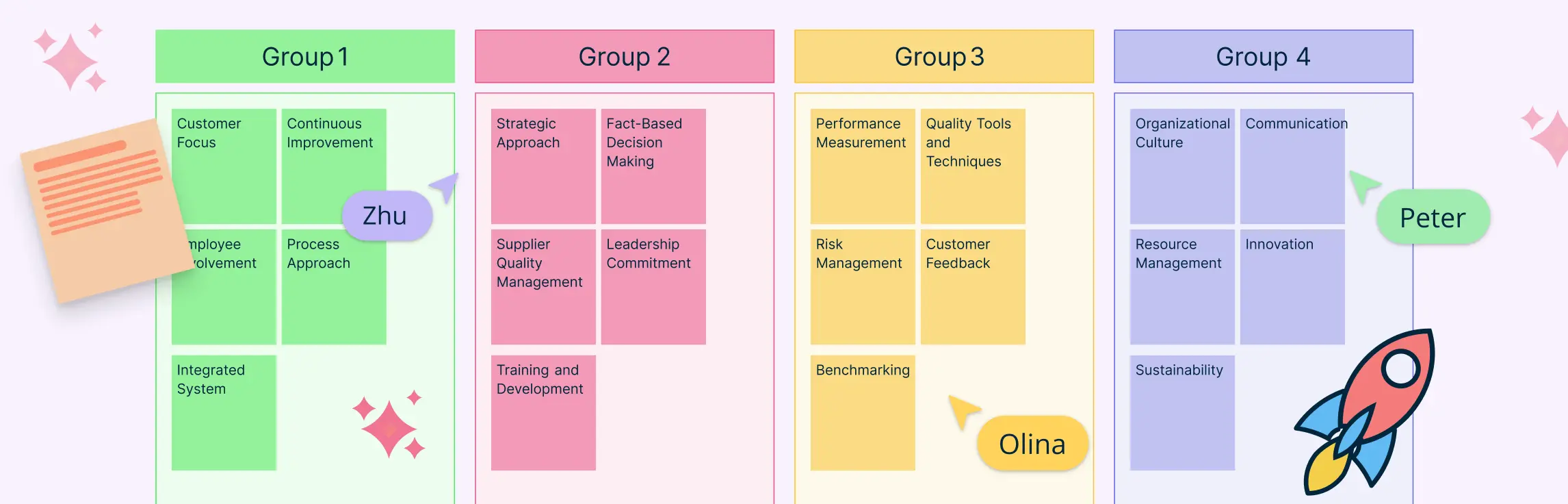
2. TQM Affinity Diagram
Best for: Total Quality Management and continuous improvement
Use case: Grouping customer feedback or defect causes to identify quality issues.
In Total Quality Management (TQM), maintaining consistency, reducing defects, and enhancing customer satisfaction are top priorities. This is where the TQM Affinity Diagram Example proves invaluable. It allows teams to gather large volumes of unstructured data, like customer complaints, internal audit findings, or team observations, and sort them into logical categories such as process, equipment, training, and communication.
By visually grouping this information, organizations can uncover hidden patterns and pinpoint recurring issues that may be undermining quality. For instance, if several quality concerns trace back to training, that insight can inform strategic workforce development initiatives.

Using Affinity Diagram Templates designed for TQM, teams can kick off quality improvement sessions with structured clarity. These templates often integrate seamlessly with tools like cause-and-effect diagrams, flowcharts, or KPIs, enabling a holistic view of quality challenges. Whether you’re running a Kaizen event or preparing for an ISO 9001 audit, this template brings efficiency and focus to your problem-solving process.
This is one of the most widely used Affinity Diagram Examples in operational excellence programs—and for good reason: it turns messy feedback into actionable insights, fast.
3. Design Thinking Affinity Diagram
Best for: Ideation in product development or UX research
Use case: Clustering user insights and pain points during the empathy or define phases.
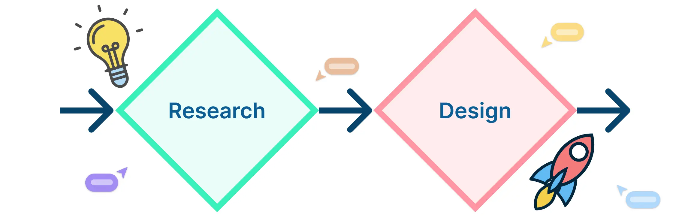
In the Design Thinking process, understanding your users deeply is the foundation for innovation. This Design Thinking Affinity Diagram Example is a critical tool during the early stages, especially in the empathy and define phases, when teams are flooded with raw qualitative data from user interviews, surveys, field observations, or usability testing.
This Affinity Diagram helps teams visually group user quotes, behaviors, and challenges into meaningful categories like “frustrations,” “needs,” or “goals.” By doing so, it becomes easier to spot patterns, themes, and unmet needs that might otherwise get lost in the noise.

Unlike linear note-taking, this method supports divergent thinking, where ideas are explored freely and sorted organically before converging into insights. This is crucial for crafting user personas, journey maps, or problem statements that are grounded in real-world evidence.
4. Educational Affinity Diagram
Best for: Teachers, students, and academic researchers
Use case: Organizing learning concepts, brainstorming lesson ideas, or summarizing research themes.
The classroom is often filled with a wealth of ideas, discussions, and complex topics that need to be structured for better understanding. Educational Affinity Diagram Examples are incredibly effective in turning abstract concepts into organized visual frameworks, making them easier to digest for both students and educators.
Teachers can use this tool to break down large curriculum topics into smaller, interconnected themes, ideal for lesson planning or concept mapping. For example, in a history lesson, an affinity diagram could group events by political, social, and economic impact. Students, on the other hand, can use it for group brainstorming activities, organizing thoughts for essays, or categorizing findings from research projects.

This visual thinking approach enhances critical thinking, helps students make connections between ideas, and improves memory retention. It’s particularly useful for differentiated instruction, as it allows learners at different levels to engage with content in a way that suits their thinking style.
5. Six Sigma Affinity Diagram
Best for: DMAIC projects and statistical problem-solving
Use case: Analyzing failure modes, process inefficiencies, or data clusters.
In Six Sigma, success hinges on the ability to identify root causes and eliminate variation. The Six Sigma Affinity Diagram Example is a powerful tool used during the Define, Measure, and Analyze phases of DMAIC to structure vast, often chaotic, sets of data into meaningful categories.
Whether you’re conducting a Failure Modes and Effects Analysis (FMEA), collecting voice-of-customer feedback, or performing a process audit, this diagram helps Six Sigma teams, especially Green Belts and Black Belts—categorize information around core themes like manpower, machinery, materials, or methods. This clear structure supports the development of accurate problem statements and lays the groundwork for cause-and-effect analysis.

One of the key strengths of this Affinity Diagram Example is its ability to uncover hidden correlations and recurring issues. When deployed effectively, it leads to data-driven decision-making and targeted improvement initiatives that reduce defects and increase efficiency.
6. Meeting Affinity Diagram
Best for: Team meetings, workshops, and idea-generation sessions
Use case: Sorting team ideas from brainstorming or retrospective sessions.
Meetings are often filled with fast-paced discussions, sticky notes, and a flurry of ideas, some brilliant, others repetitive or unclear. A Meeting Affinity Diagram Example transforms that chaos into clarity by helping teams visually group their ideas into actionable themes.
Whether you’re leading a brainstorming session, a sprint retrospective, or a strategy workshop, this diagram allows participants to contribute freely and then collaboratively sort thoughts into categories such as “quick wins,” “process blockers,” or “customer pain points.” This structure not only ensures every voice is heard but also makes it easier to prioritize and assign follow-ups.

One of the biggest challenges in meetings is translating dialogue into decisions. With this Affinity Diagram Example, teams can immediately see which ideas recur most, identify root causes behind challenges, and align on next steps—all without losing momentum.
7. Project Quality Enhancement Affinity Diagram
Best for: Product managers, QA teams, and operations leads
Use case: Visualizing areas for improvement across project lifecycle stages.
Maintaining consistent quality across a project’s lifecycle is no easy task. That’s why the Project Quality Enhancement Affinity Diagram Example is essential for teams looking to analyze feedback, uncover hidden inefficiencies, and drive continuous improvement.
This diagram allows you to sort insights gathered from quality audits, user feedback, performance reviews, bug reports, and post-mortems into logical categories such as “communication gaps,” “testing failures,” “tool limitations,” or “training needs.” It becomes much easier to identify patterns, prioritize issues, and align on solutions that boost product quality and team performance.

This Affinity Diagram Example is particularly useful during project retrospectives or when preparing for quality certifications like ISO or CMMI. It promotes a data-informed approach to quality enhancement, helping teams not only fix issues but also refine processes to prevent future ones.
8. Healthcare Affinity Diagram
Best for: Clinicians, researchers, and hospital admin teams
Use case: Categorizing patient feedback, safety reports, or care improvement suggestions.
In healthcare, where decisions impact lives, clarity and structure are critical. The Healthcare Affinity Diagram Example provides a vital framework for organizing the overwhelming flow of unstructured data—from patient surveys and incident reports to clinical observations and staff suggestions.
Healthcare teams can use this diagram to group feedback into categories such as “patient experience,” “medication safety,” “workflow delays,” or “staff communication.” This enables quick identification of recurring issues and uncovers root causes behind gaps in care delivery or operational inefficiencies.

Used during quality improvement initiatives, morbidity and mortality reviews, or process redesign sessions, this Affinity Diagram Example helps teams focus on patient-centered outcomes. It transforms anecdotal evidence into data-driven insights that inform better protocols, improved safety standards, and more empathetic care strategies.
9. Project Management Affinity Diagram
Best for: Project managers and cross-functional teams
Use case: Sorting stakeholder feedback, risks, or scope ideas.
Project management often involves juggling ideas, input, and expectations from multiple stakeholders. A Project Management Affinity Diagram Example is a powerful tool to bring structure to this complexity. Whether you’re in a kickoff meeting, risk assessment, or retrospective, this diagram helps organize diverse contributions into clear, actionable categories.
You can use it to group feedback under themes like “resource constraints,” “timeline concerns,” “feature requests,” or “team dependencies.” This visual clustering ensures that every voice is captured and considered, especially in early project phases when scoping and stakeholder alignment are critical.

This Affinity Diagram Example also plays a major role in risk management, helping teams visualize and prioritize potential threats before they impact timelines or deliverables. It’s equally useful in Agile environments for organizing sprint feedback or planning backlogs more strategically.
10. User Research Affinity Diagram
Best for: UX designers, product researchers, and customer success teams
Use case: Clustering qualitative insights from interviews or surveys.
Raw user data is only valuable when it leads to clear insights, and that’s where the User Research Affinity Diagram Example shines. This tool is essential for analyzing unstructured feedback and turning it into well-defined patterns that drive product and design decisions.
During discovery or post-launch research, teams often gather volumes of qualitative data. The affinity diagram helps organize this input into meaningful groups such as “frustrations,” “motivations,” “workflow habits,” or “feature requests.” This structure reveals trends in user behavior and highlights what users truly value, struggle with, or expect.

This Affinity Diagram Example is particularly helpful for synthesizing research findings, building accurate personas, defining MVP features, and shaping user journey maps. By mapping out connections between user quotes and observed behaviors, researchers can create a foundation for empathetic, data-informed design.
Final Thoughts
These 10 Affinity Diagram Examples show just how versatile and powerful this tool can be. Whether you’re leading a project, teaching a class, or analyzing user data, visual grouping helps bring structure to the messiest information.
Ready to bring clarity to your next big idea? Try Creately’s professionally designed Affinity Diagram Templates to save time, improve collaboration, and get results faster.
FAQs About Affinity Diagram Examples
How do Affinity Diagram Examples differ from other brainstorming tools?
Can Affinity Diagram Examples help with remote team collaboration?
Are there Affinity Diagram Examples suited for Agile or Scrum teams?
How do I choose the right Affinity Diagram Example for my use case?
Resources:
Lucero, A. (2015). Using Affinity Diagrams to Evaluate Interactive Prototypes. Human-Computer Interaction – INTERACT 2015, 9297, pp.231–248. doi:https://doi.org/10.1007/978-3-319-22668-2_19.
Widjaja, W. and Takahashi, M. (2016). Distributed interface for group affinity-diagram brainstorming. Concurrent Engineering, 24(4), pp.344–358. doi:https://doi.org/10.1177/1063293x16657860.