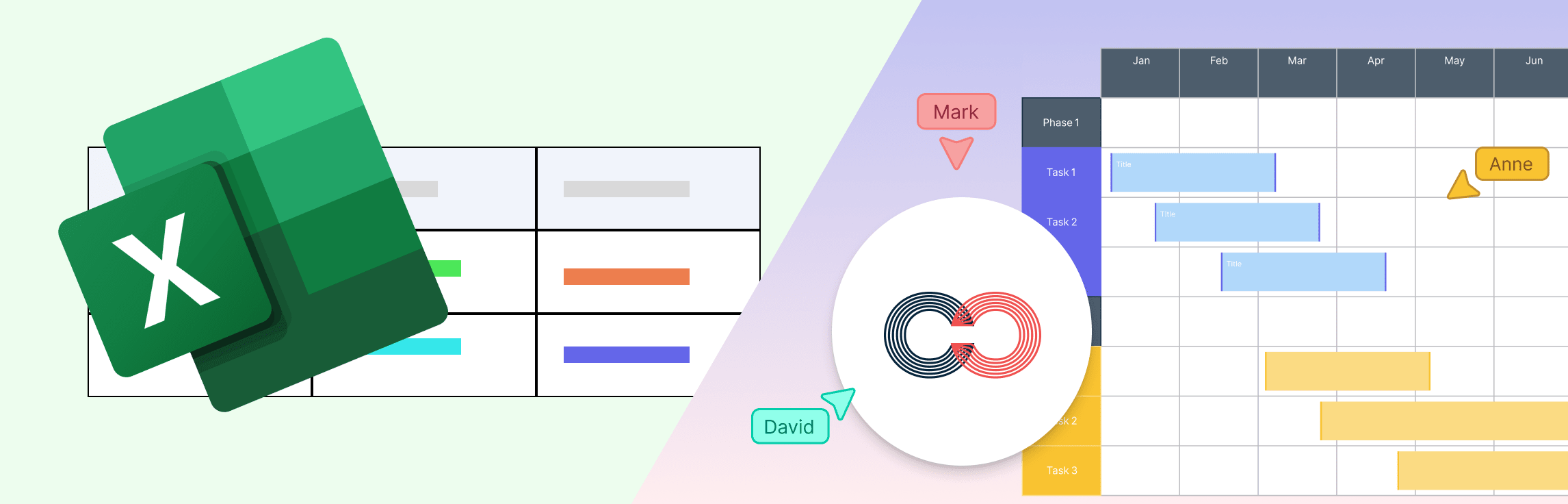
What is a Timeline in Microsoft Excel?
A timeline in Microsoft Excel is a visual way to display events, tasks, or data in chronological order, helping track progress or analyze patterns over time. You can create one using several methods depending on your needs.
- Pre-designed templates: These provide ready-made layouts that can be customized with your data.
- Gantt Charts: For more flexibility, you can build detailed timelines using charts, such as Gantt-style bar charts, to represent project durations or milestones.
- PivotTable: This feature enables interactive date filtering, letting you explore and analyze data dynamically.
- SmartArt: This feature offers a quick and simple approach for visual timelines.
While Excel is powerful for data-driven visuals, it can become complex when designing detailed or collaborative timelines.
Method 1: How to Make a Timeline Graph in Excel Using a Template
Using a template is ideal if you want a polished, ready-made design that only requires minor adjustments.
Step 1: Open Excel and Search Templates
Launch Microsoft Excel, click File → New, and open the template gallery. In the search bar, type “timeline” or “project timeline.” Excel will display several ready-made templates for project schedules, milestones, or events. Note that template availability can vary by version of Excel or region.
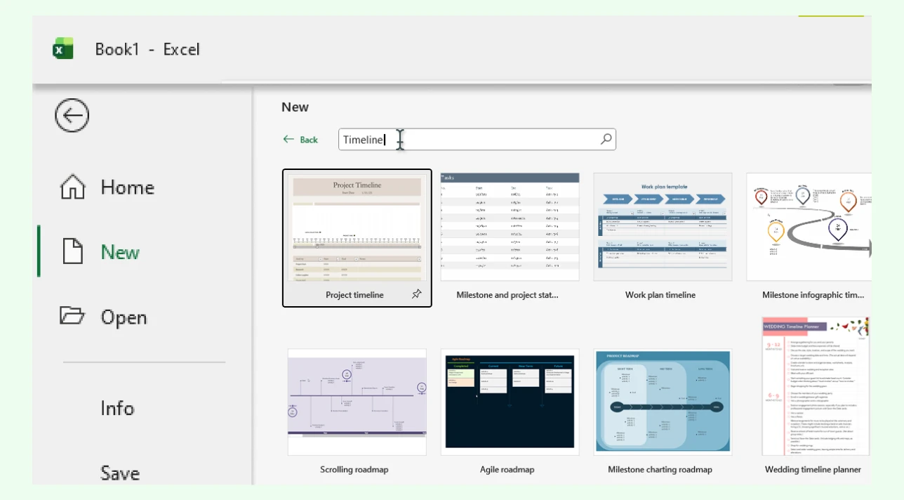
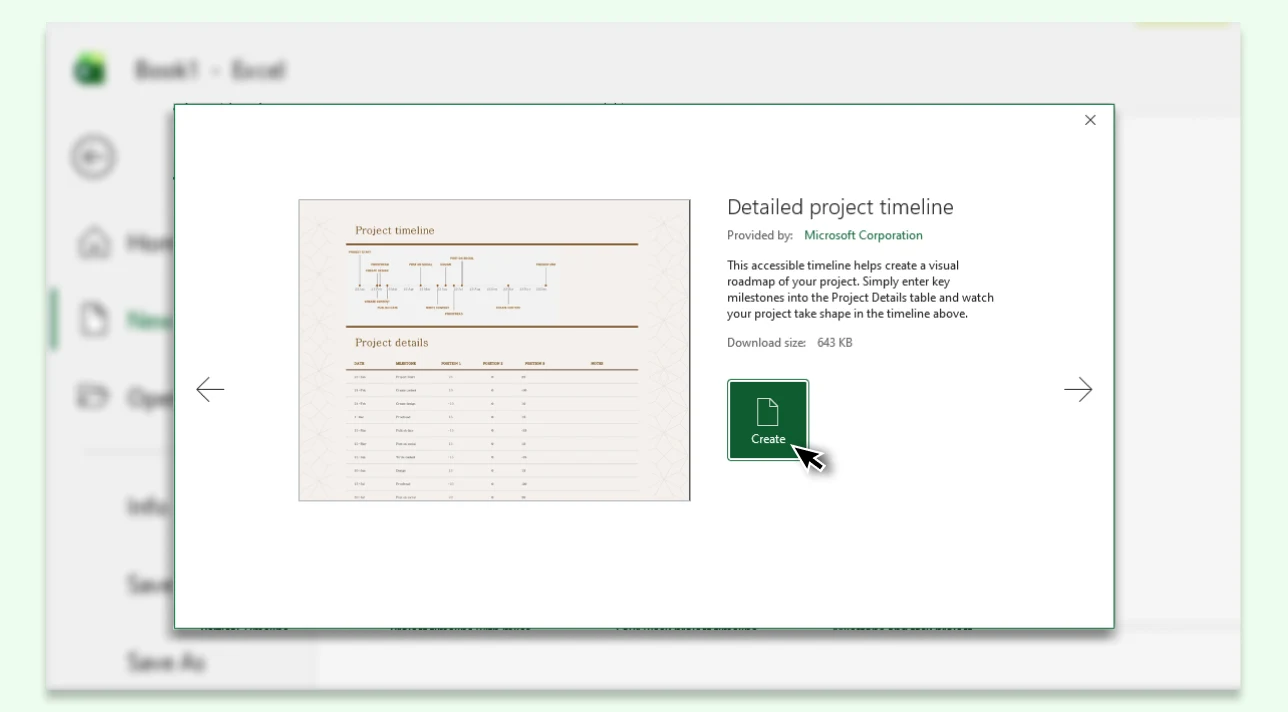
Step 2: Add a Template
Browse through the options and pick a layout that fits your purpose. Click Create to open it in a new workbook. This step can take time if you’re comparing multiple templates, as Excel’s previews don’t always reflect full functionality.
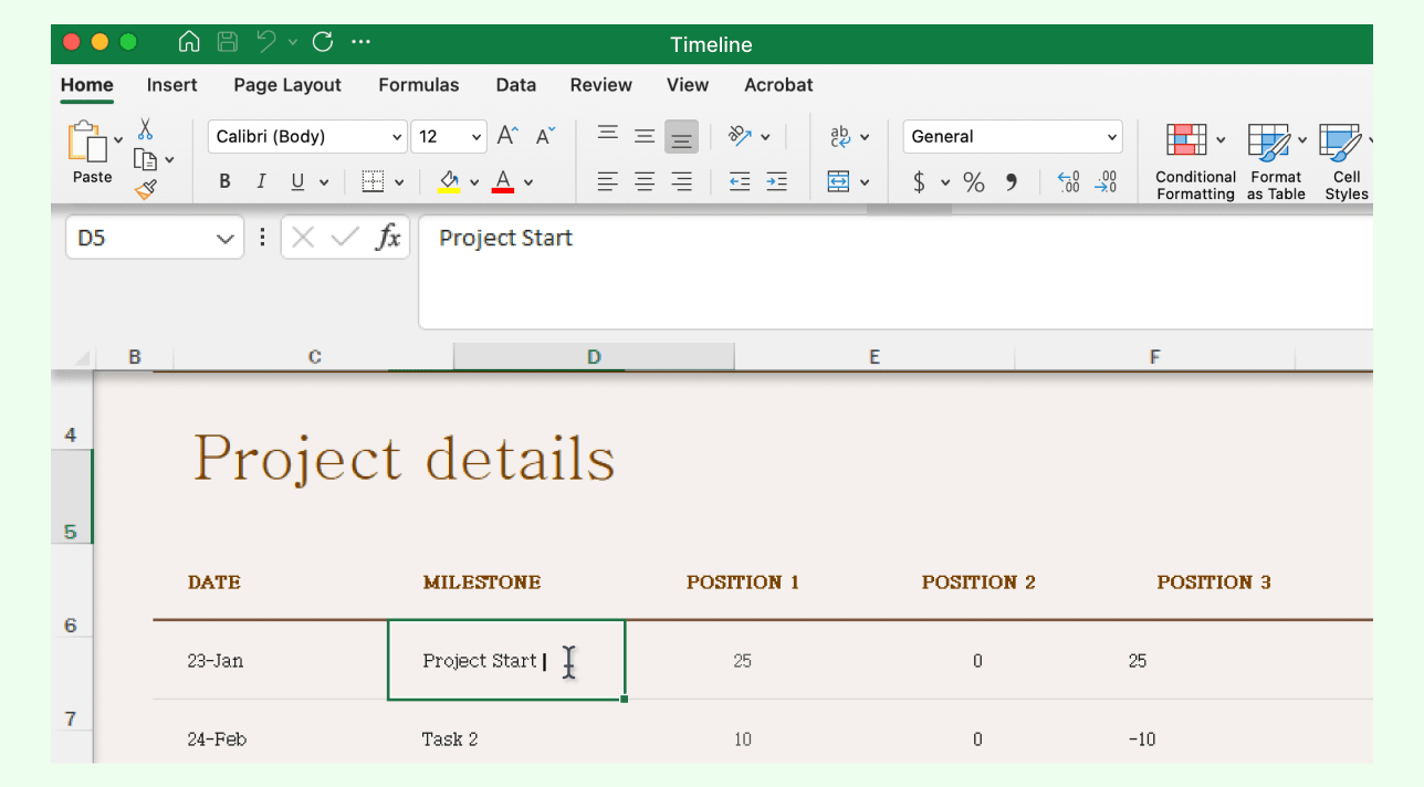
Step 3: Enter Your Data
Replace sample data with your own task names, dates, and milestones. Make sure the timeline’s formatting automatically updates. Some templates require manual editing of chart ranges. Managing many events can get tricky, especially when formulas or chart links break after edits.
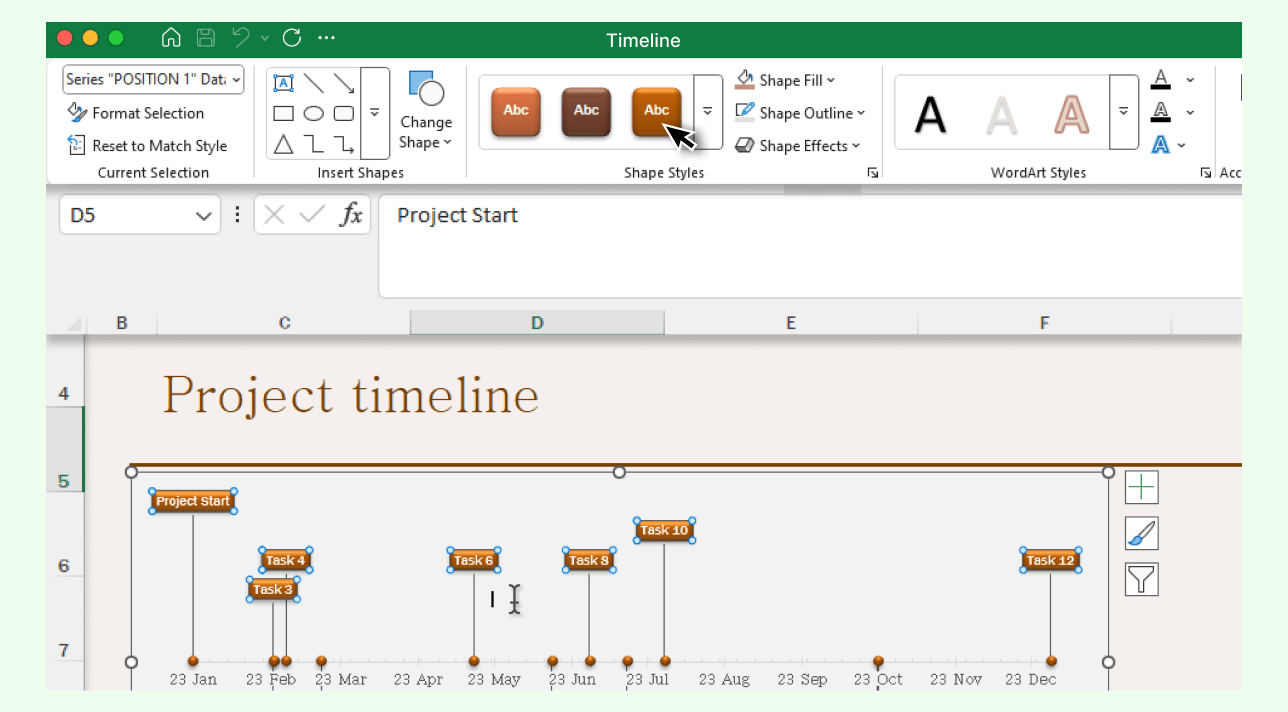
Step 4: Customize the Timeline Design
Change fonts, colors, or cell formatting to make your timeline clearer and more engaging. Adjust labels or resize chart areas as needed. Fine-tuning visual balance often requires manual alignment since Excel doesn’t auto-distribute shapes or text boxes evenly.
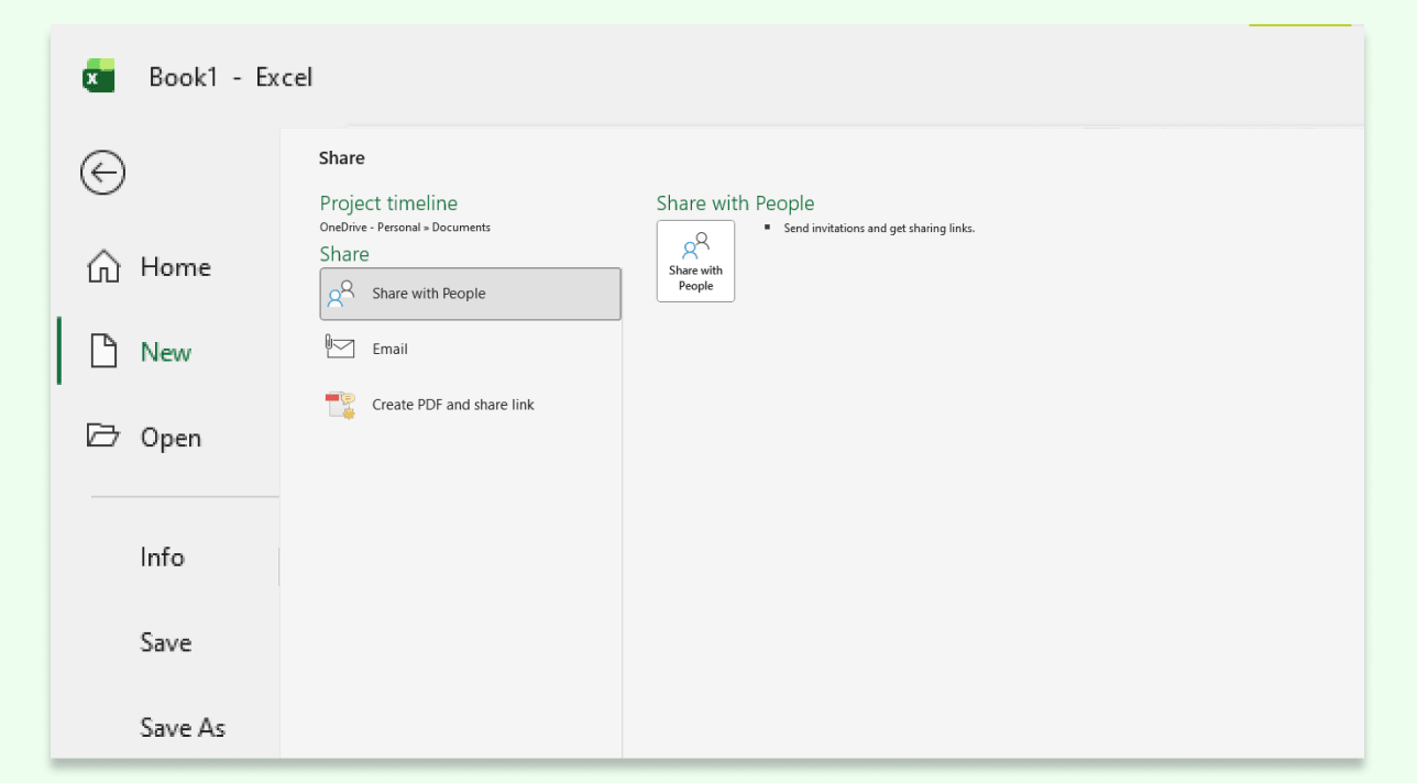
Step 5: Save and Share Your Timeline
When finished, save your workbook. Export it as a PDF for reports or share via OneDrive or email for collaboration. Remember that real-time collaboration in Excel can be limited; simultaneous editing may cause version conflicts or lost changes.
Method 2: How to Make a Timeline in Excel Using a Gantt Chart
A Gantt chart takes more setup time than a template, but it gives you precise control over scheduling, durations, and dependencies, making it ideal for project management and progress tracking.
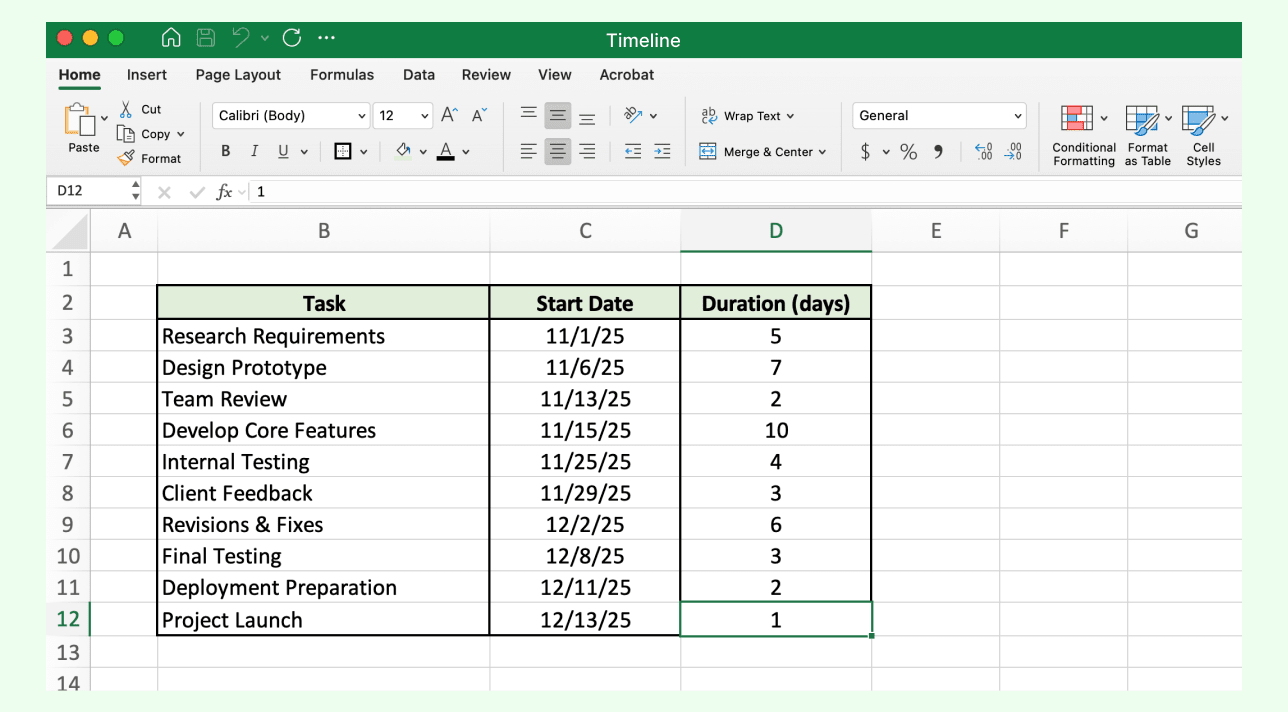
Step 1: Prepare Your Data Table
In a blank Excel worksheet, create a simple table with columns for Task, Start Date, and Duration (days). Fill in your project data—each task should include a clear start date and an estimated duration. This setup works best for small projects; with larger ones, manual data entry can become error-prone and time-consuming.

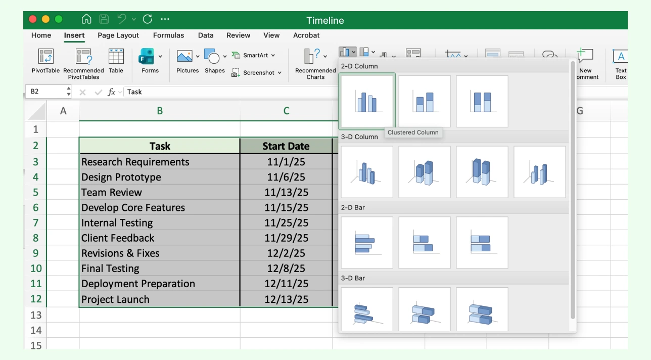
Step 2: Insert a Stacked Bar Chart
Highlight your table, go to the Insert tab, and select Bar Chart → Stacked Bar. This chart type visualizes each task’s duration along a horizontal timeline. If your date range is long or uneven, Excel may compress bars unevenly, requiring manual axis adjustments.
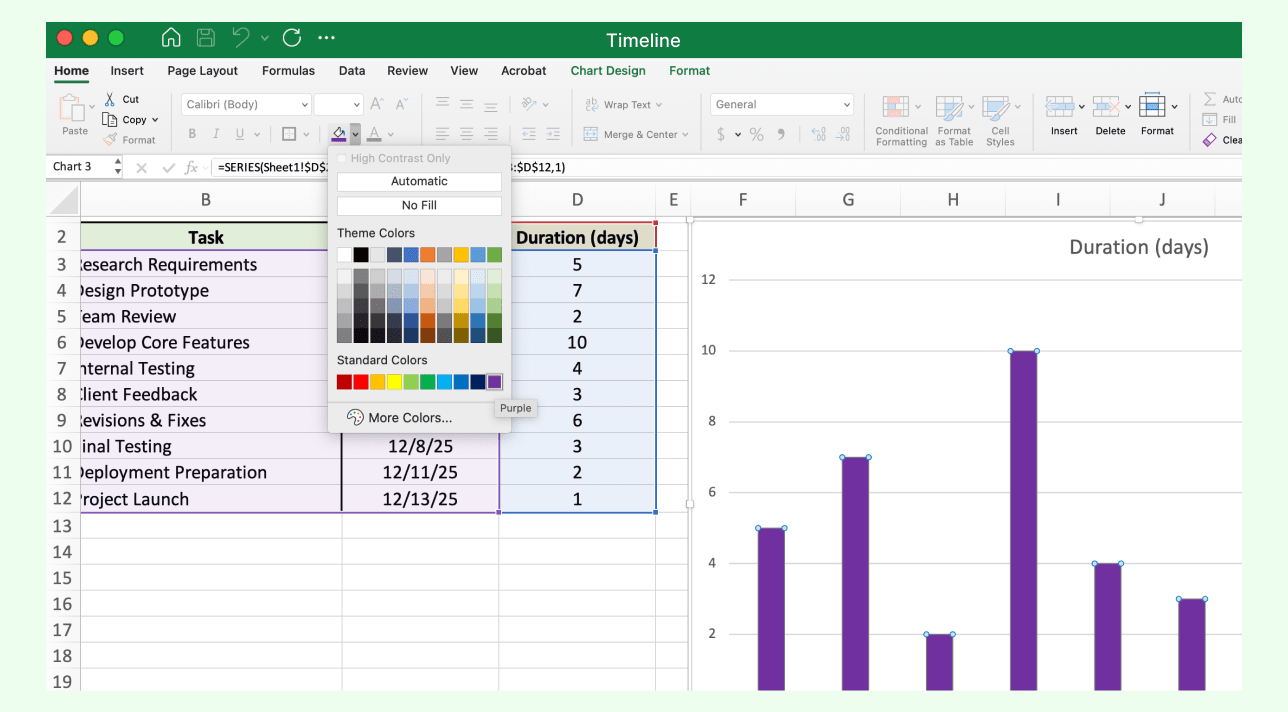
Step 3: Adjust the Bar Colors
Click the “Start Date” section of each bar and set its fill color to No Fill. This hides the offset, leaving only duration bars visible, creating the core Gantt effect. This step requires precision; small mistakes in formatting can shift bars or misrepresent task lengths.
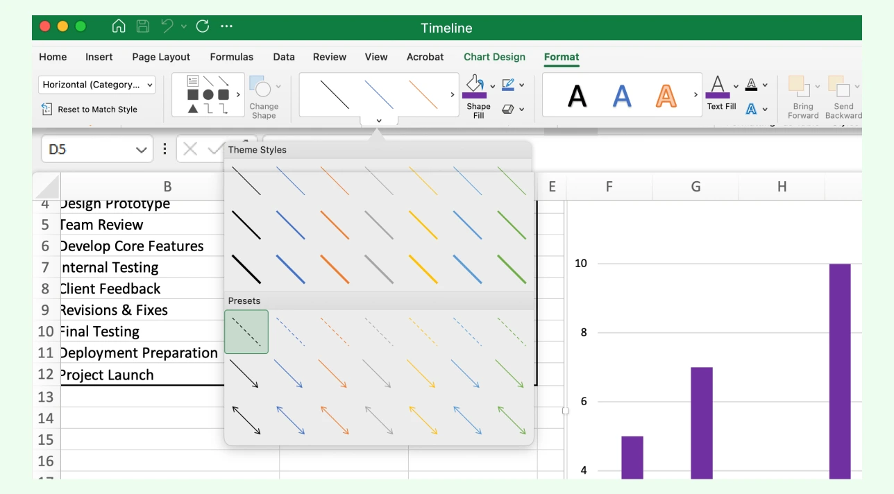
Step 4: Refine the Layout
Use the Chart Design and Format tabs to style your chart. Add task labels, change colors for better clarity, and adjust the date axis to align with your project duration. Formatting each task label manually can be tedious, especially for long timelines with many overlapping tasks.
Step 5: Save and Share
Once the layout looks right, save your file. You can print it, attach it to project reports, or share it through OneDrive for collaboration. However, sharing often breaks chart scaling or formatting across devices, something to watch out for in team settings.

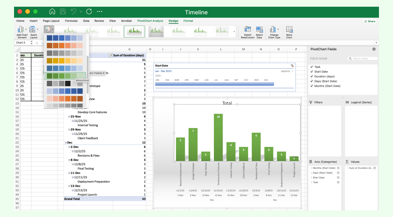
Method 3: How to Do a Timeline in Excel Using a Pivot Table
This method is perfect for teams or analysts who want to visualize and interact with time-based data, offering far more flexibility and automation than static timelines or charts.
Step 1: Prepare Your Data
Start with a structured dataset that includes at least one Date column and additional columns for categories, events, or values. Ensure your date cells are properly formatted as dates (not text), so Excel can sort and filter them correctly. If your dataset has inconsistent date formats, the timeline filter may not recognize them, a common early frustration.
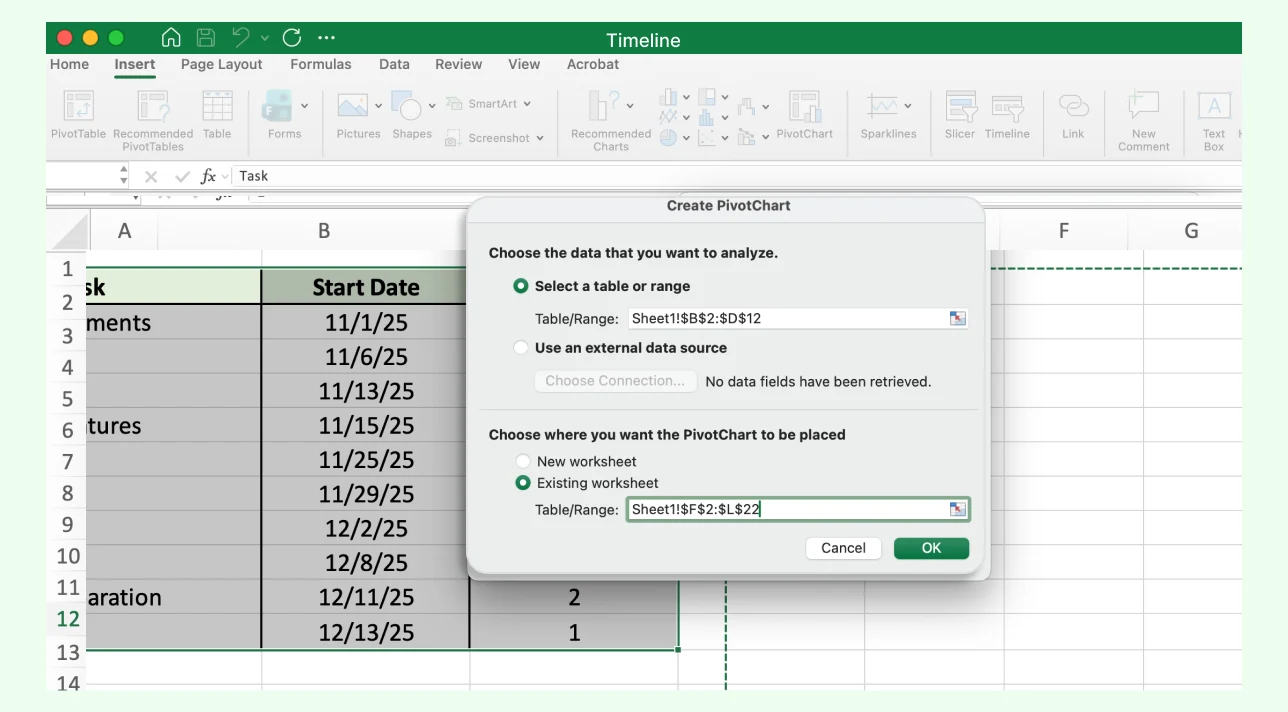
Step 2: Create a PivotTable
Select your dataset, go to the Insert tab, and click PivotTable. In the dialog box, choose whether to place it in a new worksheet or an existing one, then click OK. This step works best on clean data since missing or duplicate entries can distort the PivotTable output.
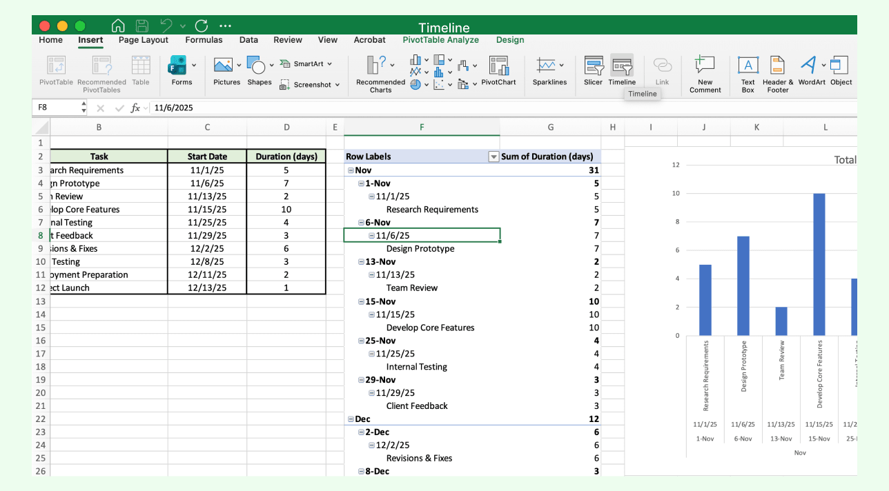
Step 3: Set Up the PivotTable Fields
In the PivotTable Fields pane, drag the Date field into the Rows area, and drag another field (like Task or Amount) into the Values area. Excel automatically organizes data chronologically. Depending on your Excel version, you might need to group dates manually by month or quarter for better readability.
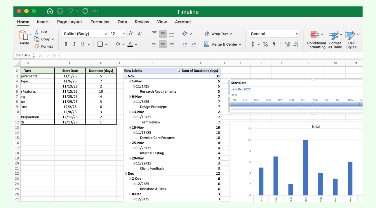
Step 4: Insert a Timeline Filter
Click anywhere inside the PivotTable, then go to the PivotTable Analyze tab (or Options in older versions) and select Insert Timeline from the Filter group. Choose the Date field and click OK. A missing “Insert Timeline” option usually means your data isn’t properly formatted as a PivotTable source.
Step 5: Use the Interactive Timeline
A timeline slicer appears above your PivotTable. Drag the slider or select specific date ranges (days, months, quarters, or years) to filter your data dynamically. Resize or move the slicer for better visibility. While intuitive, this slicer can overlap other elements and you’ll often need to adjust spacing manually for dashboard layouts.
Step 6: Customize and Format
Go to the Timeline Tools → Options tab to adjust colors, styles, and layout. You can also insert charts (like bar or line charts) linked to the PivotTable to make your timeline insights more engaging. Adding charts enhances clarity but increases file size and complexity, especially when linking multiple PivotTables.
Step 7: Save and Share Your Timeline Dashboard
When finished, save your file and share it via OneDrive or email. The interactive timeline will remain functional for anyone opening the workbook in Excel. Be aware that shared users on different Excel versions may see formatting inconsistencies or slicer misalignments.

You can learn the detailed steps for using SmartArt by reading how to make a timeline in Word, which walks through the same process applicable in Excel.
Limitations of Making a Timeline in Excel
No dedicated timeline tool: Excel doesn’t have a built-in timeline creator; users must rely on SmartArt, charts, or manual formatting to build one.
Complex setup for detailed timelines: Creating advanced or dynamic timelines (like Gantt charts) requires formulas, formatting adjustments, or multiple data series, which can be time-consuming.
Limited design flexibility: Customizing chart layouts, connectors, or shapes is less intuitive compared to specialized visualization tools.
Static visuals: Most timelines in Excel aren’t automatically linked to live data unless you use complex references or VBA (Visual Basic for Applications), making updates manual.
Difficult scaling: When timelines span long periods or contain many events, labels and data points can overlap, reducing readability.
Challenging for collaboration: While Excel supports cloud sharing, simultaneous real-time editing and visual feedback are limited compared to web-based tools.
Formatting inconsistencies: Charts or SmartArt may lose alignment or proportions when resized, copied, or exported to other platforms.
Steep learning curve for beginners: Creating professional, data-driven timelines, especially with charts or PivotTables can be confusing for new users.
Limited interactivity: Except for PivotTable timelines, most Excel timelines are static and lack interactive filters or dynamic updates.
These constraints make Excel suitable for creating structured but basic timelines.
Why Creately is the Best Alternative to Excel for Timelines
Save Time and Simplify Workflows
Professionally-made templates: Start instantly with ready-to-use timeline templates for projects, roadmaps, or events. No chart setup or formulas required.
Effortless drag-and-drop editing: Build and adjust your timeline visually without dealing with cell formatting limits or manual resizing.
Smart alignment and connectors: Keep milestones evenly spaced and organized automatically, eliminating tedious layout adjustments common in Excel.
Collaborate Better
Collaborative workspace: Work with teammates in real time. You can comment, edit, and refine together on one shared canvas.
Task and progress tracking: Link milestones directly to workflow stages or tasks to visualize project progress clearly.
Dynamic data linking: Connect your timeline to tables or data sources for automatic updates, removing the need for manual recalculations.
Design Beautifully
Advanced design flexibility: Customize fonts, colors, and shapes or add icons and visuals that match your brand, all with far more freedom than Excel’s chart tools allow.
Multiple layout options: Create horizontal, vertical, or multi-phase timelines that scale seamlessly to your project’s size and complexity.
Unified visual environment: Combine timelines with flowcharts, mind maps, and project diagrams in one collaborative workspace, something Excel can’t replicate.
Present and Share Professionally
Smooth integrations: Embed or export your timelines directly to Google Workspace, Confluence, or Slack for effortless sharing.
High-quality output: Export polished visuals as images, PDFs, or interactive links perfect for reports, client presentations, or dashboards.
For more visual, flexible, and collaborative options, use Creately’s timeline maker which offers smarter templates, automatic alignment, and real-time collaboration.
Creately Vs. Excel Timeline Features Comparison
Here’s how creating timelines in Microsoft Excel compares to using Creately:
Feature | Microsoft Excel | Creately |
Built-in Templates | Limited basic templates | Comprehensive library of professionally designed timeline templates |
Auto Alignment | Manual resizing and spacing | Smart connectors with automatic alignment |
Real-Time Collaboration | Restricted, version-dependent | True multi-user editing with live comments |
Visual Styling | Cell-based formatting only | Fully customizable fonts, colors, icons, and shapes |
Data Integration | Requires formulas or VBA | Direct linking to data tables and project tasks |
Layout Options | Fixed grid and chart structures | Flexible horizontal, vertical, and multi-phase layouts |
Scalability | Hard to manage large datasets visually | Infinite canvas for scalable, detailed timelines |
Export & Sharing | Static files or PDFs | Export as images, PDFs, or interactive links |
Ease of Editing | Manual chart and cell adjustments | Drag-and-drop simplicity with smart formatting |
Creately makes building and managing timelines faster, more visual, and truly collaborative, without complex formulas or rigid layouts. For more details and expert tips, check out how to create a timeline guide on creating effective timelines on Creately.
Free Timeline Templates to Get Started


Helpful Resources for Making Timelines
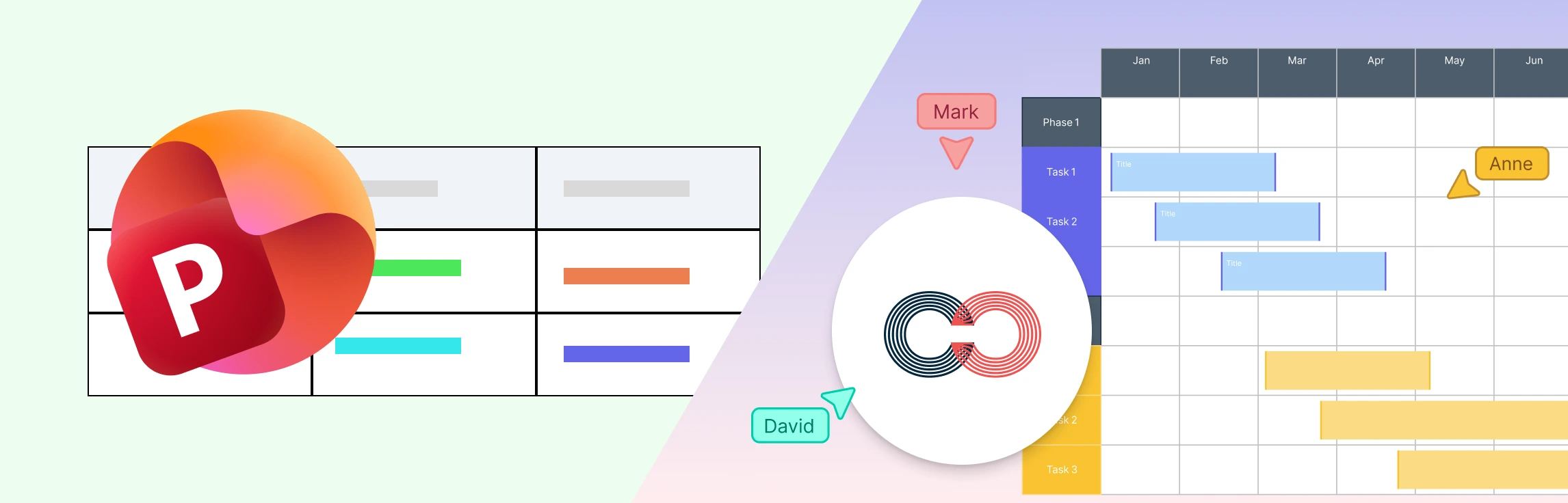
Learn how to make timelines with animations in Microsoft PowerPoint.
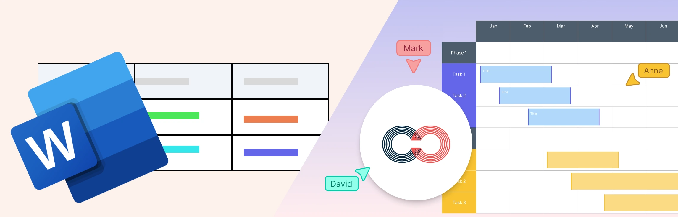
Discover how to make timelines using SmartArt in Microsoft Word.
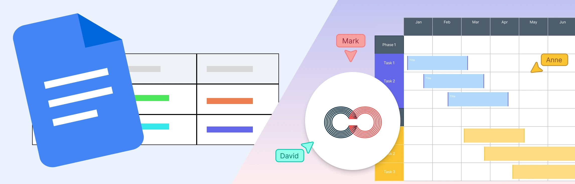
Discover how to make timelines using Google Docs.