We are thrilled to fulfill our commitment, as discussed in our previous template round-up, by introducing five new templates that will bring significant value to you and your team this week too. These carefully designed templates have been tested to ensure their effectiveness and usability across various industries.
This week, we have a variety of templates made specifically for researchers, engineers, entrepreneurs and project planners giving them the tools they need to succeed in their respective industries.
Explore more templates contributed by community members in Creately’s Diagram Community. Find professional templates for every organizational activity with more than 80 distinct diagram categories to pick from, unveiling a multitude of practical applications.
Pitch Deck Template is a useful tool designed to help professionals create attractive presentations for various goals, including pitching ideas, getting financing or attracting stakeholders. It offers a systematic framework for compiling and displaying important information about a company, item or trust. Entrepreneurs, startup owners, business professionals, and anyone looking to invest, partner, or collaborate strategically will find this template especially useful. Professionals can successfully present their value proposition, market analysis, financial forecasts, and product or service features by using the Pitch Deck Template, thereby improving their chances of success in the business environment.
Click on the image to edit Pitch Deck Template
Sailboat Template
The Sailboat Template serves as a metaphorical representation of strategic direction and progress. It is a visual tool used to depict goals, external influences, internal driving factors, and potential obstacles. Business strategists, project managers, business owners, entrepreneurs, team leaders, managers, consultants, advisors, and business analysts can leverage the Sailboat Template to align goals, assess risks, facilitate discussions, and develop action plans. It aids in enhancing decision-making, fostering collaboration, and guiding businesses toward successful outcomes.
Click on the image to edit the Sailboat Template
Neural Network Diagram
For experts in data science, machine learning, and artificial intelligence, the Neural Network Diagram template is a useful resource. It enables scientists, engineers, and developers to display a neural network’s complex structure and connections visually. With the help of this template, they can clarify relationships between nodes and layers, communicate complex network topologies, and improve their models. It facilitates collaboration in these domains by streamlining the understanding, analysis, and presentation of neural networks.
Click on the image to edit the Neural Network Diagram
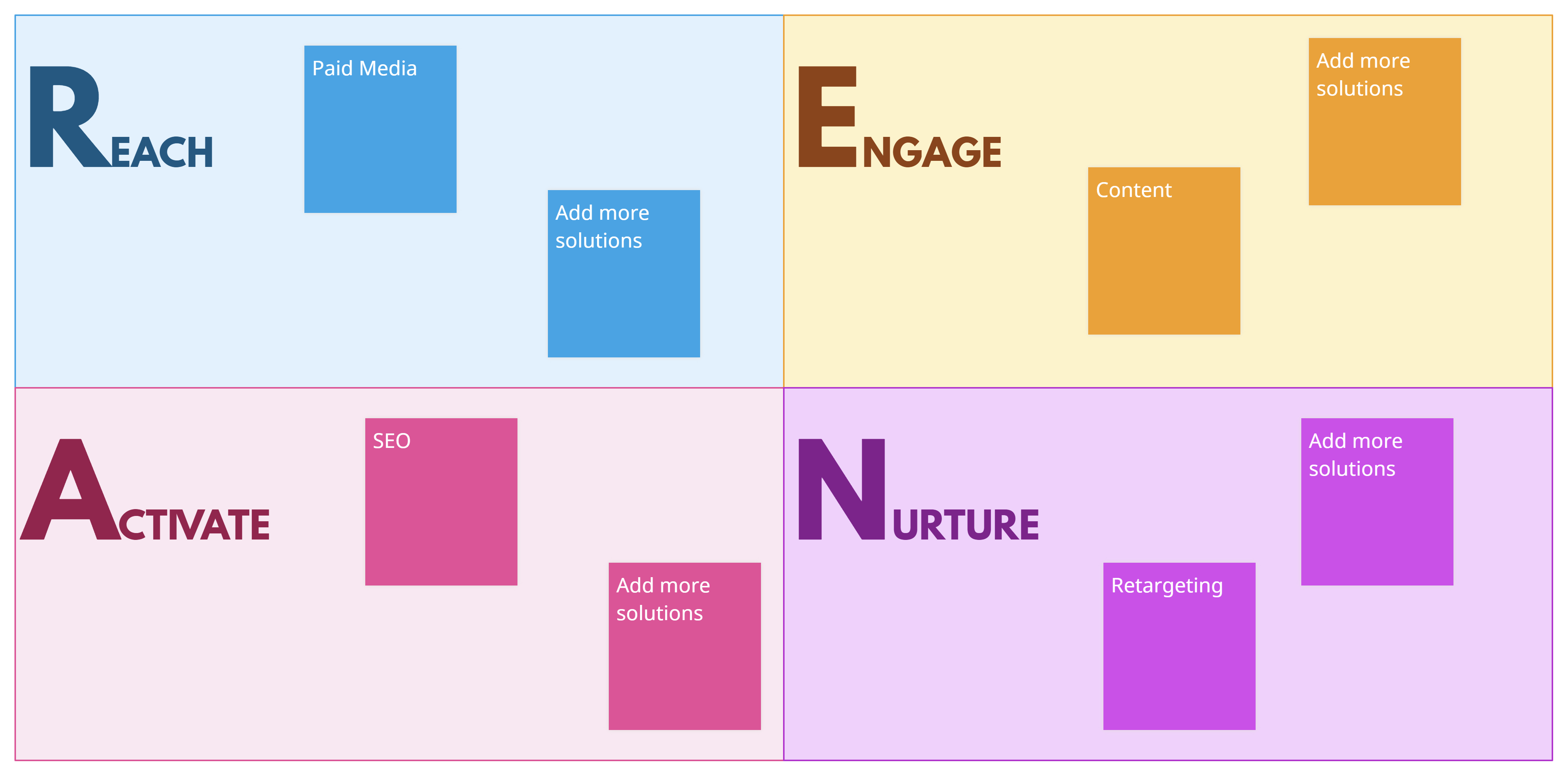
REAN Model Template
Professionals in marketing, sales, and customer success roles can benefit from the REAN Model Template, which integrates Reach, Engage, Activate, and Nurture. It directs them in creating thorough strategies to draw in, engage, activate, and nurture customers during the course of their relationship with a company. Professionals can successfully target their audience, produce engaging experiences, encourage desired activities, and develop long-lasting relationships by using this template. It provides a blueprint for customer-centric tactics, which enhance customer acquisition, customer retention, and overall corporate success.
Click on the image to edit the REAN Model Template
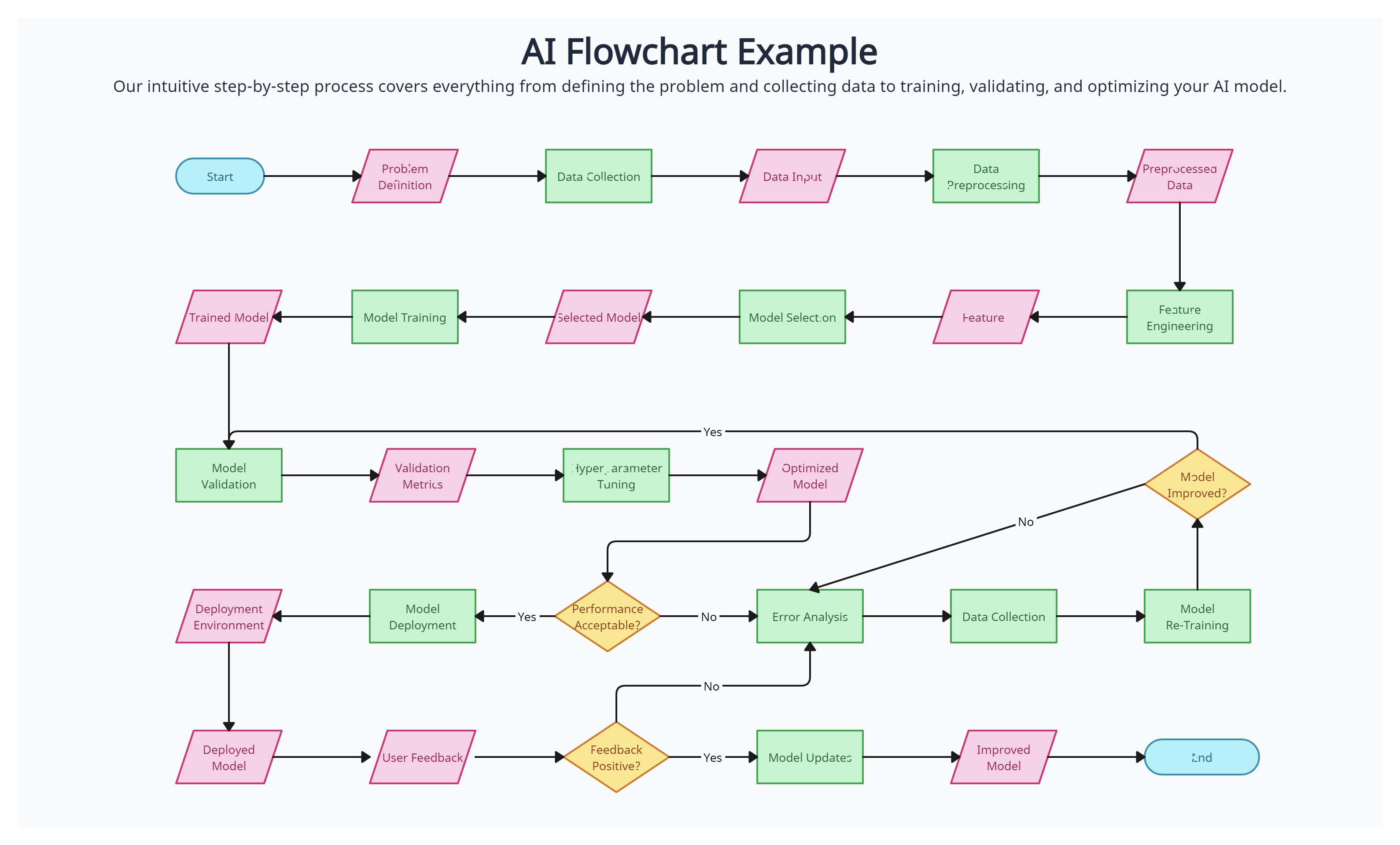
AI Flowchart
The AI Flowchart is a visual representation tool used by professionals in artificial intelligence, machine learning, data science, and software engineering. It aids in the documenting, communication, and analysis of the workflow and decision-making process within AI systems. The use of this template will benefit AI researchers, data scientists, software engineers, and system architects since it will help them better comprehend data and algorithm flows, improve performance, and make AI models more transparent and comprehensible. The AI Flowchart is an essential tool in the field for collaboratively troubleshooting and enhancing the effectiveness of AI systems.
Japan is known worldwide for its quality products and services. One of the many reasons for this is its excellent quality management. How did it become so? Japan has Dr. Kaoru Ishikawa to thank for that.
Postwar Japan underwent a major quality revolution. Companies were focused on training their employees in statistical quality control. But soon they realized that the complexity of the subject itself could intimidate most of the workers; so they wanted more basic tools.
Dr. Kaoru Ishikawa, a member of the Japanese Union of Scientists and Engineers (JUSE), took it to his hands to make quality control easier for everyone – even those with little knowledge of statistics – to understand. He introduced the 7 basic tools of quality. They were soon adopted by most companies and became the foundation of Japan’s astonishing industrial resurgence after World War 2.
This post will describe the 7 basic quality tools, how to use them and give you access to templates that you can use right away.
Quality Tools: What Are They?
The 7 basic tools of quality, sometimes also referred to as 7 QC tools – represent a fixed set of graphical tools used for troubleshooting issues that are related to quality.
They are called basic quality tools because they can be easily learned by anyone even without any formal training in statistics. Dr. Kaoru Ishikawa played the leading role in the development and advocacy of using the 7 quality tools in organizations for problem-solving and process improvement.
Quality tools are used to collect data, analyze data, identify root causes, and measure results in problem-solving and process improvement. The use of these tools helps people involved easily generate new ideas, solve problems, and do proper planning.
The 7 quality tools were first emphasized by Kaoru Ishikawa a professor of engineering at the University of Tokyo, who is also known as the father of “Quality Circles” for the role he played in launching Japan’s quality movement in the 1960s.
7 Basic Quality Tools Explained with Templates
The 7 quality tools can be applied across any industry. They help teams and individuals analyze and interpret the data they gather and derive maximum information from it.
Flowchart
Flowcharts are perhaps the most popular out of the 7 quality tools. This tool is used to visualize the sequence of steps in a process, event, workflow, system, etc. In addition to showing the process as a whole, a flowchart also highlights the relationship between steps and the process boundaries (start and end).
Flowcharts use a standard set of symbols, and it’s important to standardize the use of these symbols so anyone can understand and use them easily. Here’s a roundup of all the key flowchart symbols.
Uses:
To build a common understanding of a process
To analyze processes and discover areas of issues, inefficiencies, blockers, etc.
To standardize processes by leading everyone to follow the same steps
How to use a flowchart
Gather a team of employees involved in carrying out the process for analyzing it
List down the steps involved in the process from its start to end
If you are using an online tool like Creately, you can first write down the process steps and rearrange them later on the canvas as you identify the flow.
Identify the sequence of steps; when representing the flow with your flowchart, show it from left to write or from top to bottom
Connect the shapes with arrows to indicate the flow.
Flowchart Template (Click on the template to edit it online)
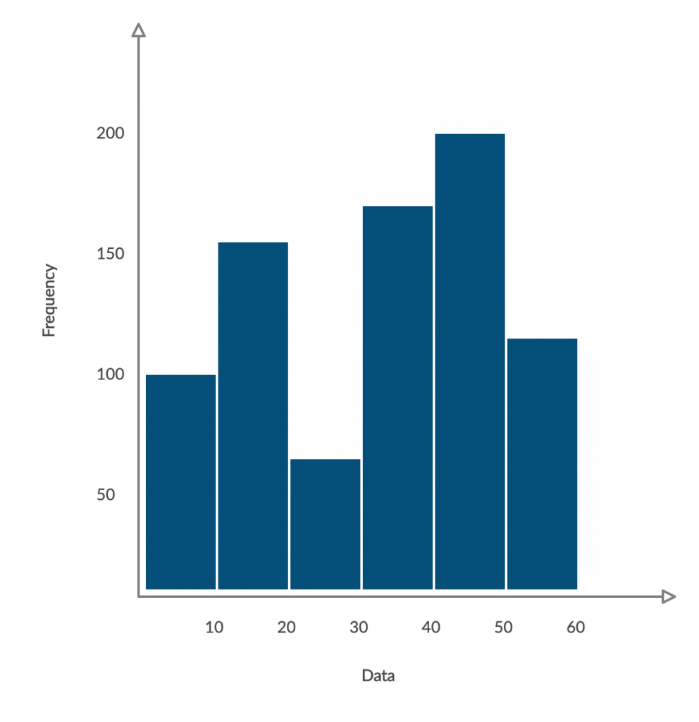
Histogram
A histogram is a type of bar chart that visualizes the distribution of numerical data. It groups numbers into ranges and the height of the bar indicates how many fall into each range.
It’s a powerful quality planning and control tool that helps you understand preventive and corrective actions.
Uses
To easily interpret a large amount of data and identify patterns
To make predictions of process performance
To identify the different causes of a quality problem
How to make a histogram
Collect data for analysis. Record occurrences of specific ranges using a tally chart
Analyze the data at hand and split the data into intervals or bins
Count how many values fall into each bin
On the graph, indicate the frequency of occurrences for each bin with the area (height) of the bar.
Histogram Example (Click on the template to edit it online)
Here’s a useful article to learn more about using a histogram for quality improvement in more detail.
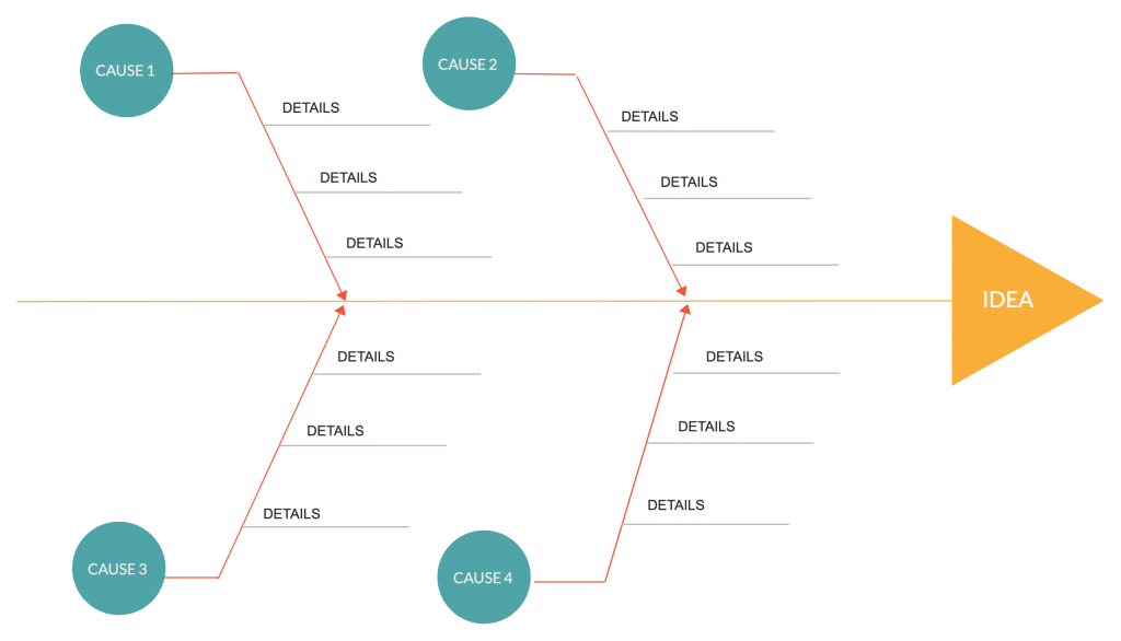
Cause and Effect Diagram
This tool is devised by Kaoru Ishikawa himself and is also known as the fishbone diagram (for it’s shaped like the skeleton of a fish) and Ishikawa diagram.
They are used for identifying the various factors (causes) leading to an issue (effect). It ultimately helps discover the root cause of the problem allowing you to find the correct solution effectively.
Uses
Problem-solving; finding root causes of a problem
Uncovering the relationships between different causes leading to a problem
During group brainstorming sessions to gather different perspectives on the matter
How to use the cause and effect diagram
Identify the problem area that needs to be analyzed and write it down at the head of the diagram
Identify the main causes of the problem. These are the labels for the main branches of the fishbone diagram. These main categories can include methods, material, machinery, people, policies, procedures, etc.
Identify plausible sub-causes of the main causes and attach them as sub-branches to the main branches.
Referring to the diagram you have created, do a deeper investigation of the major and minor causes
Once you have identified the root cause, create an action plan outlining your strategy to overcome the problem
Cause and Effect Diagram (Click on the template to edit it online)
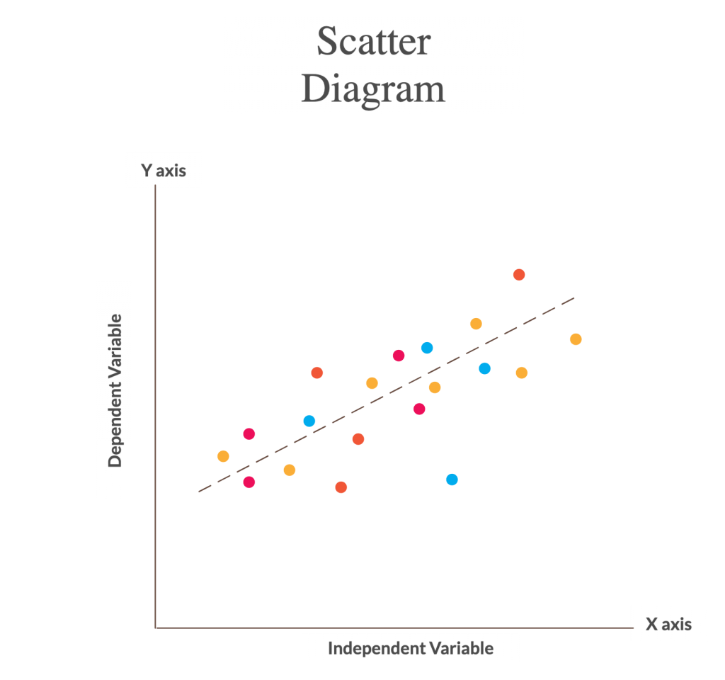
Scatter Diagram
The scatter diagram (scatter charts, scatter plots, scattergrams, scatter graphs) is a chart that helps you identify how two variables are related.
The scatter diagram shows the values of the two variables plotted along the two axes of the graph. The pattern of the resulting points will reveal the correlation.
Uses
To validate the relationship between causes and effects
To understand the causes of poor performance
To understand the influence of the independent variable over the dependent variable
How to make a scatter diagram
Start with collecting data needed for validation. Understand the cause and effect relationship between the two variables.
Identify dependent and independent variables. The dependent variable plotted along the vertical axis is called the measures parameter. The independent variable plotted along the horizontal axis is called the control parameter.
Draw the graph based on the collected data. Add horizontal axis and vertical axis name and draw the trend line.
Based on the trend line, analyze the diagram to understand the correlation which can be categorized as Strong, Moderate and No Relation.
Scatter Diagram (Click on the template to edit it online)
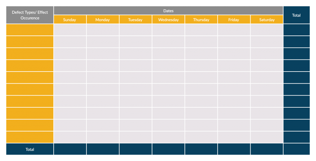
Check Sheets
Check sheets provide a systematic way to collect, record and present quantitative and qualitative data about quality problems. A check sheet used to collect quantitative data is known as a tally sheet.
It is one of the most popular QC tools and it makes data gathering much simpler.
Uses
To check the shape of the probability distribution of a process
To quantify defects by type, by location or by cause
To keep track of the completion of steps in a multistep procedure (as a checklist)
How to make a checksheet
Identify the needed information.
Why do you need to collect the data?
What type of information should you collect?
Where should you collect the data from?
Who should collect the data?
When should you collect the data?
How should you measure the data?
How much data is essential?
2. Construct your sheet based on the title, source information and content information (refer to the example below)
3. Test the sheets. Make sure that all the rows and columns in it are required and relevant and that the sheet is easy to refer to and use. Test it with other collectors and make adjustments based on feedback.
Check Sheet Template (Click on the template to edit it online)
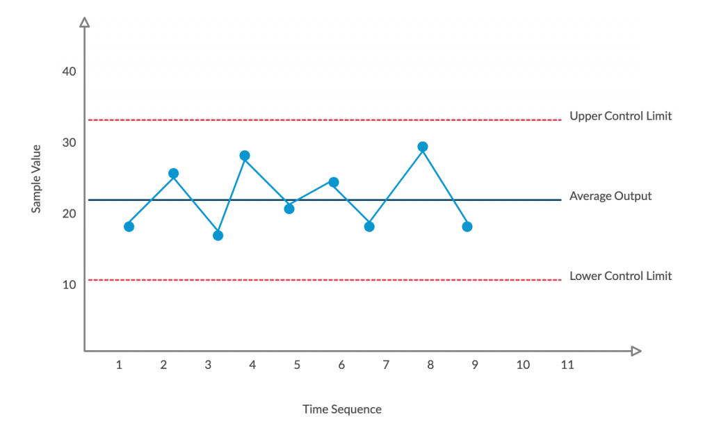
Control Chart
The control chart is a type of run chart used to observe and study process variation resulting from a common or special cause over a period of time.
The chart helps measure the variations and visualize it to show whether the change is within an acceptable limit or not. It helps track metrics such as defects, cost per unit, production time, inventory on hand, etc.
Control charts are generally used in manufacturing, process improvement methodologies like Six Sigma and stock trading algorithms.
Uses
To determine whether a process is stable
To monitor processes and learn how to improve poor performance
To recognize abnormal changes in a process
How to create a control chart
Collect the data and divide it into subgroups based on
Control Chart (Click on the template to edit it online)
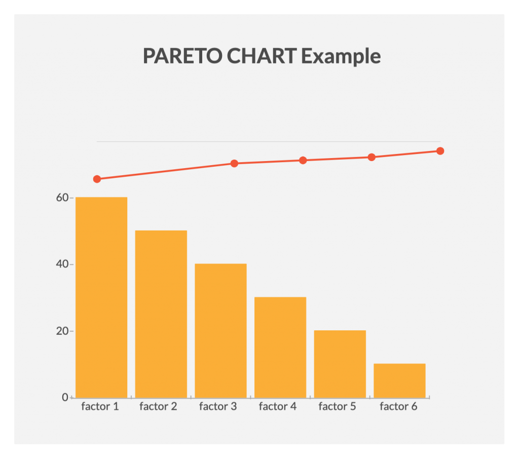
The Pareto chart is a combination of a bar graph and a line graph. It helps identify the facts needed to set priorities.
The Pareto chart organizes and presents information in such a way that makes it easier to understand the relative importance of various problems or causes of problems. It comes in the shape of a vertical bar chart and displays the defects in order (from the highest to the lowest) while the line graph shows the cumulative percentage of the defect.
Uses
To identify the relative importance of the causes of a problem
To help teams identify the causes that will have the highest impact when solved
To easily calculate the impact of a defect on the production
How to create a Pareto chart
Select the problem for investigation. Also, select a method and time for collecting information. If necessary create a check sheet for recording information.
Once you have collected the data, go through them and sort them out to calculate the cumulative percentage.
Draw the graph, bars, cumulative percentage line and add labels (refer to the example below).
Analyze the chart to identify the vital few problems from the trivial many by using the 80/20 rule. Plan further actions to eliminate the identified defects by finding their root causes.
Pareto Chart (Click on the template to edit it online)
What’s Your Favorite Out of the 7 Basic Quality Tools?
You can use these 7 basic quality tools individually or together to effectively investigate processes and identify areas for improvement. According to Ishikawa, it’s important that all employees learn how to use these tools to ensure the achievement of excellent performance throughout the organization.
Got anything to add to our guide? Let us know in the comments section below.
So you want to learn flowcharts? Well, This flowchart tutorial will teach you all you need to know. It will cover the history of flowcharts, flowchart symbols, how to create flowcharts, flowchart best practices and we’ve also included a section to answer frequent questions about flowcharts. Best of all you can use our flowchart software to draw them.
Creately already has some really awesome articles and videos covering various things related to flowcharts like meanings of flowchart symbols, how to use swimlanes in flowcharts, flowchart best practices, case studies, and much more.
Flowchart Tutorial
This blog post will simply gather all that information and present it in a logical way. I’ve added links to different sections to make it easier to navigate. Click on the relevant link to quickly read the relevant section.
Frank Gilberth introduced flowcharts in 1921, and they were called “Process Flow Charts” at the beginning. Allan H. Mogensen is credited with training business people on how to use flowcharts. Wikipedia has a great summary of the history of flowcharts, read more in this wiki section.
Flowchart Symbols
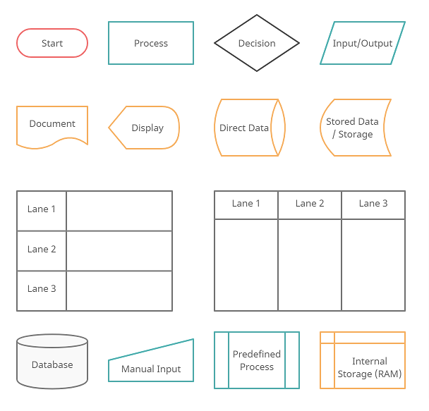
So what are the different symbols used in a flowchart?. Most people are only aware of basic symbols like processes and decision blocks. But there are many more symbols to make your flowchart more meaningful. The above image shows all the standard flowchart symbols.
The most common symbol used in a flowchart is the rectangle. A rectangle represents a process, operation, or a task. The next most common symbol is the diamond which is used to represent a decision.
With this following list, you can figure out the most commonly used flowchart symbols as well as those that are little-known. All these shapes are available in Creately and you can try out a demo or take a look at some flowchart examples for more context.
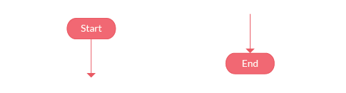
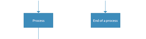
Terminal / Terminator
The terminator shows where your process begins or ends. You can use words like ‘Start’, ‘Begin’, ‘End’ inside the terminator shape to make things more obvious.
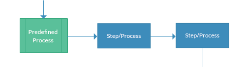
Process / Rectangle
Flowchart process shape is used to represent a process, action step, or operation. While these are pictured with rectangles, the text in the rectangle mostly includes a verb. For example, ‘Edit Video’, ‘Try Again’, ‘Choose Your Plan’.n’.
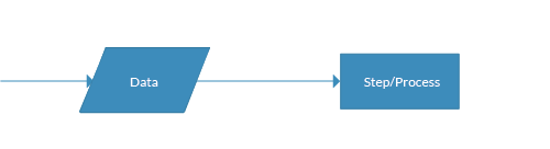
Data (I/O)
The Data object, often referred to as the I/O Shape shows the Inputs to and Outputs from a process. This takes the shape of a parallelogram.
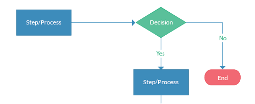
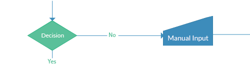
Decision / Conditional
The decision shape is represented as a Diamond. This object is always used in a process flow to ask a question. And, the answer to the question determines the arrows coming out of the Diamond. This shape is quite unique with two arrows coming out of it. One from the bottom point corresponding to Yes or True and one from either the right/left point corresponding to No or False. The arrows should always be labeled to avoid confusion in the process flow.
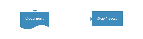
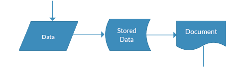
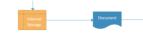
Document
The document object is a rectangle with a wave-like base. This shape is used to represent a Document or Report in a process flow.
Stored Data
This is a general data storage object used in the process flow as opposed to data that could be also stored on a hard drive, magnetic tape, memory card, of any other storage device.
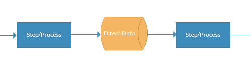
Direct Data
Direct Data object in a process flow represents information stored which can be accessed directly. This object represents a computer’s hard drive.
Internal Storage
This is a shape that is commonly found in programming flowcharts to illustrate the information stored in memory, as opposed to on a file. This shape is often referred to as the magnetic core memory of early computers, or the random access memory (RAM) as we call it today.
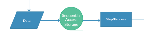
Sequential Access
This object takes the shape of a reel of tape. It represents information stored in a sequence, such as data on a magnetic tape.
Manual Input
This object is represented by a rectangle with the top sloping up from left to right. The Manual Input object signifies an action where the user is prompted for information that must be manually input into a system.
Subroutine / Predefined Process
This shape takes two names – ‘Subroutine’ or ‘Predefined Process’. Its called a subroutine if you use this object in flowcharting a software program. This allows you to write one subroutine and call it as often as you like from anywhere in the code.
The same object is also called a Predefined Process. This means the flowchart for the predefined process has to be already drawn, and you should reference the flowchart for more information.
Although these are the standard symbols available in most flowchart software, some people do use different shapes for different meanings. The most common example of this is using circles to denote start and end. The examples in this flowchart tutorial will stick with the standard symbols.
How to Draw a Flowchart
How do you draw a flowchart? Well, our flowcharting tool is a good place to start. But before directly using the tool, let’s take a look at some basics.
There are four main types of flowcharts. Document flowchart, System flowchart, data flowchart, and program flowchart. Not everyone agrees with this categorization, but the core principles of drawing a flowchart remain the same. You need to consider a few things when drawing a flowchart, Check out 6 useful tips on drawing flowcharts before you start.
If you are drawing a flowchart with many responsible parties you can group them together using swimlanes. Swimlanes are a powerful technique to increase the readability of your flowchart so you should use them according to the situation. Read how to use cross-functional flowchart for planningto learn more about the process.
The below video shows how to draw a flowchart using Creately. It is very simple to use and one-click create and connect helps you draw them faster as well. You can drag and drop symbols from the library or drag images to your diagram by doing an image search.
Flowchart Templates and Examples
Although you can start drawing flowcharts by scratch it is much easier to use templates. They help you reduce errors and remind you about the best practices to follow. If you want to use a ready-made template, go to the flowchart examples section and click on the flowchart that best suits you. Click on the use at template after the image and you are ready to draw your flowchart.
Below are two templates out of hundreds of flowchart templates available to the user. Click on any of them to start drawing flowcharts immediately.
Meeting Flowchart Template (Click on the template to edit it online)Student Application Process (Click on the template to edit it online) Horizontal Flowchart Template (Click on the template to edit it online)
Flowchart Best Practices
There are a few things you can do to make your flowchart universally accepted. And there are some things that you can do to make it visually pleasing to others as well.
If you’re planning to share your flowchart or hoping to use it on a presentation etc. then it’s wise to use standard symbols. However, it is important to remember that the idea is to give out information in an easy-to-understand manner. It is perfectly acceptable to use an alternative image instead of the document symbol as long as the audience understands it.
Keeping the arrow flow to one side, using the same size symbols, naming the decision blocks, processes, arrows, etc. are a few things you can do to make it better. The common mistakes section covers most of these practices in detail.
Map out any process, workflows, or system with ease. Dedicated shape library, drag and drop interface, and powerful diagramming for super-fast drawing.
This section highlights the common mistakes made when drawing flowcharts. Some of the things mentioned here are to make it better looking and more understandable, not having them in your flowchart won’t make it wrong. Since there are two posts covering these mistakes in-depth I will link to them from this flowchart tutorial.
A flowchart tutorial isn’t complete without some case studies. Below are three case studies and real-life examples of how flowcharts can help you make decisions.
Flutterscape Case Study – How one of our customers used flowcharts to enhance their processes.
Frequently Asked Questions About Flowchart
The comments section of this article is full of questions. Please note that I will not draw flowcharts for specific scenarios. Below I have answered some of the most frequently asked questions.
Q 01: What is a subprocess in a flowchart?
Answer: Sometimes complex processes are broken down into smaller sub-processes for clarity. So a flowchart can point to a different sub-process within its flow. The predefined process symbol is used to show such subprocesses.
Q 02: How are flowcharts used in computer programming?
Answer: A computer program consists of many processes and flows. Flowcharts are used to visualize the processes and make them understandable for non-technical people. They are also used to visualize algorithms and comprehend pseudo-code which is used in programming.
Comments and Feedback on the Flowchart Tutorial
I hope this flowchart tutorial will help you to come up with awesome flowcharts. Flowcharts are a great way to present complex processes in a simple-to-understand manner and they are used all over the world in many industries. If you have a question about drawing flowcharts or have any suggestions to improve this post, feel free to mention in the comments section.
Surprisingly many user manuals never accomplish their direct goal the way they should. They don’t help a user or do this awfully bad. We are not talking about incomplete or badly written documentation here. Even the greatest manuals fail to deliver what users expect due to just one common flaw:
Typical User Manuals Lack Visuals
People rarely read user manuals. One part of the reason is because we presume we are smart and don’t need instructions even if that isn’t so. The other reason is: manuals are boring.
While you can’t blame people for being people, you can and should make your user manuals easier to read. The recipe is simple: add visuals. Even concepts that are hard to express in words often become astonishingly easy to understand when shown as a flowchart or a diagram.
So, what exact parts of the user manual should you convert into flowcharts? Below are 5 tips to make your user documentation perform better by being more explanatory, using graphical elements instead of text.
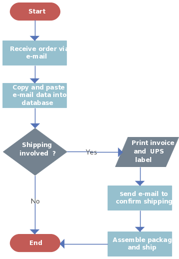
#1: Turn Text Step-By-Steps to Flowcharts
When you need to give complex conditional instructions to users, consider complementing a wordy description with a nice and illustrative flowchart. Compare the below instructions and the flowchart that follows, both formalizing the same process.
How to decide whether you are ready to have a dog? Dogs may be cute, but they are still no toys. When you want to adopt a dog, consider if you can afford feeding it, if you have enough time to walk it and if your room is big enough for a dog. Other things to take into account are dog fur and saliva, training, games etc. Most importantly, if you have other pets you want the dog to communicate with them in a non-aggressive manner. And if you have kids, both the dog and the kids should relate to each other.
User manuals describing device structure and components must do this in the most comprehensible way. And this is a diagram, not a list.
Compared to just listing all parts of the system one by one, the structure diagram depicts not only components but also interconnections between them and the type of these connections (as different line styles and colors). With just one glyph, you can distinguish one way connections from two way, input signals from outgoing, power connectors from information inputs and so on.
Here is an example:
#3: UML Is Designed for Documenting Classes
UML (an object-oriented language) diagrams are a good way to represent class hierarchy and structures. Not only such diagrams take less space and are easier to grasp, they also help to better understand the relationships and dependencies between classes. And this is crucial in user documentation of code libraries, software components and packages.
Here is an example of a visual class diagram.
Looking at the above class diagram, one can quickly see the main objects of the system (Visitor, Admin, Movie, Registered User, Book Ticket, Payment), all the main properties of each object (for example, id, name, phone number and address of a registered user), possible actions the given object can do and relationships between each object.
The alternative would be the source code of these classes, which is apparently less illustrative.
#4: Process Flowchart Is Great for Operating Procedures and Workflow
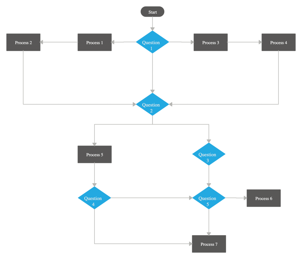
Make a habit: whenever you want to describe a process, use the flowchart first, not text. While the text may provide a more detailed explanation of what’s going on on each step, it lacks clarity of the flowchart. Indeed, you can start examining the flowchart from any block and go along the lines to cover the entire diagram.
This way, a user struggling to solve some task or having difficulties at some point of the operating process can easily find the step on the flowchart he is currently on and unravel the rest of it. The other option is to scan the text for problems and directions, which can be a rather frustrating experience.
The flowchart, if designed correctly, can be very descriptive in categorizing various issues, actions and entities of the operating process as shown on the picture above. And when it comes to designing a user manual, being descriptive is simply a must.
#5: Display ER-Models Properly (Read: Visually)
Entity-relationship models are a crucial part of understanding concepts of database-driven software and therefore are widely used in programming manuals to this type of software. If your product allows users to design databases or work with ones, do include well-drawn ER-model of corresponding databases into the user manuals.
How do you improve user manuals ?
Creating a ready-to-publish user manual for a product is a formidable challenge. However, armed with proper tools you can prepare comprehensible, straightforward and illustrative documentation that does a good job of helping your users to work with your product.
I hope you’ve enjoyed these tips and make sure to leave a comment if you have any useful tips to improve user manuals.
Author Bio
Dennis Crane is team leader of Dr.Explain (http://www.drexplain.com) software team. He mostly specializes in help authoring software development and in software documentation methods. The area of expertise includes UI and UX, user support and relationships, product and project management, and IT business management.
Flowcharts and Gantt charts are both effective tools to plan projects. However, when it comes to project execution, both have different uses and applications. For a complex plan with a longer duration, a Gantt chart is better, and for short term and smaller projects, a flow chart can do the trick on its own. In some cases, Gantt charts and flowcharts are used in combination. Both types of charts can be easily made using Creately’sonline flow charting tools and Gantt tools.
Using Flowcharts for Project Planning
Flowcharts can be used to display a stage by stage progression. They effectively show a sequence of events, with the completion of one stage leading to the beginning of another. The only downside of using a flowchart for project planning is that you cannot add a time interval for each stage. Flowcharts of a project plan must show:
A clear beginning
Clearly labeled stages represented by rectangular boxes
Diamond shaped boxes for decisions/quality checks
A clearly defined end
The arrows show the direction of flow. In case of a decision, the yes and no arrows must clearly indicate how to tackle different possible outcomes. Using Creatley’s flowchart designing tool, a simple flowchart for a small project can easily be made.
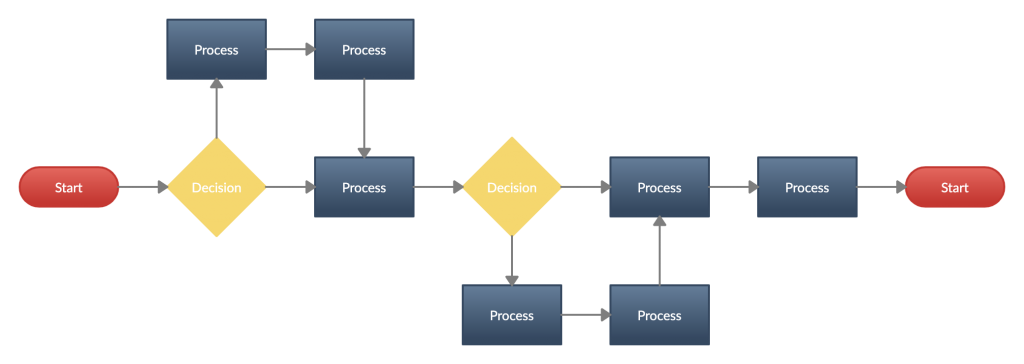
A small project quickly described using a flowchart(Project Flowchart)
As can be seen from the diagram, a flowchart gives a nice visual representation of different stages of the project but misses out on one of the most important elements of project planning, i.e. time. For a project to be planned and managed efficiently, it has to be timed and each stage has to be performed within a deadline.
When working on smaller projects, ones that can be completed within a day or two, a flowchart is enough. However, when working on larger projects, it is better to outline processes using a flowchart before using a Gantt chart to get into details.
Using Gantt Charts for Project Planning
We have featured a number of posts about this topic in the past, so we will keep this section brief. The biggest advantage of using Gantt charts for project planning is that they allow the manager to determine a time duration for each activity. Gantt charts allow for the effective display of task dependencies, information flows, and relationships between different activities. They do not put any emphasis on the logic controlling the decision making. Creatley’s Gantt chart designing tool can be used to make charts for simple and complex projects.
A Gantt chart template available at Creately ( click to use as a template )
Use Gantt Charts for High Level Plans
Gantt charts are perfect for high-level plans and complex planning. Suppose you have a complex project to plan and the project spans over several weeks. Your first step should be to draw a mind map and come up with as many tasks and subtasks related to the project as possible. You should then identify the main tasks and draw a flowchart using Creatley’s flowchart designing tool.
After designing a flowchart, you should be able to see all the essential task presented in front of you clearly. Now to create a Gantt chart, you need to know the exact duration that each task should take. You should calculate your deadlines in mind, allocate resources accordingly, and assign each essential task with a time frame. List the tasks and their time frame in a table:
Task
Duration
Task A
3 Weeks
Task B
2 Weeks
Task C
3 Weeks
Task D
4 Weeks
Once you have determined the duration for essential tasks, you can identify their relationships, see if they can function independently, and add to the table:
Task
Duration
Dependent Upon
Task A
3 Weeks
Task B
2 Weeks
A
Task C
3 Weeks
B
Task D
4 Weeks
C
Furthermore, you can identify if the tasks can be performed parallel to others or if they are sequential. In the example we have used each task so far is dependent on the preceding task and cannot be accomplished simultaneously with other tasks.
In a complex project, there will most likely be an opportunity to run several tasks at once. You will just have to identify which tasks can be run independently and will have to keep checking the new tasks that become available after the completion of each task.
After identifying the tasks, drawing a flow chart, identifying the different types of tasks and their inter-relationship, you can easily construct a Gantt chart for a complex project.
The diagramming community is gaining steam and we are fine tuning the features to make it more awesome. If you’re creating public diagrams make sure to rate them as well as diagrams submitted by other users. The objective is to filter out the best diagrams so other users can benefit from them. It sure is much easier to come up with this post now since diagrams are automatically selected for me 🙂 . So below are the top 5 community diagrams of the week.
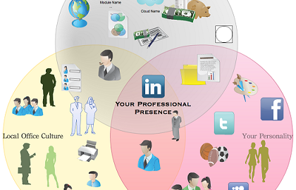
5.Your Professional Presence Venn Diagram
We start with a Venn diagram submitted by Pretty Ponies. Although a Venn diagram you can qualify it as an infographic as well. We are very pleased to see our users making full use of our extensive image library.
4. Issue Resolving Flowchart
Next up is a flowchart submitted by Miki Yarkoni. Although it is a relatively simple diagram we appreciated the fact that it uses swim lanes. Swim lanes are a great way to organize your flowchart according who is responsible for various activities. Read this article about flowchart with swim lanes to learn more about the process.
3. Reporting System UML Class Diagram
Then we have a UML class diagram submitted by Chris Butchart. The diagrams could do with some colors but we appreciated the effort put into creating a detailed diagram.
2. Phone System Database schema
Next we have a colorful database schema submitted by Maurice Bennet. The relationships are clearly defined and we love the use of colors. Diagrams that uses colors are more likely to get a higher rating and it is much more pleasing to look at as well.
1. Contract Management ER diagram
Finally we have a contract management ER diagrams submitted by Akash Jain. Although lot of effort is put in drawing the diagram he could have named it much better 🙂 .
Enjoy the diagrams and keep submitting more, you could be next in the featured post.