Nuwan Perera is a Senior Content Writer at Creately with specialized diagramming expertise in workflow mapping, business analysis frameworks, and IT and engineering diagrams. Drawing on hands-on experience with Creately’s tools, he develops detailed guides, product documentation, and practical use-case content that help professionals in business, education, and clinical environments structure information visually and collaborate more effectively. Nuwan has a background in engineering and over 5+ years of content experience writing for SaaS and technology audiences. Outside of his technical work, he is a professional musician with a strong interest in film and interactive media, bringing a creative perspective to technical storytelling.
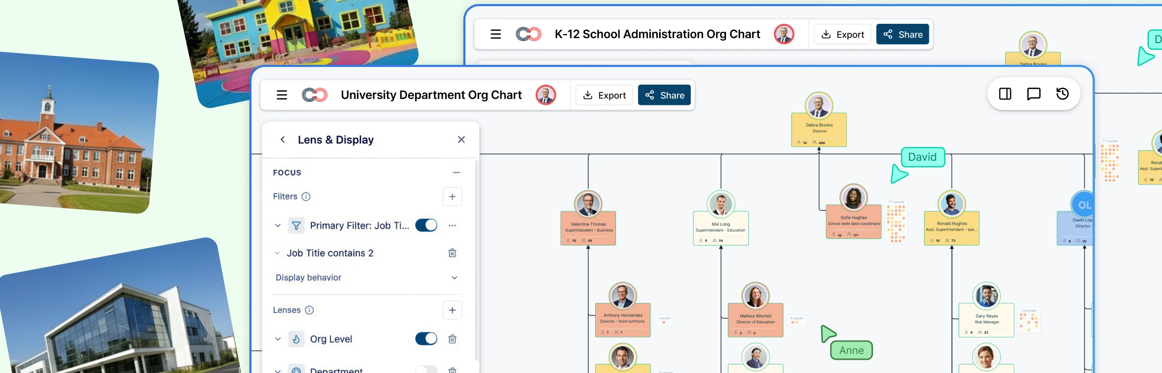
Schools and education institutions are complex organizations. Between administrators, teachers, counselors, department heads, and district offices, it’s easy for reporting lines and responsibilities to become unclear, especially as staff change year to year. Read More
Family systems are complex, and every profession looks at them differently. Genetic counselors focus on hereditary disease patterns, therapists explore emotional dynamics, and social workers track risk factors and living conditions. Genogram field packs solve this by letting you activate only the data fields relevant to your work, making it easier to create a genogram for different professions. Read More
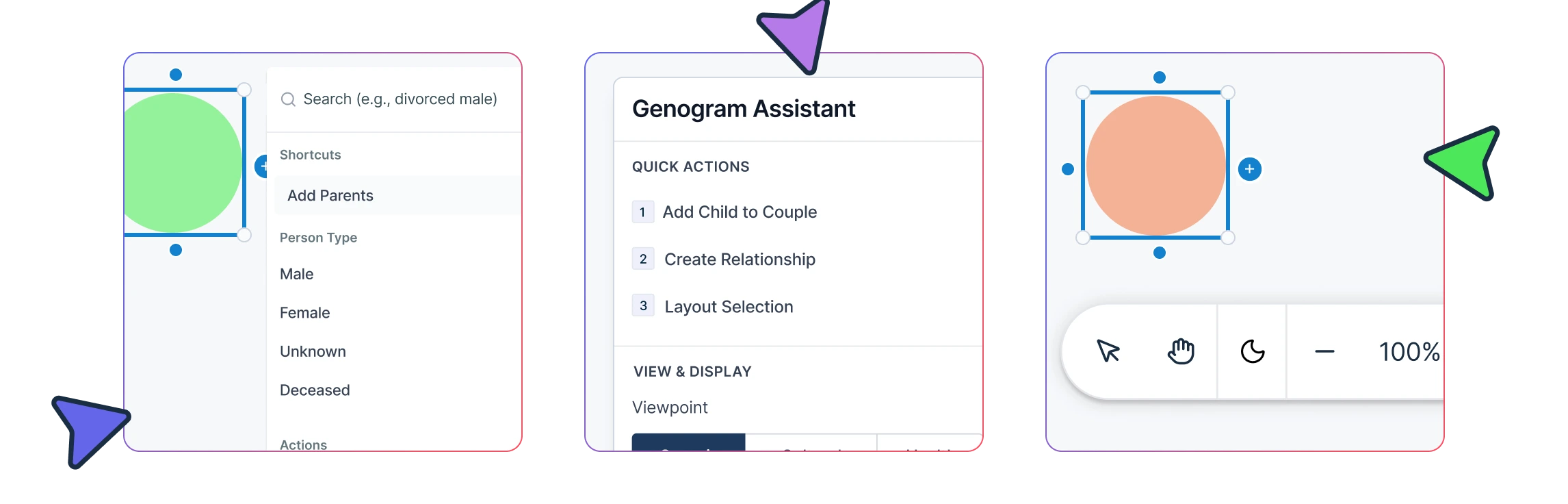
Building a genogram live is hard when you’re listening, asking follow‑up questions, and documenting at the same time. In this guide you’ll learn the 1–5 shortcut system for adding relatives, relationship shortcuts, and ways to move around the canvas fast so you can keep the conversation flowing. Read More
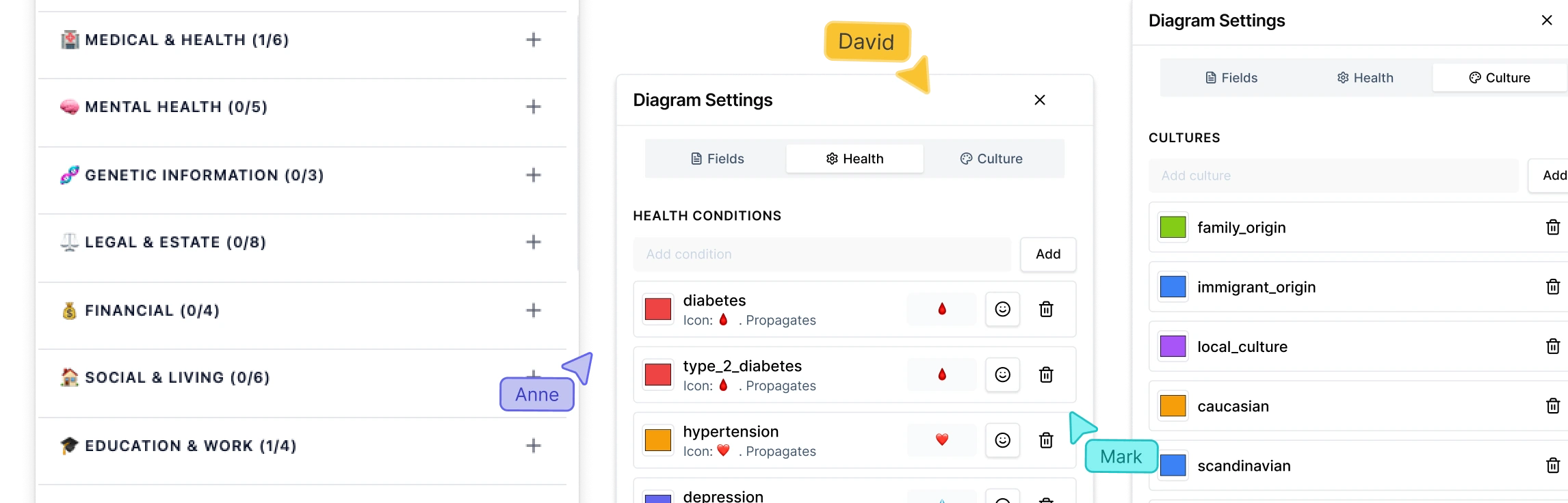
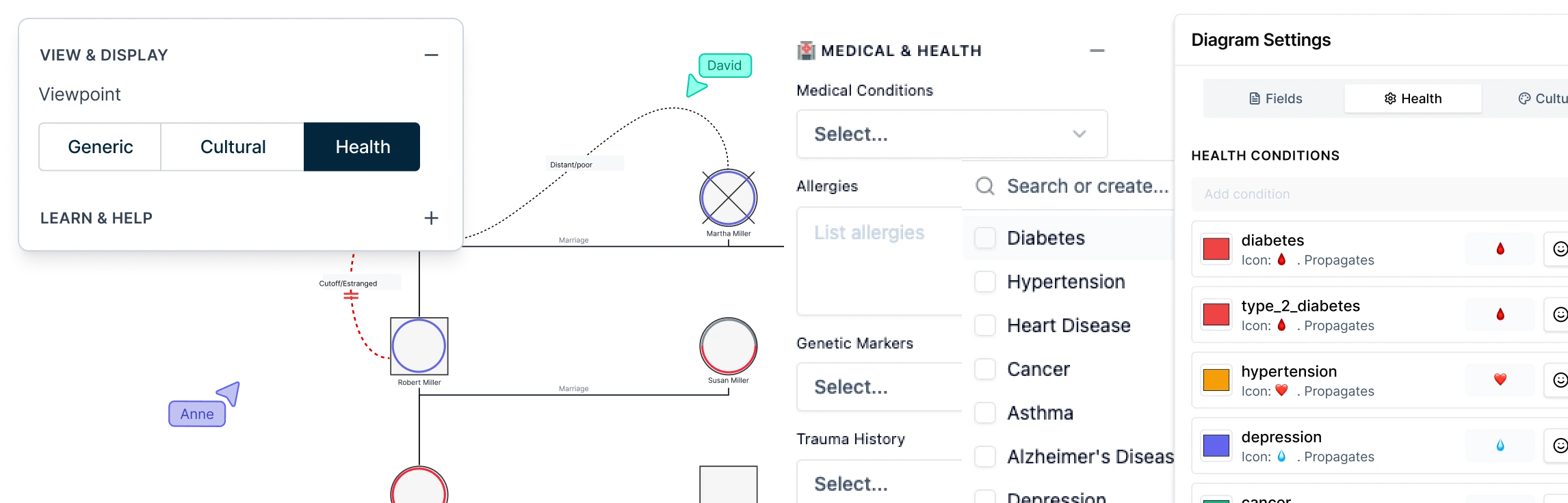
When you review family health history, the hardest part is not capturing conditions. It’s spotting inherited risk across generations quickly. Genogram Health View mode helps you see those patterns at a glance by color-coding conditions across the family. In this guide, you’ll learn how to add the right medical data for a genogram health assessment, turn on Health View, and use it to review hereditary patterns faster during genetic counseling and clinical preparation. Read More
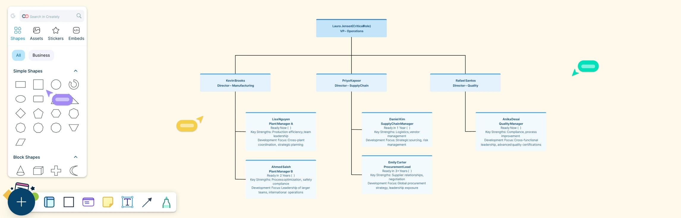
This guide walks you through replacement planning in a clear, practical way, so you’re never left guessing when key roles change. You’ll learn what replacement planning is, when to use it, and where it fits into a broader talent strategy. We’ll break down the pros and cons, show how succession planning helps close the gaps, and bring it all to life with real-world examples across business, operations, and academia. Read More
Growth and continuity shouldn’t feel like competing priorities. Employees want to know where they’re headed, and organizations need confidence that the right people are ready when change happens. That’s where career planning and succession planning come together. This guide breaks down how each works, how they differ, and most importantly, how aligning them creates clearer growth paths for employees and stronger, more resilient leadership pipelines for the business. Read More
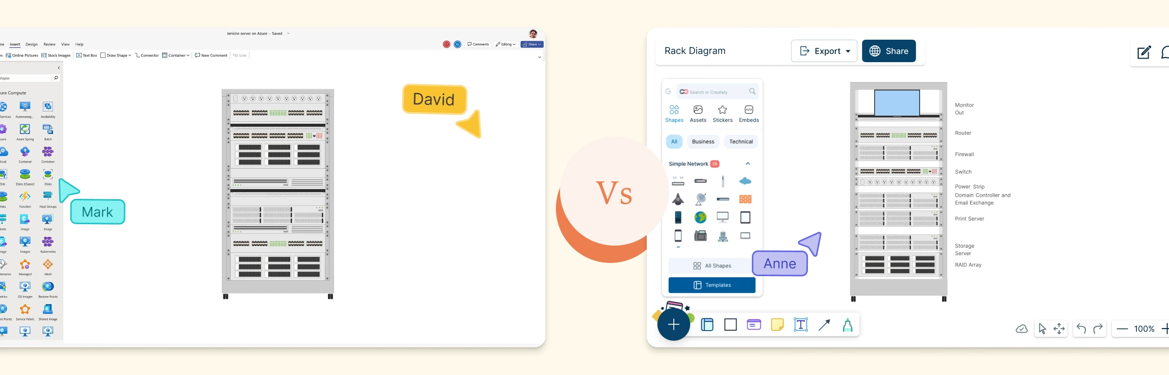
In this guide, you’ll learn what a rack diagram is, how to make a rack diagram in Visio, and the common limitations teams run into when using Visio for rack layouts. We’ll also explore a faster, more collaborative alternative and explore some ready-made rack diagram templates to get started. Read More
Leadership transitions often expose gaps that weren’t visible before like unclear ownership, outdated plans, or roles no one was ready to step into. This guide covers the core succession planning best practices that help organizations avoid those moments, along with common mistakes to watch for, how practices differ by role and organization size, and what to focus on as succession planning evolves over time. Read More
Leadership changes often catch organizations unprepared, creating uncertainty, disruption, and avoidable risk. A succession planning strategy addresses this challenge by ensuring the right people are ready to step into critical roles before transitions occur. This guide explains what a succession planning strategy is, the key elements that make it effective, and how to execute it in practice, with real-world examples across different organizational contexts to support long-term business continuity. Read More
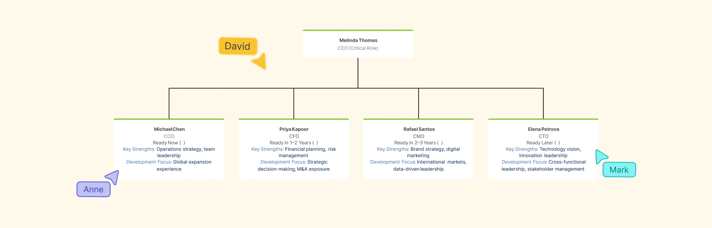
Leadership changes are inevitable, but being unprepared doesn’t have to be. This guide walks through what succession planning is, why it matters, who it benefits, and how it works in practice. You’ll learn the key stages of succession planning, see a simple real-world example, understand the advantages and common misconceptions, and explore how strategy, process, and tools come together to support confident leadership transitions. Read More
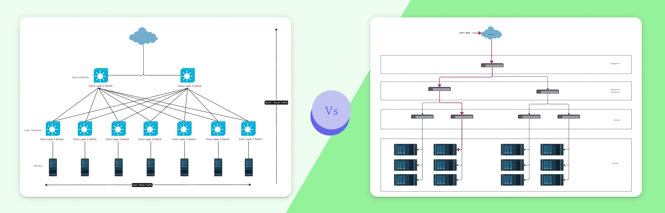
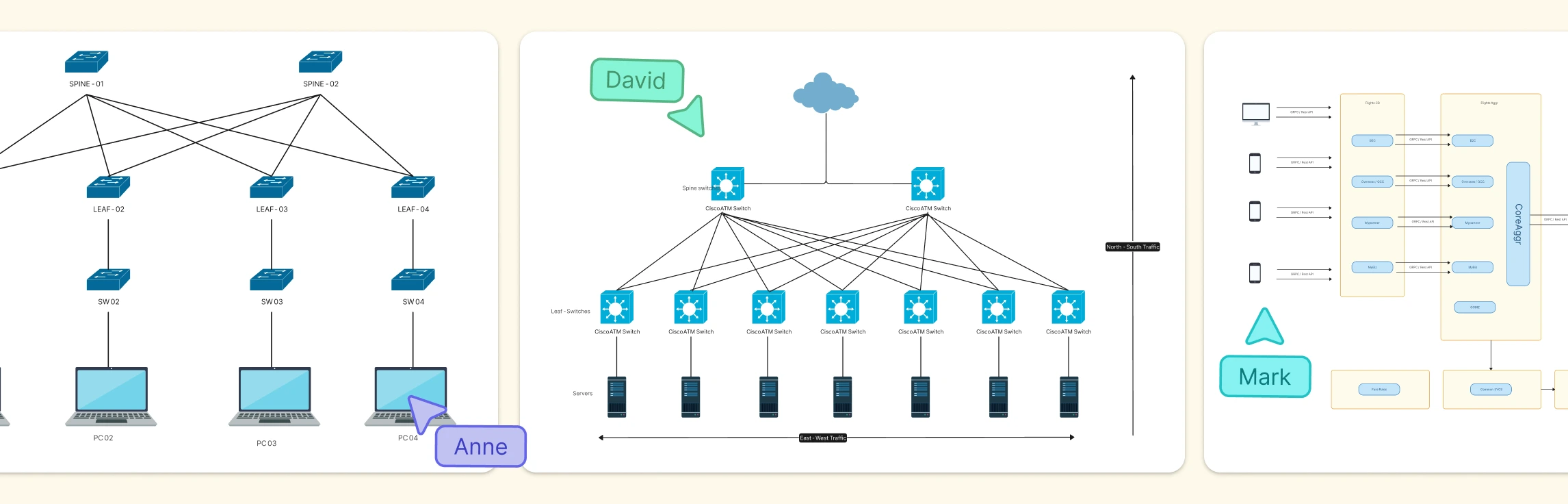
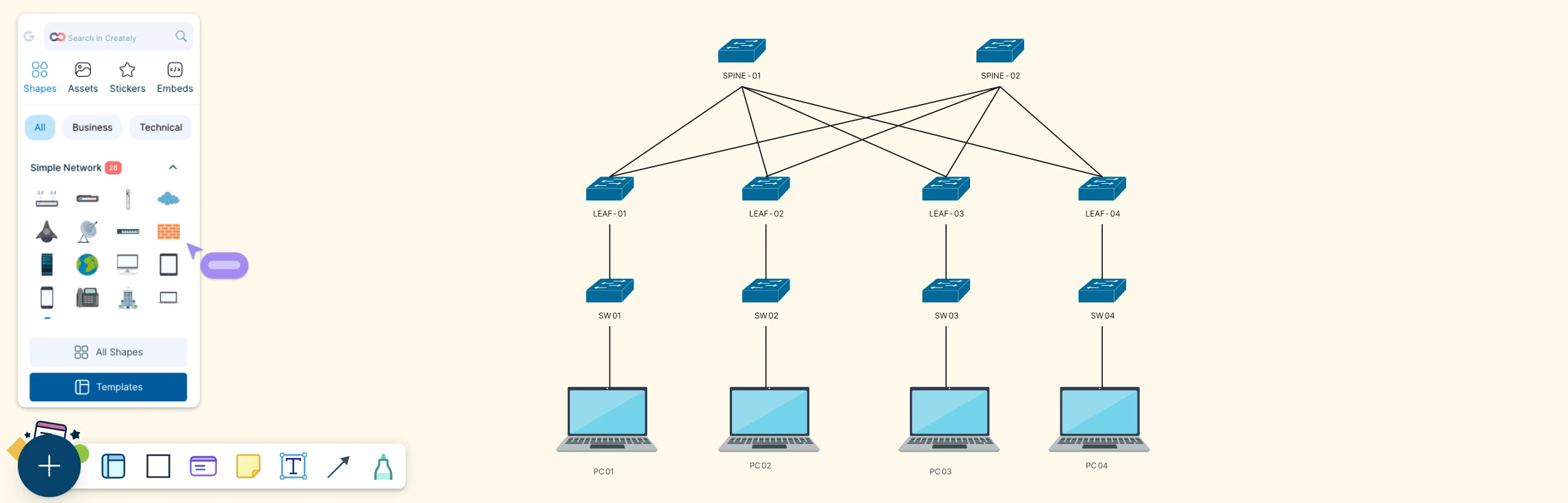
Modern applications don’t just send traffic in one direction. Requests move into systems from users, flow across internal services, and fan out across increasingly complex architectures. Understanding the difference between North–South and East–West traffic is essential for making sense of how modern networks actually behave. This guide breaks down both traffic patterns, shows how they differ in real-world environments like data centers and microservices, and explains why visualizing these flows matters for performance, security, and reliability today. Read More
Modern networks generate far more traffic inside their boundaries than at the edges, and that internal flow is where things often go wrong. This guide explains what East–West traffic is, where it shows up in data centers, microservices, Kubernetes, and cloud networks, and why visualizing it is critical for performance, security, and observability. You’ll see real-world examples, common challenges teams face, and how network diagrams can turn hidden internal traffic into something clear, shareable, and easier to manage. Read More
Choosing the right network topology can feel confusing, especially when terms like bus and star sound technical but affect how your entire network behaves. This guide breaks down how bus and star topologies work, what makes them different, where they overlap, and when each one makes sense. By the end, you’ll know exactly which topology fits your setup, and how to diagram it clearly using ready-made templates. Read More
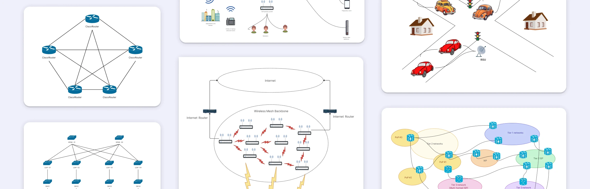
A mesh topology connects devices through multiple redundant paths instead of a single central link, making networks more reliable, fault-tolerant, and scalable. This guide covers real world mesh topology examples, from internet backbone routing and wireless mesh networks to home Wi-Fi systems, data center interconnections, emergency communication networks, and peer-to-peer architectures to help you understand how mesh designs work in practice and draw accurate network diagrams. Read More
A partial mesh network is a practical approach to building reliable networks without the overhead of fully connecting every device. This guide explores why partial mesh networks are used, where they appear in real-world architectures, and how they compare to full mesh topology designs, helping you understand and choose the right topology with confidence. Read More
This guide walks you through everything you need to know about peer-to-peer (P2P) network diagrams, from what they are and how they work, to the key elements that make them effective. You’ll explore the main P2P architectures, see real-world diagram examples like BitTorrent, WebRTC, and Gnutella, learn how to draw your own P2P network diagram step by step, and compare peer-to-peer layouts with traditional client–server networks. Read More
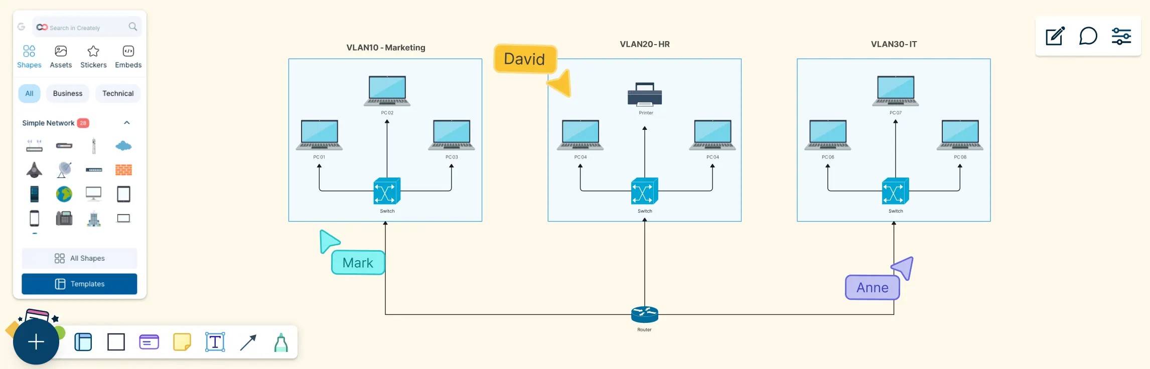
Modern networks can look simple on the surface, but behind the scenes, traffic needs to be carefully separated, secured, and managed. This guide helps you understand VLAN diagrams by breaking them down step by step, from what a VLAN diagram is, the key components you’ll see, why it’s used, real-world examples, and how to draw one yourself. Read More
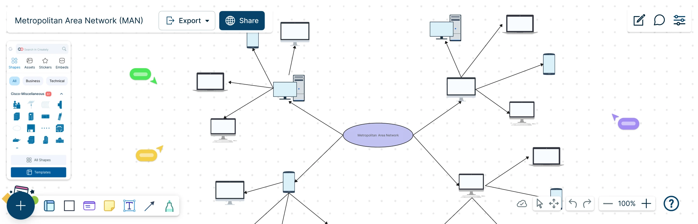
A Metropolitan Area Network (MAN) sits at the heart of modern, city-scale connectivity, linking offices, campuses, and critical services into one seamless network. But as networks grow beyond a single building, understanding how everything connects can quickly become complex. This guide explores what a MAN network diagram is, how it compares to LAN and WAN setups, when it makes sense to use one, and how to design it step by step. With practical examples and free templates, you can move from concept to clarity and confidently map networks that scale across an entire city. Read More
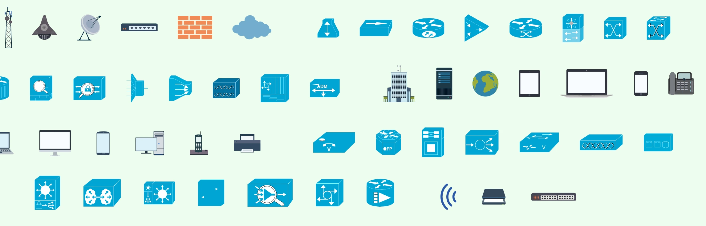
Network diagrams are visual representations of a computer network that show how devices, systems, and connections are structured and how data flows between them. These diagrams are only as clear as the symbols used to draw them. This guide simplifies networking symbols by explaining what they are, why they matter, and how to use standard symbols correctly. You’ll learn about common network diagram symbols, best practices for labeling and annotation, and how these visual elements help create diagrams that are easy to read, share, and maintain over time. Read More
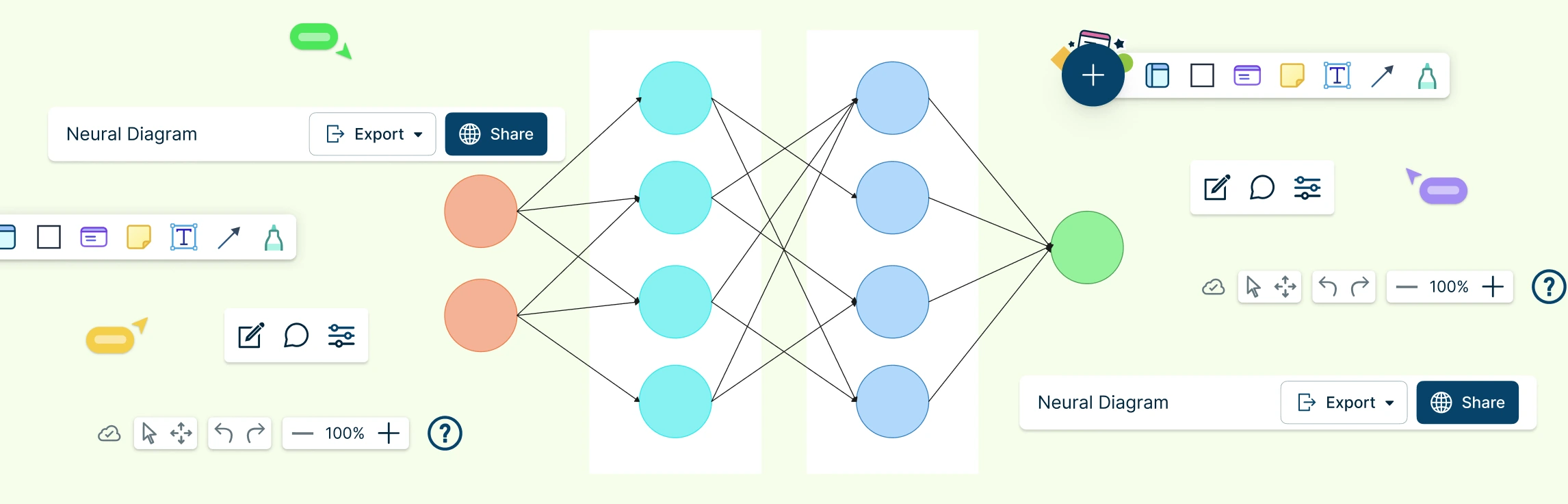
Neural networks power many of the intelligent systems we use every day, but what happens inside these models can feel abstract and hard to visualize. A neural network diagram brings clarity by turning complex learning processes into a simple, visual structure you can actually understand. In this guide, you’ll explore what neural networking diagrams are, how neural networks are used, their key components, common examples, and how to create one yourself. Read More
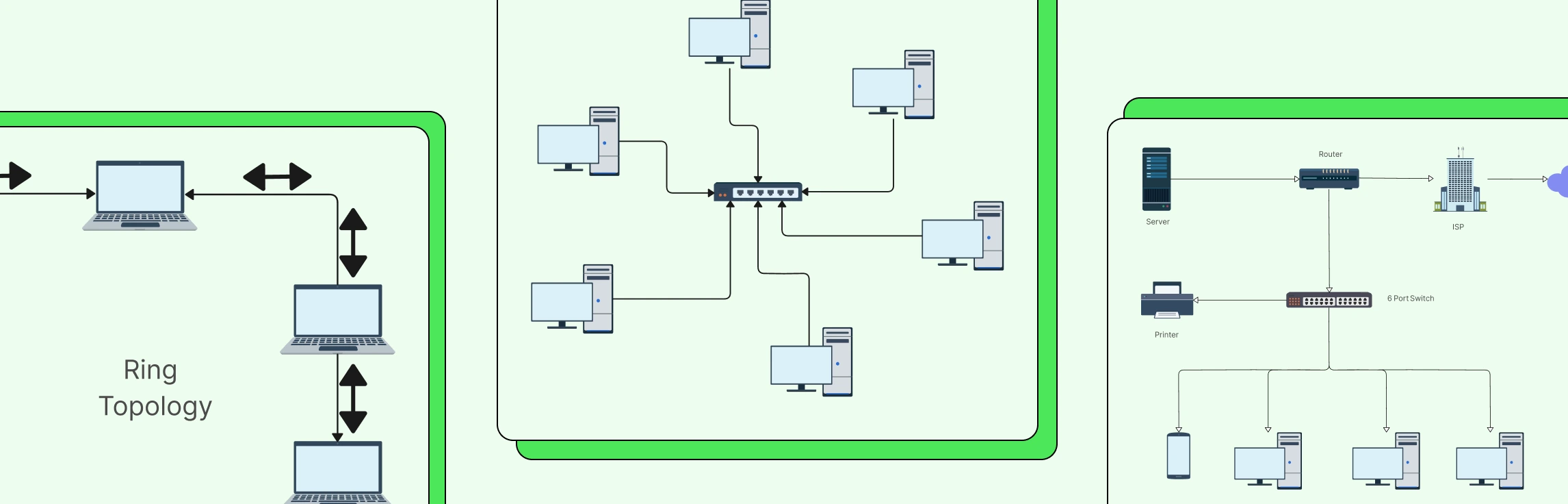
Designing a network can quickly feel complex when you’re trying to balance performance, cost, and scalability at the same time. Understanding network topology simplifies that process by showing you how different network structures work and why they matter. In this guide, you’ll explore the 7 types of network topology, see where each one fits in real-world scenarios, and learn how to choose the right option with confidence. Read More
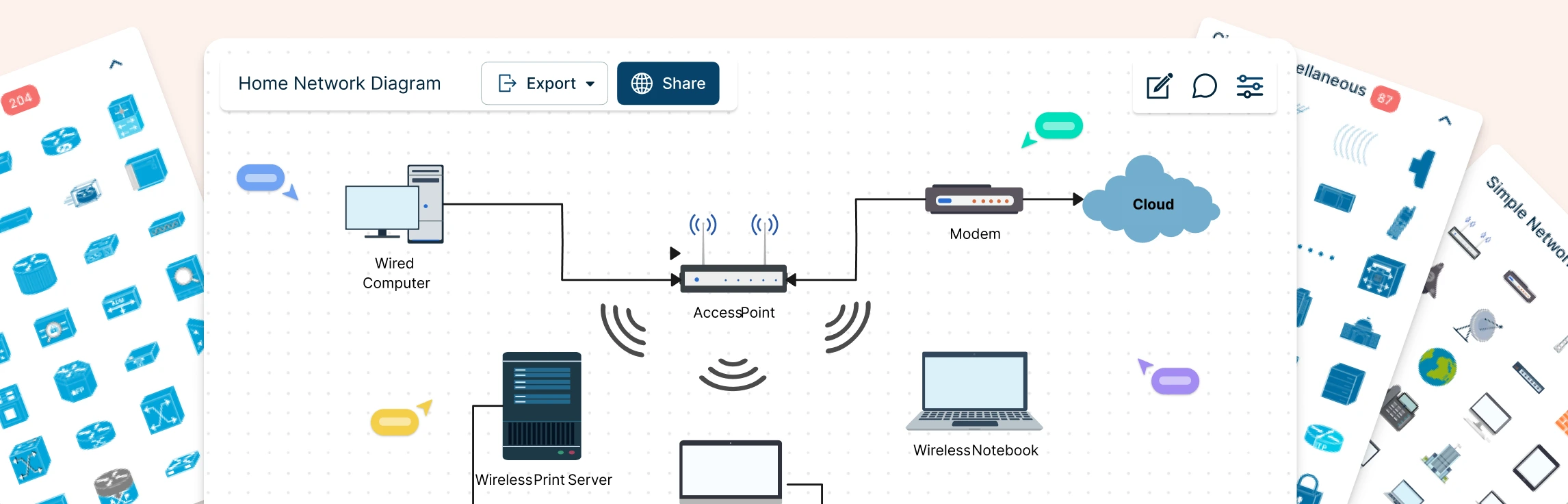
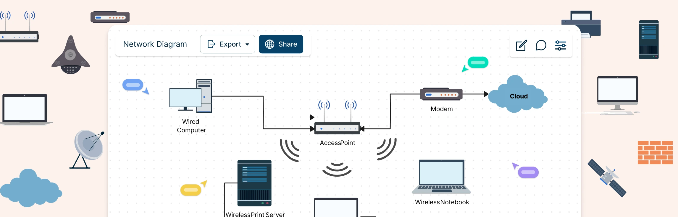
Planning a home network often starts with guesswork—what’s connected, what’s slowing things down, and where everything actually sits. A home network diagram removes that uncertainty by giving you a clear, visual view of how your devices connect and communicate. In this guide, you’ll learn how to create a home network setup diagram step by step, understand common layouts, follow practical best practices, and use free templates to map your setup. Read More
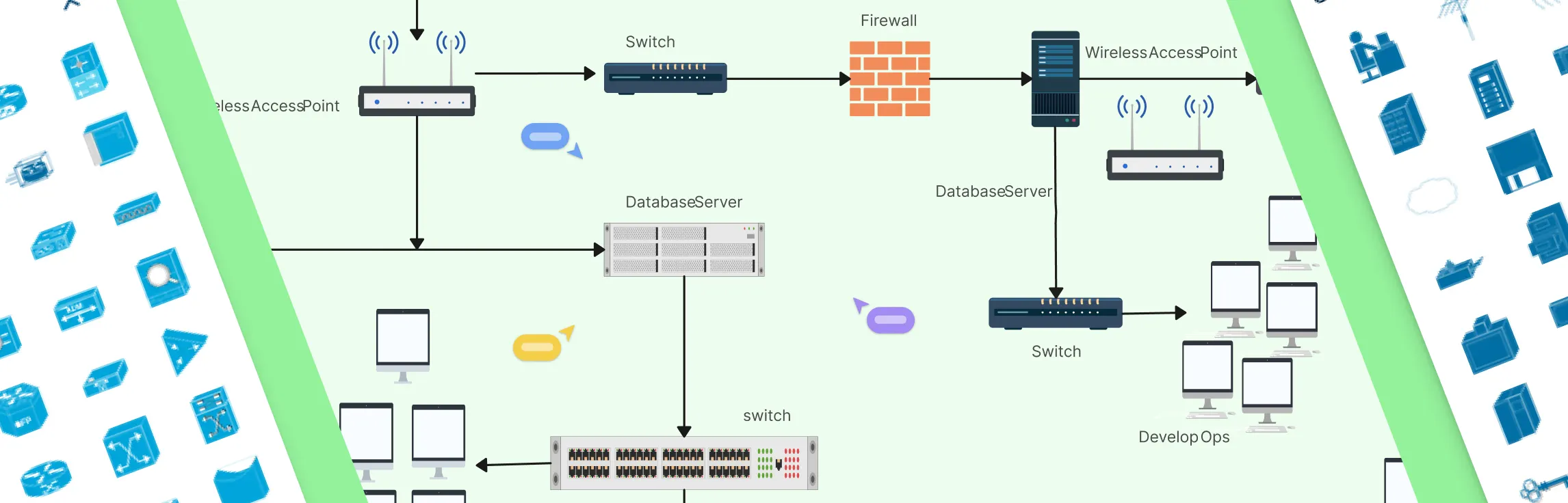
Modern networks can quickly become complex, devices multiply, connections overlap, and one small change can impact the entire system. Whether you’re setting up a network, managing infrastructure, or trying to explain how everything fits together, having a clear visual makes all the difference. This guide walks you through what network diagrams are, how they’re used, the different types you’ll encounter, and common network topologies. Read More
Designing a wide area network can quickly feel overwhelming when you’re trying to connect multiple locations, keep traffic secure, and avoid downtime at the same time. A clear WAN diagram cuts through that complexity by showing how everything fits together before problems appear. In this guide, you’ll learn how to create a wide area network diagram step by step, understand key components and WAN examples, follow proven best practices, and get started faster using free network diagram templates. Read More
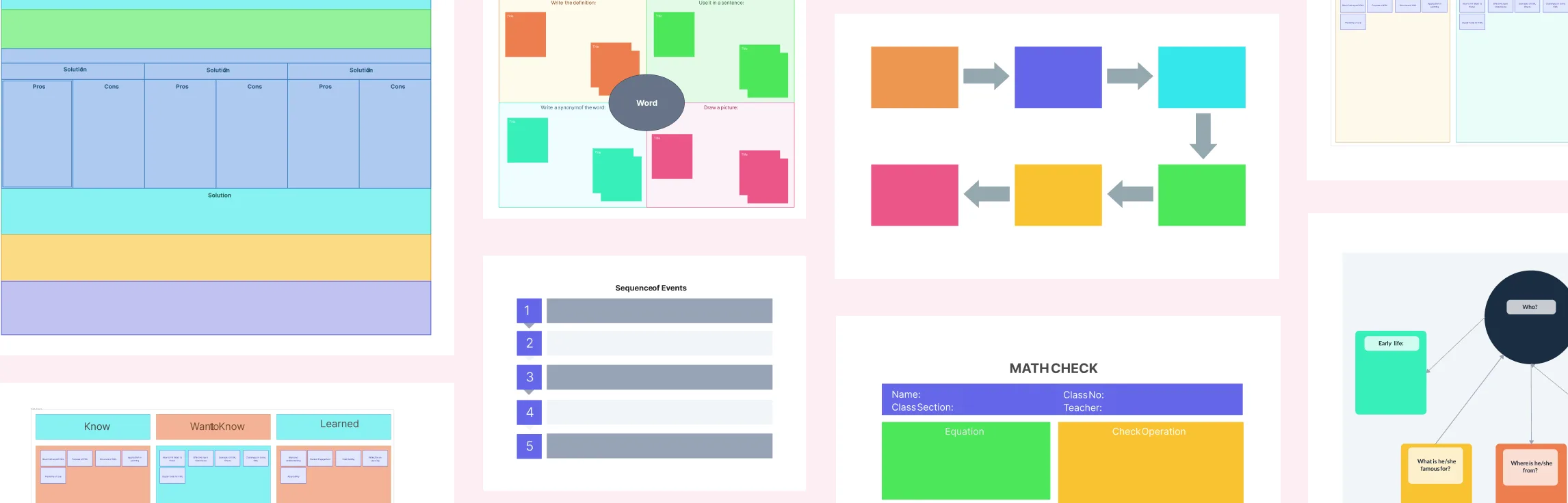
Writing doesn’t usually fail because you lack ideas, it stalls because those ideas feel scattered and hard to organize. Graphic organizers for writing help bridge that gap by giving your thoughts a clear visual structure you can build on. Whether you’re brainstorming an essay, summarizing a dense article, or planning a research paper, graphic organizers make it easier to see connections, shape your arguments, and move forward with confidence instead of staring at a blank page. Read More
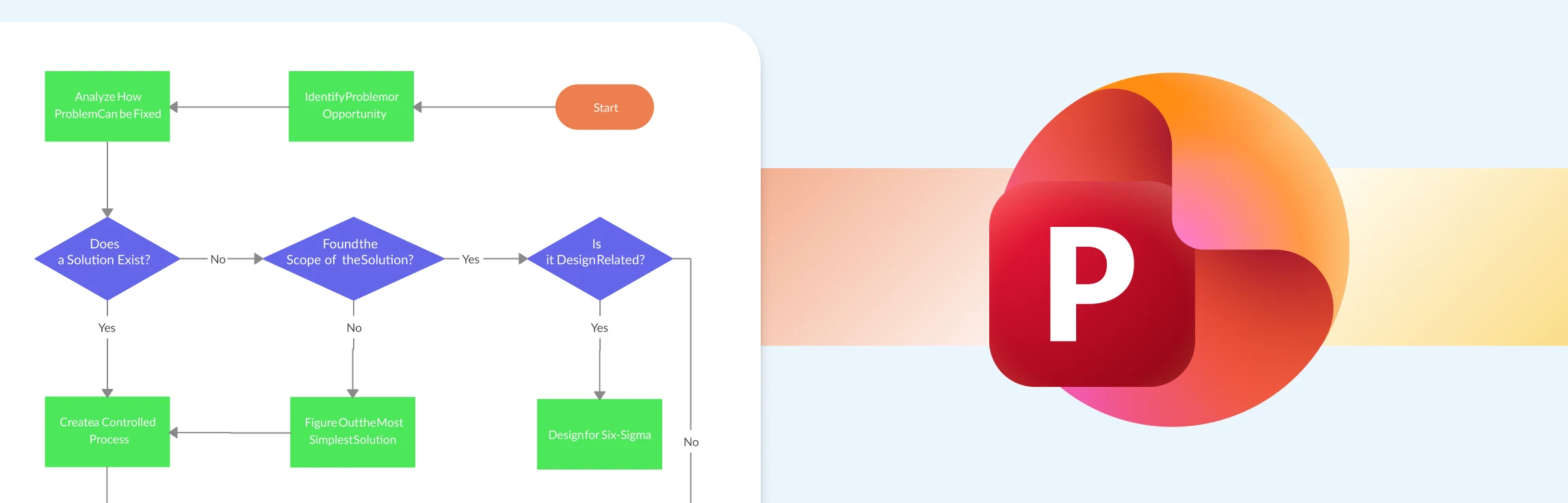
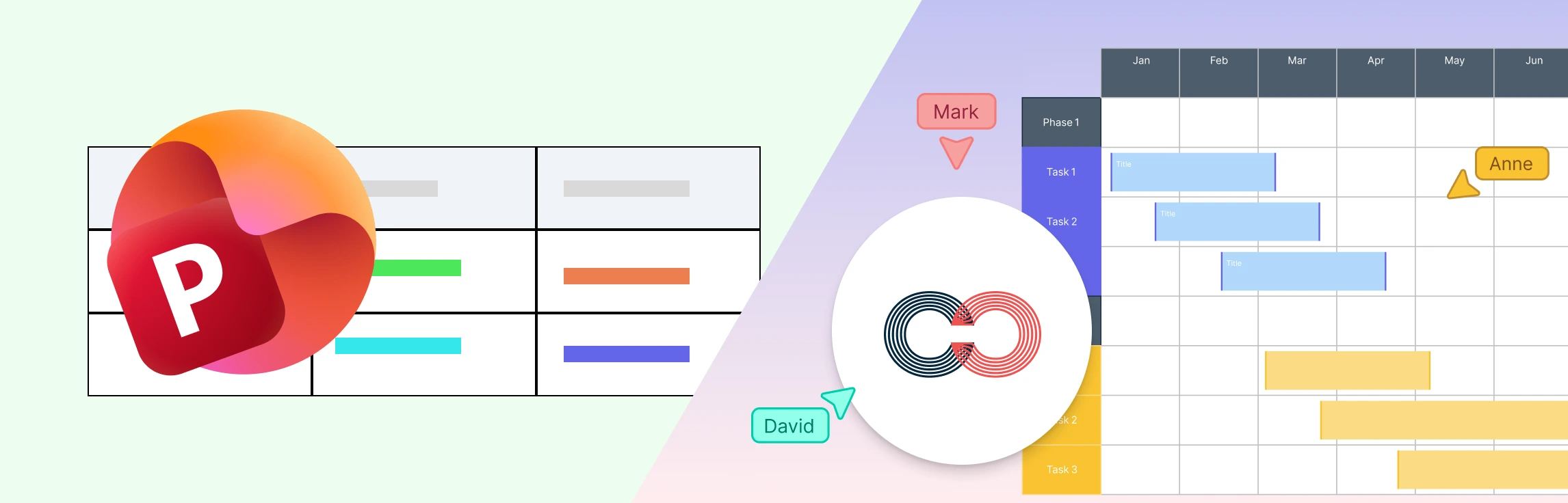
This guide walks you through exactly how to create a process map in PowerPoint, step by step, without overcomplicating things. It also covers the common limitations you’ll run into as your process grows, and introduces a more flexible alternative for building and sharing process maps faster. Along the way, you’ll find free templates to help you get started with less setup and more clarity. Read More
Creating a clear, professional SWOT analysis in PowerPoint can feel simple at first, until layouts start shifting, text boxes misalign, and your slide becomes hard to read. This guide walks you through everything you need to know, from building a SWOT diagram step by step to understanding the common challenges that come with PowerPoint’s manual formatting. After you’ve mastered how to present a SWOT analysis in PowerPoint, we’ll explore a better alternative and free templates that make the process faster, cleaner, and more presentation-ready. Read More
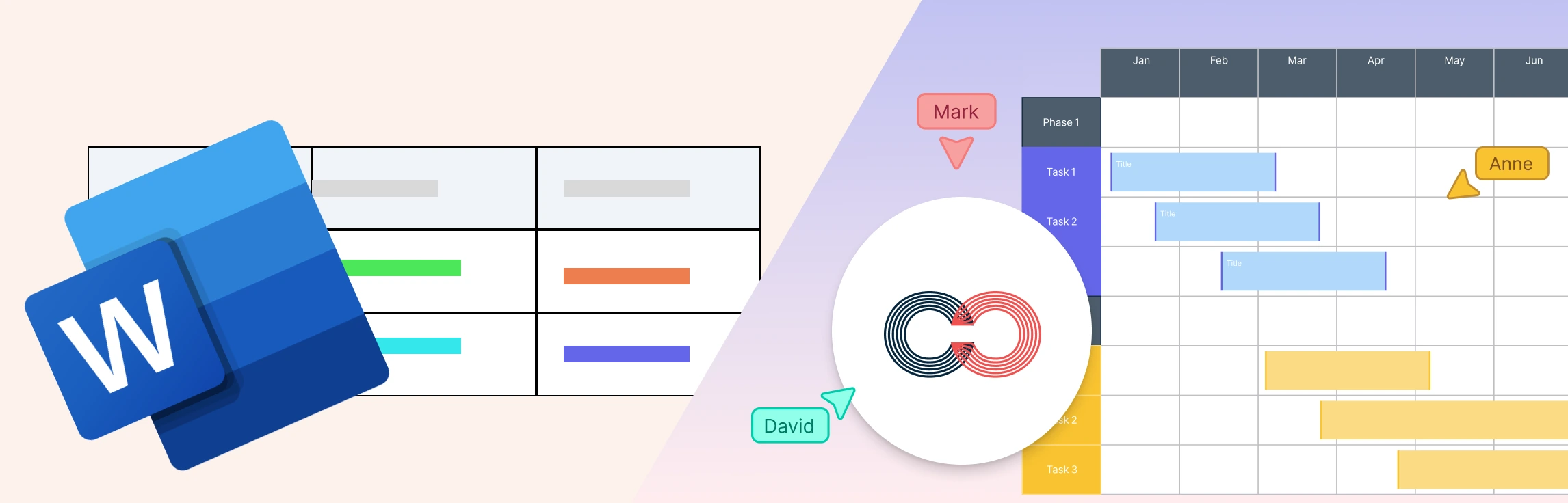
If you’ve ever tried creating a SWOT analysis in Word, you’ve probably felt the friction from tables that won’t align, to layouts that break as you edit, and versions that quickly get out of sync. In this guide, you’ll learn detailed steps of how to create a SWOT analysis in Word, and where Word starts to fall short for strategic work. We’ll also explore better alternatives when you need more flexibility and collaboration, along with free SWOT templates to help you move faster and plan with confidence. Read More
If you’ve ever tried value stream mapping and felt overwhelmed by unfamiliar icons, cluttered diagrams, or symbols that weren’t clearly explained, you’re not alone. This guide breaks it all down, starting with what value stream mapping is, followed by a clear explanation of value stream mapping symbols and meanings. You’ll see what each value stream icon represents, when to use it, and how it fits into the bigger picture, along with practical tips to avoid overcomplicating your map and turning insights into action. Read More
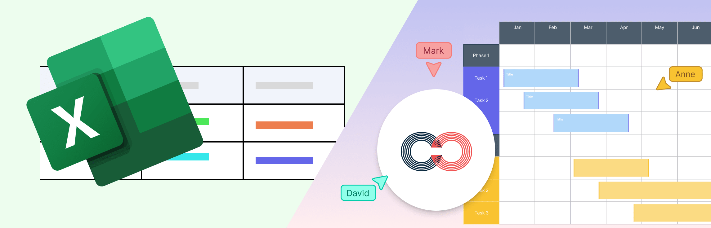
This guide walks you through how to create a mind map in Excel in a simple, friendly way so you can turn scattered thoughts into a clear visual plan. You’ll learn what a mind map is, the exact steps to build one using Excel’s tools, where the method starts to feel limiting, and the smarter alternatives available. By the end, you’ll know exactly how to structure your ideas quickly and confidently. Read More
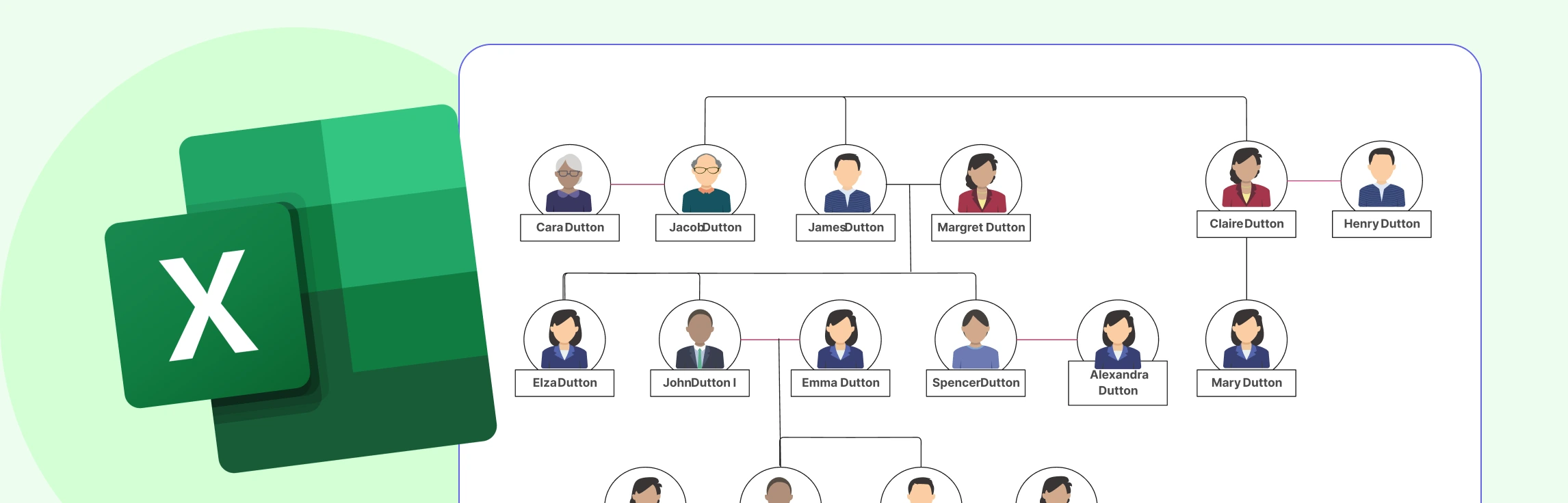
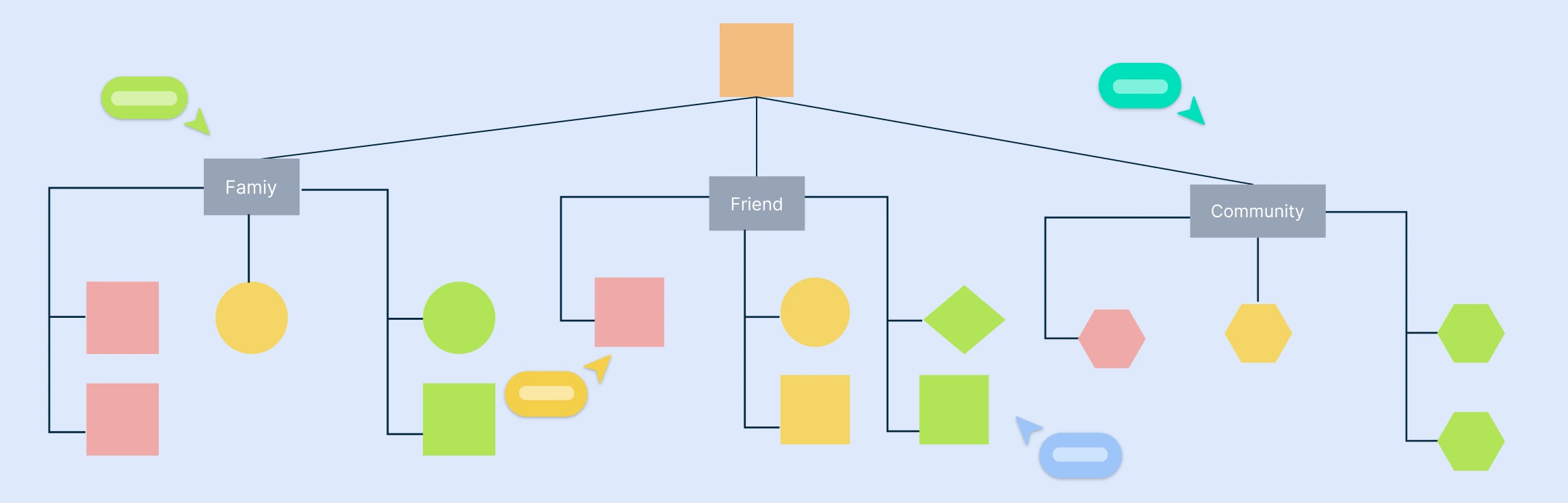
Whether you’re mapping out your ancestry for a school project, organizing family history for elders, or simply curious about how everyone is connected, you’ll need to understand how to build a basic family tree. In this guide, you’ll learn how to do a family tree in Excel using SmartArt or simple shapes, where Excel may fall short as your tree expands, and an easier alternative you can try instead. You’ll also get free templates so you can jump in without starting from scratch. Read More
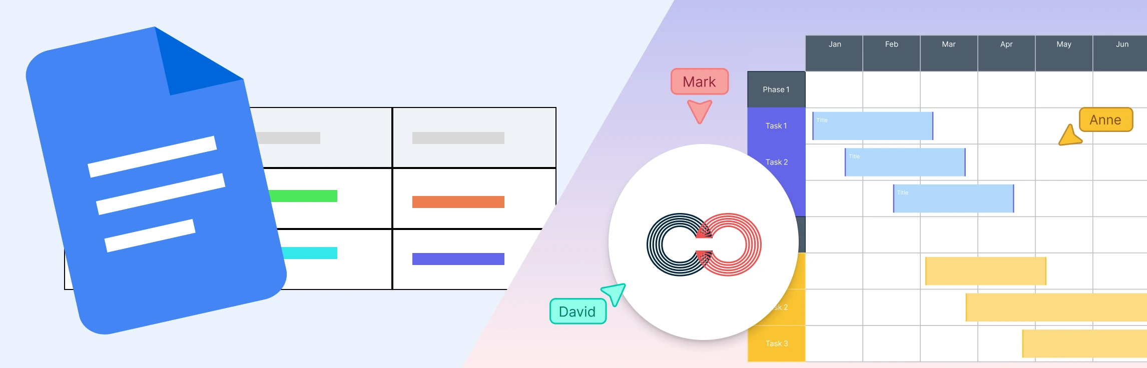
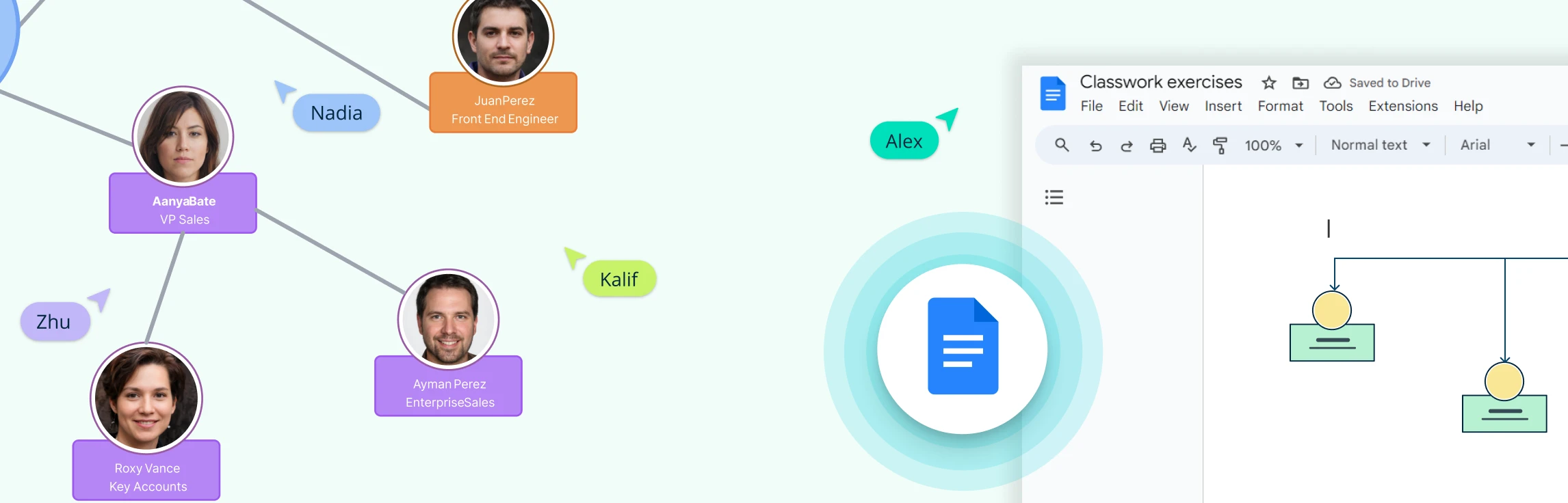
If you’re trying to figure out how to make a family tree in Google Docs, you’re likely looking for a simple way to map out family relationships using tools you already have. Google Docs can create basic diagrams, but it does require some manual work to structure generations and keep everything aligned. This guide walks you through the steps, explains the limitations you may run into as your tree expands, and offers alternative options and free templates if you need something more flexible. Read More
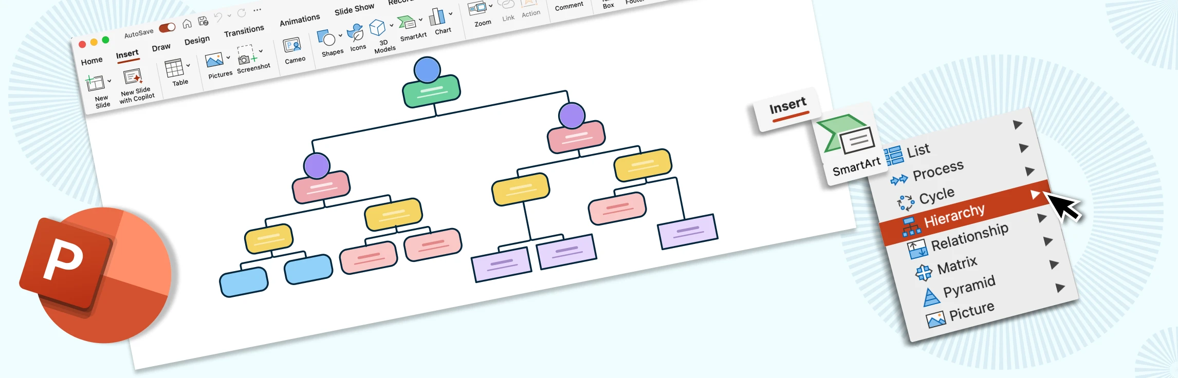
If you’re exploring how to make a family tree in PowerPoint, you’re likely looking for a straightforward way to map out your family history using software you already have access to. PowerPoint can create simple, structured diagrams, but it does require manual setup and adjustments as your tree grows. In this guide, you’ll learn the step-by-step process, understand the limitations you may run into, discover an alternative option and free templates that can help you build a clear, organized family tree with less effort. Read More
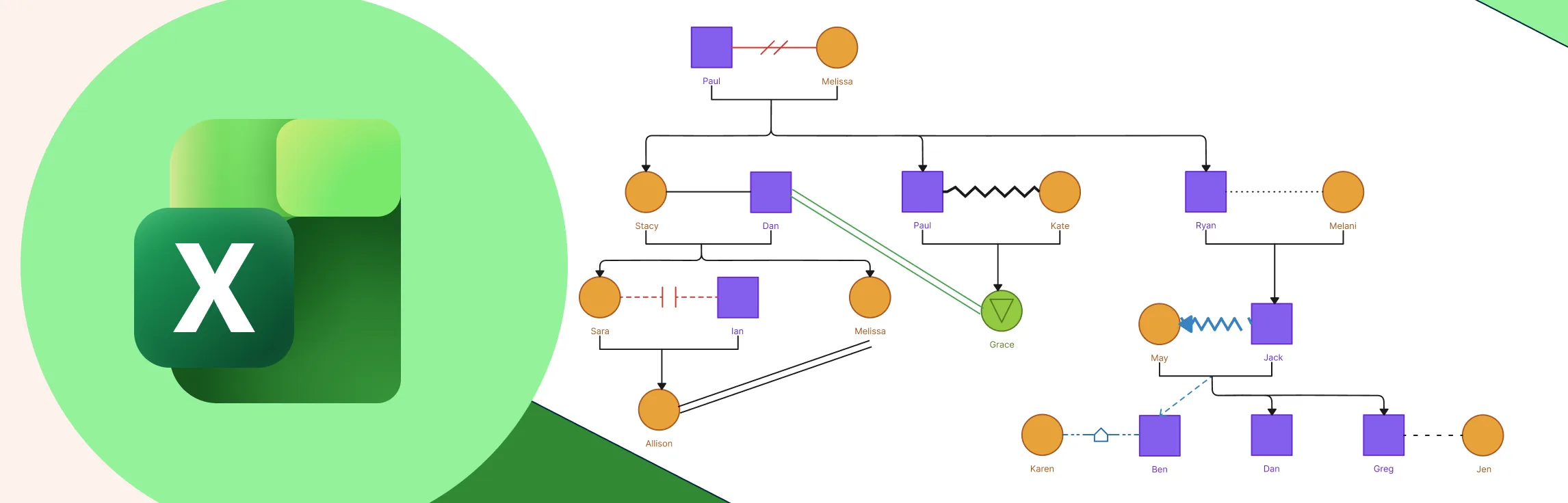
Working with shapes, connectors, and layouts inside a spreadsheet can take extra time and care, especially as your genogram becomes more detailed. This guide walks you through the essentials of how to make a genogram in Excel so you can do it confidently, while also helping you understand when a more specialized diagramming tool might offer a smoother, more efficient experience. Read More
This guide shows you how to draw a mind map in PowerPoint in a clear, approachable way, helping you turn scattered ideas into a structured visual. You’ll get a quick overview of what a mind map is, learn the step-by-step process to build one using PowerPoint, understand where the tool starts to feel challenging, and explore an easier alternative. By the end, you’ll feel confident organizing your ideas into a mind map that’s clean, clear, and presentation-ready. Read More
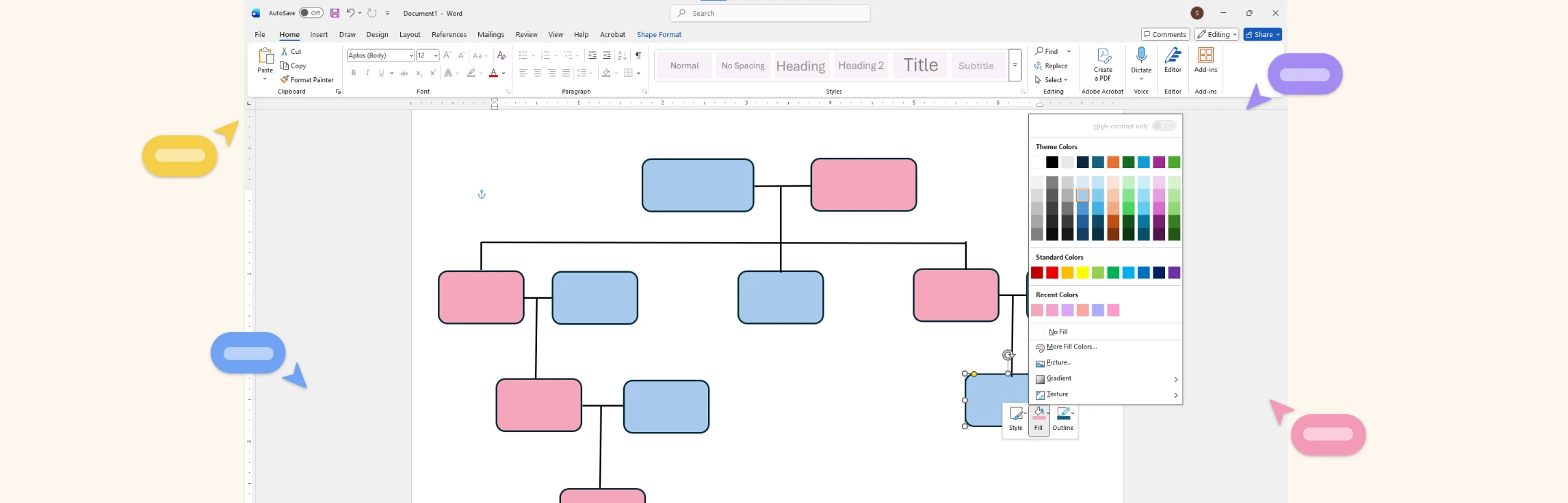
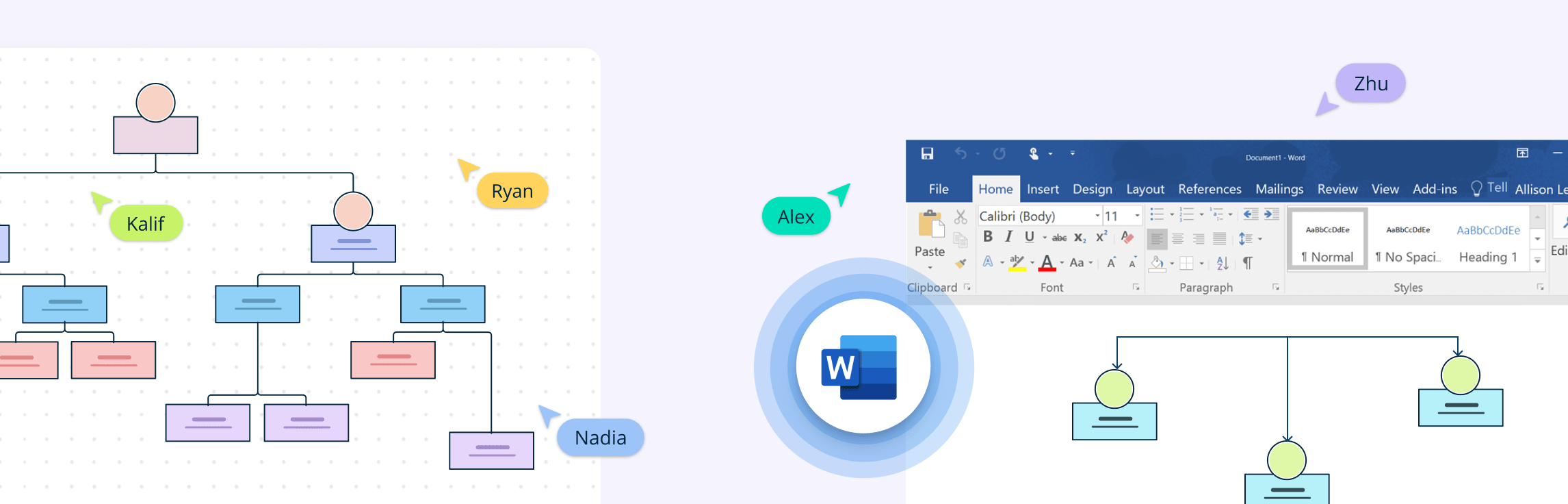
If you’re trying to figure out how to draw a family tree on Word, this guide will walk you through it in a simple, beginner-friendly way. You’ll first learn the steps of how to build a family tree in Word, then understand what Word can and can’t do, and finally, discover a much easier alternative for creating clearer, more flexible family trees. We’ll also compare this alternative with Microsoft Word and share ready-to-use templates so you can start building your family tree right away. Read More
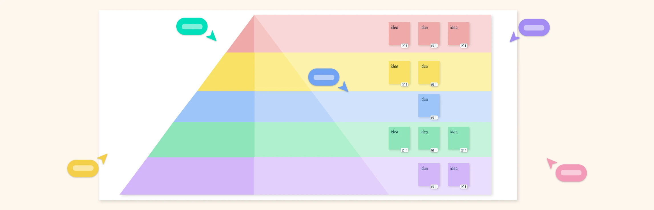
Understanding how people grow, stay motivated, and make decisions becomes much easier when you can see it clearly. This guide walks you through Maslow’s Hierarchy of Needs in a simple way—breaking down each core level and helping you turn it into a clean, visual diagram. You’ll learn the basics, follow a step-by-step process to map the hierarchy, and pick up practical tips to make your diagram clear, useful, and easy for anyone to understand. By the end, you’ll be able to apply this framework to your own field or scenario and create a diagram that fits your specific goals or context. Read More
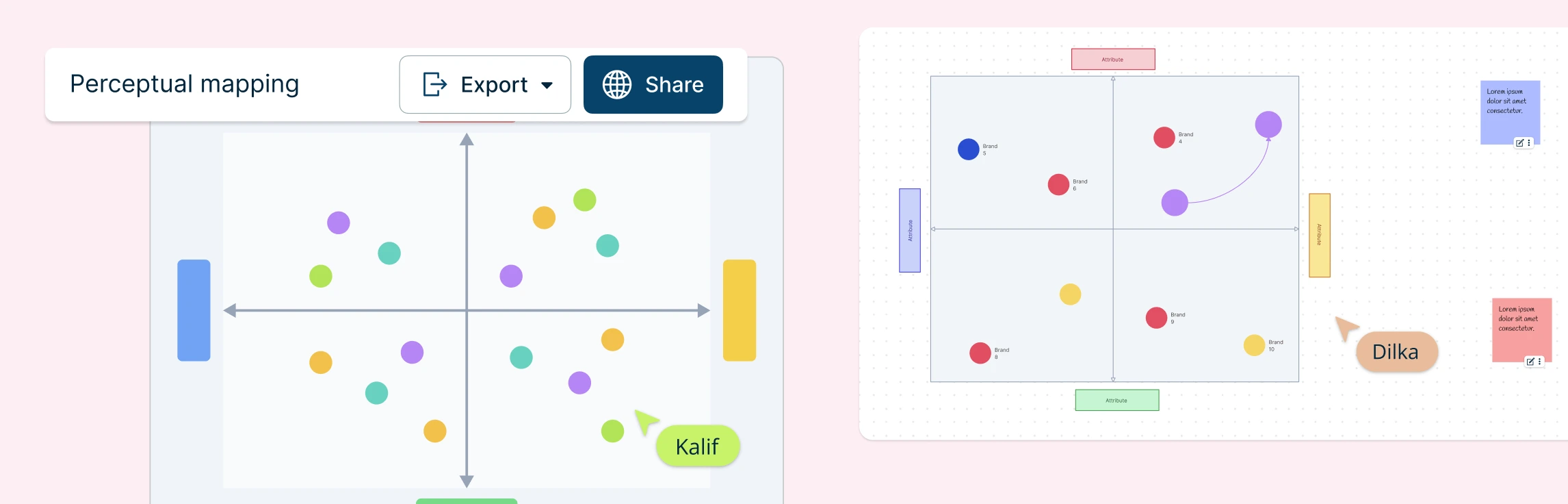
Perceptual mapping helps you see your brand the way customers do, along with who you’re competing with, where you shine, and where gaps or opportunities might be hiding. In this guide, you’ll learn how to draw a perceptual map step-by-step using Creately’s free templates, along with practical tips to make sure your map reflects real customer perceptions. Read More
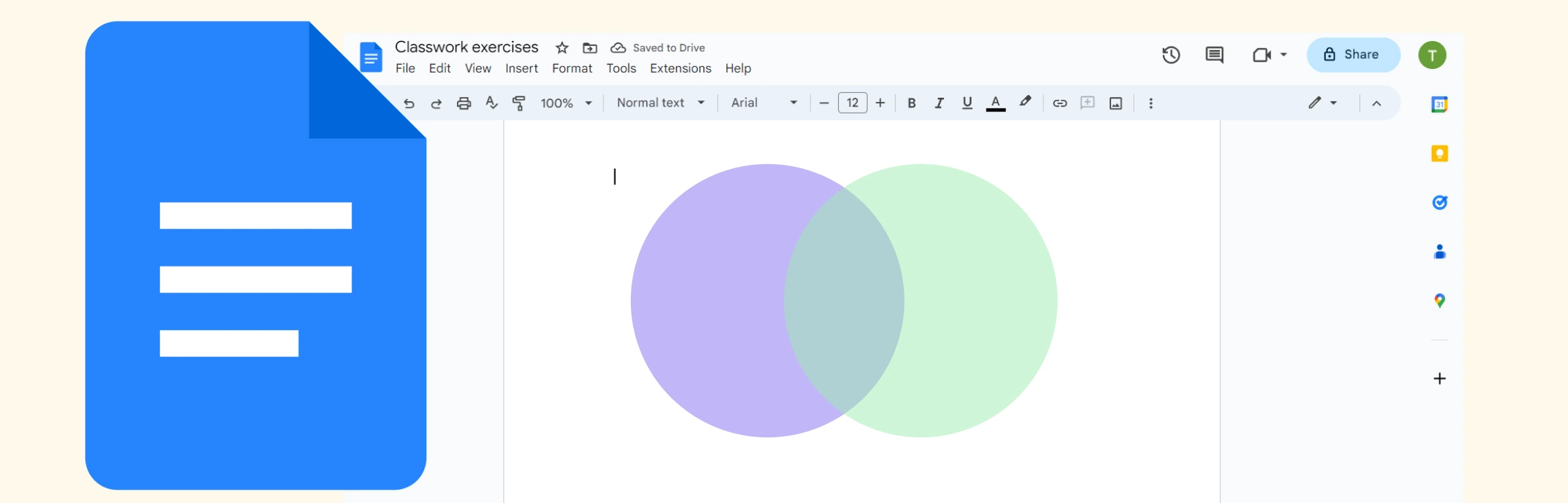
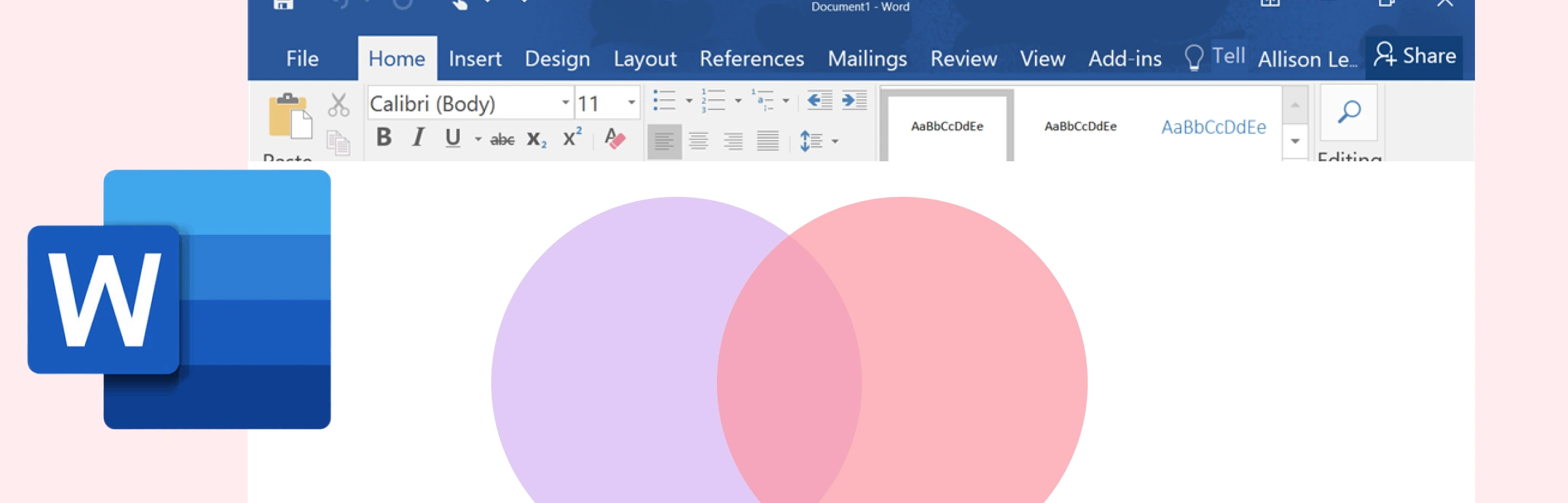
If you’re wondering how to create a Venn diagram in Excel, then you’ve come to the right place. We explore what Venn diagrams are, how to make a Venn diagram in Excel, and understand the challenges of using Excel for this. This guide also covers an easier to use and better alternative which comes with plenty of ready-made templates for making Venn diagrams. Read More
If you want to know how to do a Venn diagram in Google Docs, then this guide is for you. Discover what Venn diagrams are, how to create one in Google Docs, and understand the limitations of Google Docs for making them. We also dive into a better alternative, and compare the two methods. Read More
This guide walks you through the steps for how to create a process map in Excel, highlights the challenges you may encounter on the platform, and introduces a more efficient alternative for teams that need faster, clearer, and more scalable process mapping. Read More
If you want to learn how to do a process map in Word, then this is the guide for you. We cover step-by-step instructions, an understanding of the limitations of Microsoft Word, an alternative for making process maps, and a features comparison to help you choose the best option. Read More
If you’ve been wondering how to draw a Venn diagram in Word, then this guide is for you. Keep reading to discover what a Venn diagram is, step-by-step instructions on how to add a Venn diagram in Word, and understand its limitations. This also covers a better alternative and a comparison between the two methods. Read More
If you want to learn how to make a flowchart in Excel, then this guide is for you. Learn how to build a flowchart in Excel, make it interactive, explore its limitations, and discover a better alternative and free templates to get started today. Read More
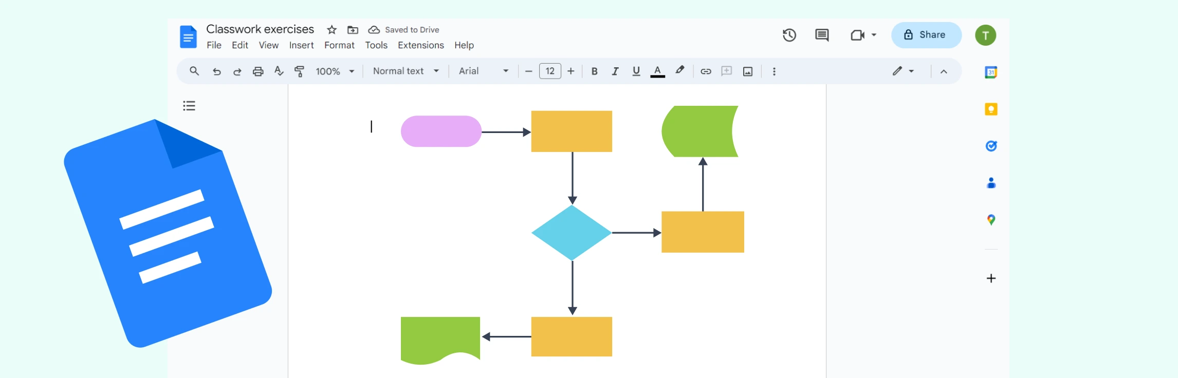
If you’ve been wondering “how do I make a flowchart in Google Docs”, then this is the guide for you. This tutorial covers how to build a flowchart in Google Docs in just six simple steps, go through the limitations, explore a better alternative, and compare its features to Google Docs. Read More
What is a Hierarchical Structure? The hierarchical organizational structure is a traditional model in which authority, responsibility, and communication flow through clearly defined levels, from top management down to individual contributors. Each employee reports to a single supervisor, creating a pyramid-shaped chain of command that supports control and accountability. This structure is one of the most widely used frameworks for organizing teams and business operations. Read More
What is a Timeline in Microsoft Excel? A timeline in Microsoft Excel is a visual way to display events, tasks, or data in chronological order, helping track progress or analyze patterns over time. You can create one using several methods depending on your needs. Read More
If you’re wondering ‘how to do a timeline in PowerPoint’, then this guide is for you. Keep reading to discover how to insert a timeline in PowerPoint with step-by-step instructions, understand its limitations and why Creately is the best alternative. Read More
What is a Timeline in Microsoft Word? A timeline in Microsoft Word is a visual graphic created using the SmartArt feature to display events or milestones in chronological order. It helps illustrate project phases, progress, or historical sequences directly within a Word document. By selecting a timeline layout under Process SmartArt, you can design horizontal or vertical timelines and customize them with dates, descriptions, and colors for professional-looking visuals. While this method works well for simple timelines, it quickly becomes limiting when managing multiple events, maintaining alignment, or collaborating with others. Read More
If you were wondering ‘how do you make a timeline on Google Docs’, then this is the guide for you. Keep reading to learn how to make a timeline chart in Google Docs with step-by-step instructions, understand its limitations and why Creately is a better alternative. Read More
Understanding how a system behaves requires looking at both its process flow and its state changes, and that’s where Activity and State Diagrams come in. This guide explores the Difference Between Activity Diagram and State Diagram in UML, explaining how each visualizes system behavior from a different perspective. You’ll learn how each diagram works with real-world examples, and how to choose the right one for your modeling needs. Read More
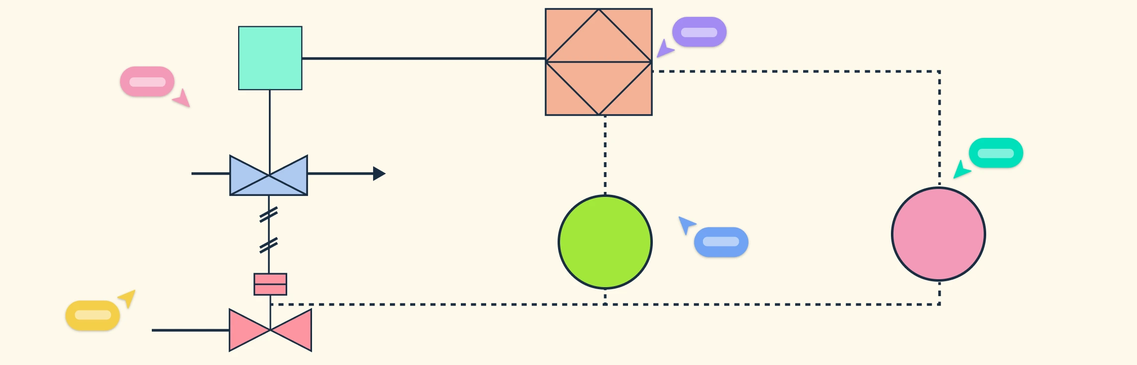
In this guide, we’ll explain why it’s important to understand piping and instrumentation diagrams, break down how to interpret lines, labels, and tags, and walk you through a step-by-step method for how to read piping and instrumentation diagrams. This also covers common notations, abbreviations, and best practices to help you confidently analyze and work with these critical technical documents. Read More
Understanding Piping and Instrumentation Diagram (P&ID) symbols is essential for anyone involved in process design, engineering, or plant operations. These standardized symbols form the visual language of process systems, allowing engineers to design, communicate, and maintain complex industrial setups accurately. In this guide, we’ll break down the different types of P and ID symbols, the international standards that define them, and the best practices to follow when creating or reading P&ID diagrams. Read More
Understanding what is a Piping and Instrumentation Diagram (P&IDs), is essential for anyone involved in process design, engineering, or plant operations. These diagrams serve as the foundation for building, analyzing, and maintaining complex systems safely and efficiently. In this guide, we’ll explore what is P and ID, their purpose, key components and real-world engineering applications. Read More
In this guide, we’ll explain what a block flow diagram is, its purpose in process design, the key components that make it effective, and how to create one. You’ll also learn how it compares to more detailed diagrams like process flow diagrams, along with its benefits, limitations, and practical uses in engineering workflows. Read More
Understanding how different parts of a system interact is essential for modeling complex behaviors in software design. In this guide, we’ll cover what an Interaction Overview Diagram is, its key notations, and a step-by-step process on how to draw one. You’ll also explore the benefits of using these diagrams and learn when to use them effectively in system modeling. Read More
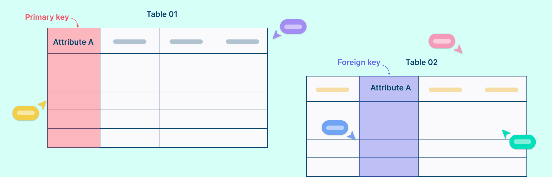
In relational databases, primary keys and foreign keys play crucial roles in maintaining data integrity and establishing relationships between tables. Understanding the fundamental differences between these keys is essential for designing well-organized databases. In this guide, we’ll compare primary key vs. foreign key, suggest tips for using both and help you understand how together, they can transform a good database into a great one. Read More
Understanding the difference between UML vs. ERD is essential for anyone involved in software or database design. While both are visual modeling tools, they serve distinct purposes. In this guide, we’ll explore what UML and ER diagrams are, their key differences, use cases, and comparison through examples to help you decide which diagram to use for your next project. Read More
What Are Actors in Use Case Diagrams? Actors in a use case diagram represent the roles that interact with a system. They can be individuals, external systems, or organizations that exchange information or perform actions with the system being modeled. Their main purpose is to define who uses the system and what they expect it to do, helping clearly establish boundaries between the system and its environment. Read More
What is a UML Collaboration Diagram Understanding how different parts of a system interact is key to effective software design, and UML Collaboration Diagrams provide a clear way to visualize those interactions. This guide explains what collaboration diagrams are, their key components, and notations. You’ll also learn how to create one step by step, and discover best practices to make your diagrams clear and useful. Read More
What Are Class Diagram Symbols? UML Class Diagram symbols are the standardized notations used to represent the structure and relationships of classes in object-oriented systems. These symbols visually communicate how classes, attributes, methods, and relationships interact within a software design. They serve as a universal language for developers, analysts, and designers, helping teams model systems clearly without ambiguity. Read More
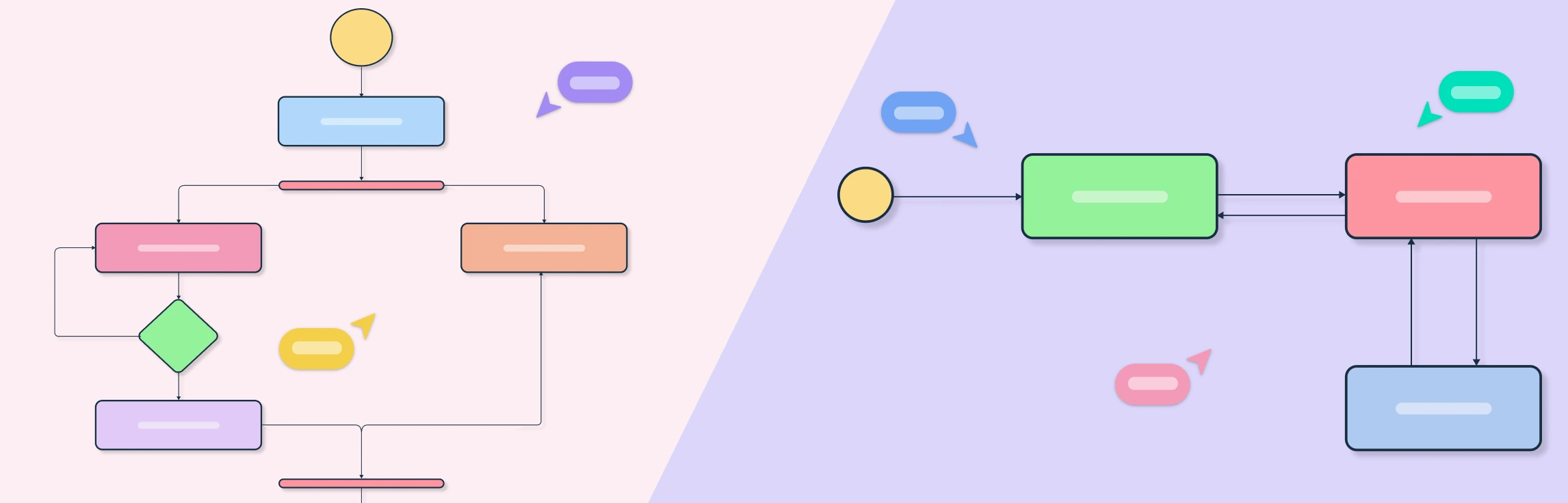
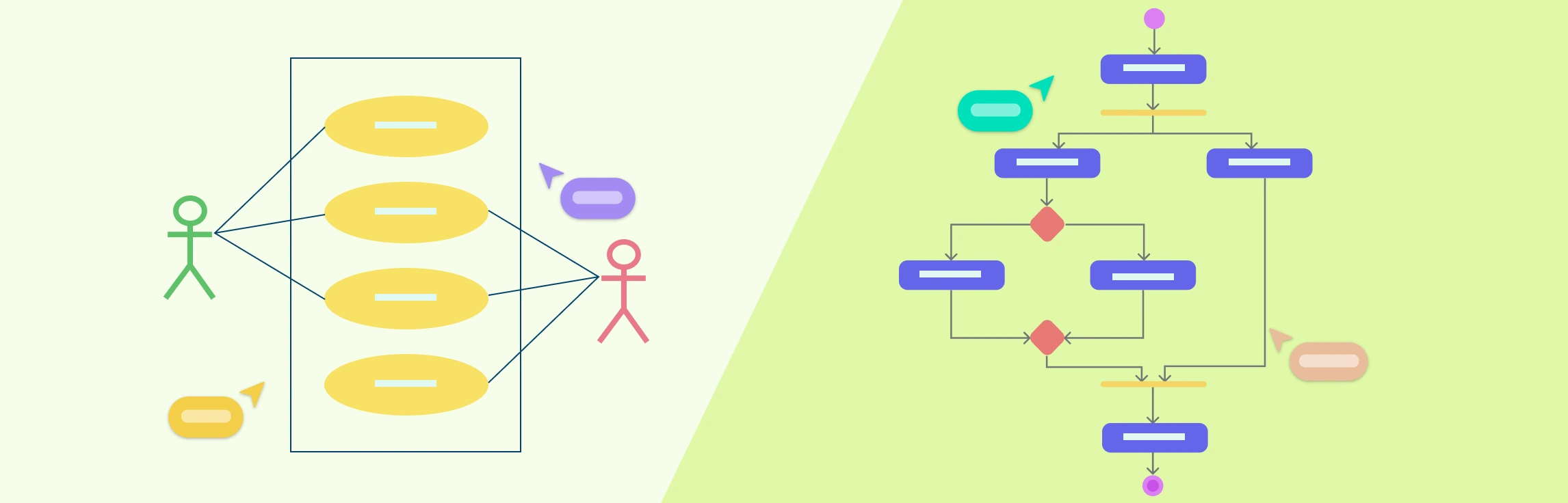
Understanding the difference between use case diagram and activity diagram is essential for anyone involved in system analysis, software design, or process modeling. While both are part of the Unified Modeling Language (UML) suite, they serve distinct purposes and visualize different aspects of a system. This guide breaks down their purposes, notations, and practical applications, helping you understand when to use each diagram, and how they complement one another. Read More
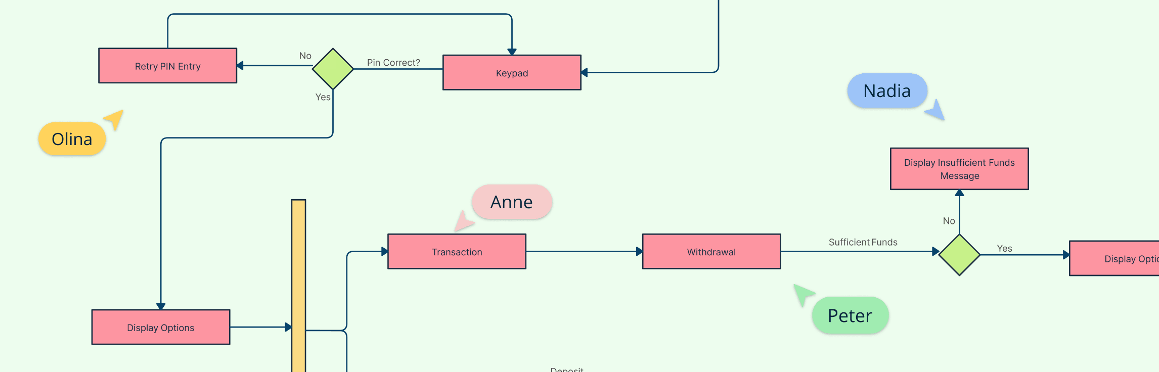
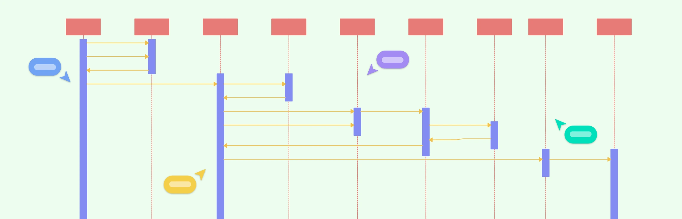
A System Sequence Diagram (SSD) is a high-level UML sequence diagram that shows how external actors interact with the system as a single black box for a specific use case. It captures the time-ordered sequence of input events (messages) from actors to the system and the system’s observable responses, without revealing any internal objects, classes, or control flow. Let’s look at when to use UML system sequence diagrams, notations, a comparison with sequence diagrams and benefits. Read More
Interaction Diagram Definition A UML Interaction Diagram is a type of behavioral diagram used to visualize how objects in a system interact through the exchange of messages. It focuses on the dynamic behavior of a system by showing what happens, when it happens, and which components communicate during a specific process or use case. Interaction diagrams capture the “conversation” between objects, helping designers and developers understand how parts of a system collaborate to achieve a goal. Read More
A deployment diagram is a UML diagram that shows how software components are deployed across hardware nodes, servers, devices, or cloud environments. It bridges the gap between design and implementation by visualizing where each part runs and how elements communicate. Used across industries from web and mobile apps to IoT, cloud, and enterprise systems, it helps teams plan, document, and optimize architecture for scalability, reliability, and efficiency. Read More
Retrospectives are vital for team cohesion, continuous improvement, and productivity, especially in remote and hybrid setups. Yet, without variety, they can become dull and lose their impact. To keep them engaging and effective, we’ve put together a set of creative ideas, fun retrospective templates, and practical tips designed to make your meetings both enjoyable and results-driven. Read More
Understanding how different parts of a system interact is essential for effective software design, and that’s where UML Communication Diagrams come in. In this guide, we’ll explore what a Communication Diagram is, its purpose, key elements, and how to create one effectively. Read More
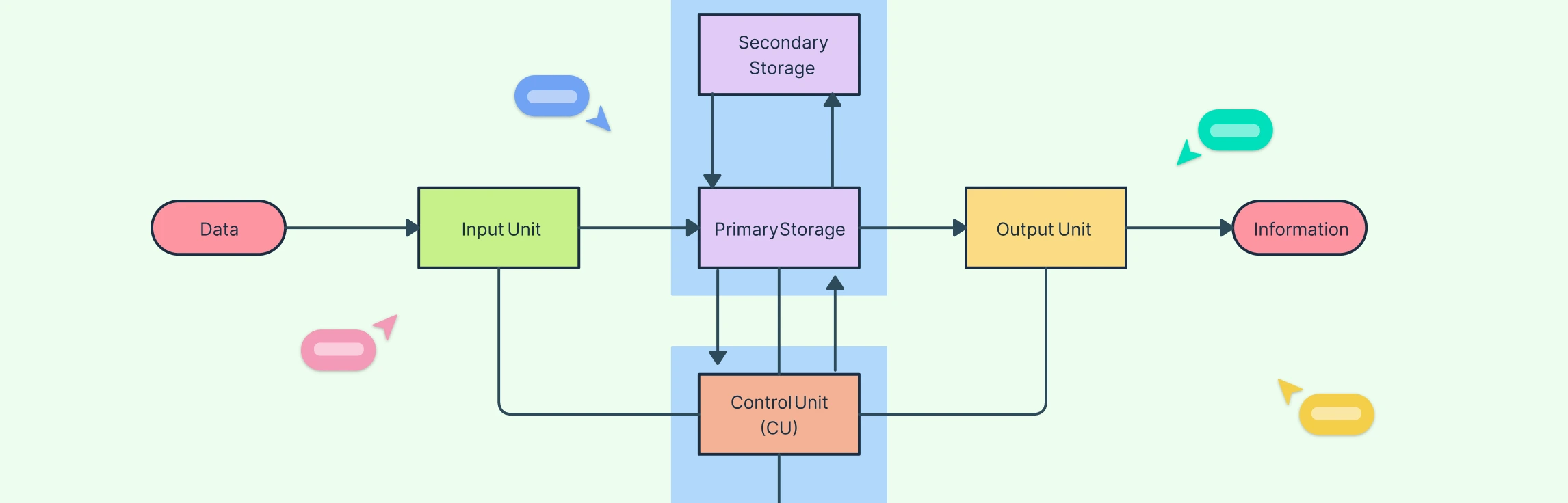
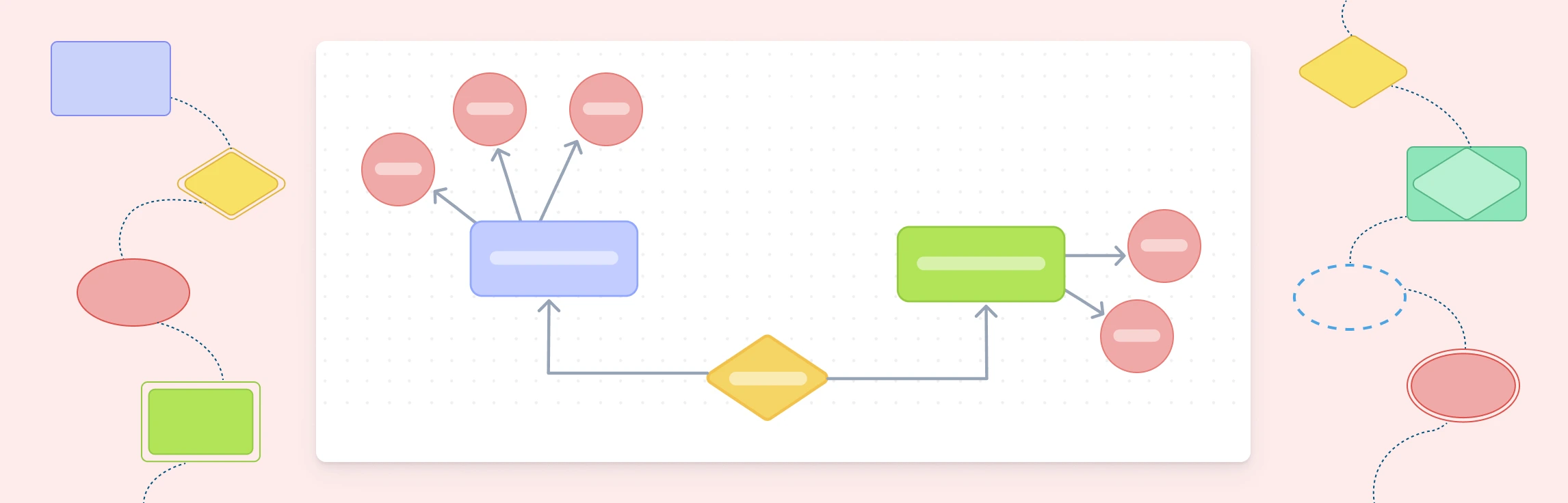
UML Diagram Definition A UML Diagram is a visual representation of a system created using the Unified Modeling Language (UML) to illustrate how different parts of a software system interact, function, or are structured. It helps developers, designers, and stakeholders understand and communicate system design clearly before or during implementation. UML diagrams are generally divided into two main types, structural and behavioral. In complex organizations, 43% of people in highly matrixed environments report complexity hurts decision quality and speed, which is why clear system modeling matters early (Marmolejo et al., 2021). Read More
Class Diagram Definition A class diagram is a type of UML (Unified Modeling Language) diagram that visually represents the structure of a system by showing its classes, attributes, methods, and relationships. It serves as a blueprint for how different parts of an object-oriented system interact and organize data. Class diagrams are fundamental in system design because they bridge the gap between real-world concepts and code implementation. This helps developers, analysts, and stakeholders understand how the system’s components are connected and how they collaborate to perform various functions. Read More
Package Diagram Definition A package diagram in UML (Unified Modeling Language) is a structural diagram that groups related elements such as classes or components into logical units called packages. It shows how these packages are organized and depend on each other, offering a clear view of a system’s structure. By grouping related parts, package diagrams simplify complex designs, promote modularity, and ensure a clean separation of responsibilities within large software systems. Read More
Object Diagram Definition A UML Object Diagram is a structural diagram that shows a snapshot of objects, their attributes, and relationships at a specific point in time. It represents how instances of classes interact in a real situation, reflecting the system’s state during execution. While class diagrams define the blueprint of a system, object diagrams display the actual data and connections between objects, making them useful for understanding, validating, and illustrating how a system behaves at runtime. Read More
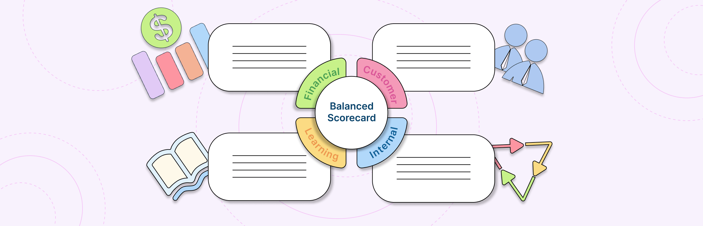
Definition of a Balanced Scorecard A Balanced Scorecard (BSC) is a framework that tracks company performance and aligns goals by measuring results across four perspectives: Financial, Customer, Internal Processes, and Learning & Growth. The Balanced Scorecard is not just a measurement tool, but a strategy management system. It helps organizations translate vision and mission into actionable objectives, align teams around common goals, and track progress across both financial and non-financial dimensions. Read More
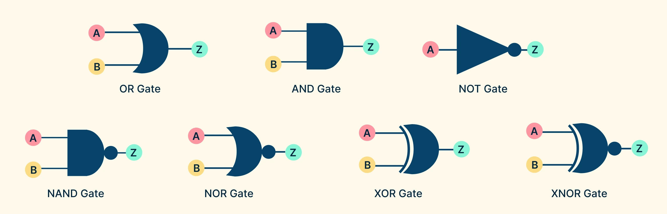
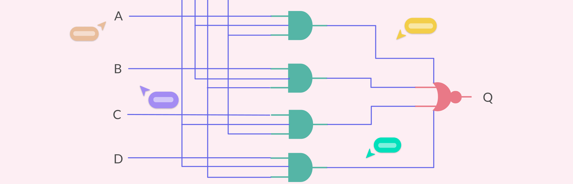
Logic gates are tiny electronic devices that take one or more input signals and produce a single output based on logical rules such as AND, OR, and NOT. By combining these gates in different ways, engineers can design everything from simple calculators to complex processors that power modern computers. In this guide, we’ll explore the different logic gate types, the symbols that represent them in logic gate diagrams, and the ways they can be combined to form more complex integrated circuits. Read More
Definition of a Logic Gate Diagram A logic gate diagram is a visual representation of how different logic gates are connected in a digital circuit. Instead of describing logical operations with words or equations, the diagram uses standardized symbols and lines to show how signals flow between them. In short, a logic gate diagram acts as a blueprint for digital decision-making, showing how simple logic gates come together to form complex systems like adders, comparators, memory units, and processors. Read More
What Is a B2B Buyer Persona? A B2B Buyer Persona is a semi-fictional profile of a company’s ideal business customer, built using real data, research, and insights. It describes the type of person (or group of people) inside an organization who is involved in evaluating, influencing, and making purchase decisions for B2B products or services. Unlike simple demographics, a B2B persona goes beyond who the buyer is and explains why, how, and under what conditions they buy. Read More
What is a 4Ls Retrospective? A 4Ls Retrospective is a simple yet powerful reflection technique used by agile teams to look back on a sprint, project, or workflow and identify what they Liked, Learned, Lacked, and Longed For. By breaking feedback into these four categories, teams can celebrate wins, capture valuable lessons, highlight missing resources, and share aspirations for improvement. The structured yet open format makes it easy to spark meaningful discussions, uncover insights that might otherwise be missed, and turn reflections into actionable steps for continuous growth. Read More
Why Buyer Persona Development Matters Buyer persona development is essential for building customer-centric strategies. By capturing real motivations, behaviors, and challenges, personas give businesses a clearer view of who they are serving. This deeper understanding helps organizations connect with audiences more effectively, make informed decisions, and drive long-term growth. Read More
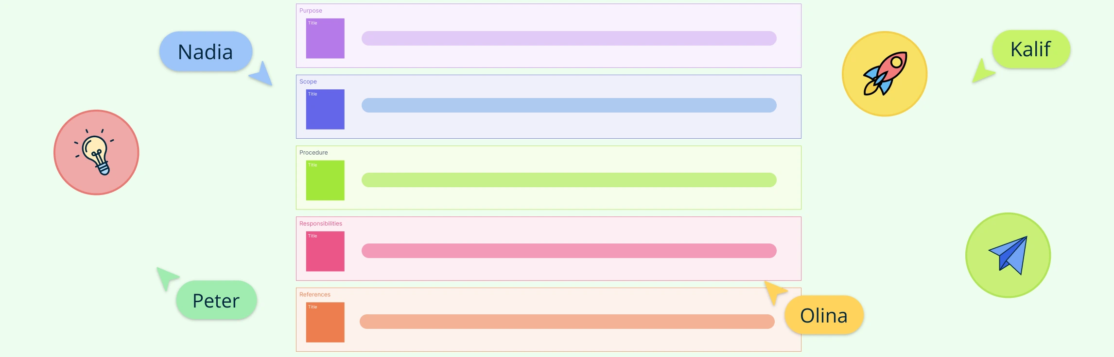
What Are Standard Operating Procedures (SOPs)? Standard Operating Procedures, or SOPs, are formal, documented instructions that guide teams through repeatable workflows to ensure consistency and quality. SOPs define the objective of a task, outline its scope, assign roles and responsibilities, and describe each step in the process. Well-crafted SOPs reduce errors, accelerate onboarding, and serve as the foundation for effective SOP automation and process optimization. Read More
What is a Quick Retrospective? A quick retrospective is a short, time-boxed meeting (15–30 minutes) held at the end of a sprint or milestone to capture wins, challenges, and improvement ideas. Unlike a full retrospective, it focuses on a few targeted questions to keep momentum and clarity. Teams often use methods like dot voting, short brainstorming, or mood checks, with input shared on a simple board in real time or asynchronously. The goal is a clear list of action items that can be acted on immediately, making it ideal for fast-moving teams or when time is limited. Read More
The 4Ls retrospective strikes a balance between celebrating progress and uncovering opportunities, making it ideal for teams that value both reflection and continuous improvement. This guide explores how the method works, why it’s effective, and includes free templates to help you run your own 4Ls session. Read More
Balanced Scorecards are essential for every level of the organization to understand how day-to-day activities support overarching goals. This guide explains how to create a balanced scorecard from scratch, offering actionable steps for product managers and strategy consultants. Read More
Creating an organizational chart in Google Docs is a handy way to visualize team structures and reporting lines, especially if you’re already working within Google Workspace. While Docs doesn’t have a built-in org chart feature, you can still build one using the Drawing tool with shapes and connectors. In this guide, we’ll walk you through the steps, share tips to make the process easier, highlight the drawbacks of using a Google Doc org chart, and suggest a better alternative for more complex or professional org charts. Read More
Creating an org chart in PowerPoint is a quick way to visualize reporting lines and align teams right inside your deck. This guide gives you step-by-step instructions on how to build an org chart in Powerpoint, practical layout and formatting tips to keep branches tidy and on brand, and common pitfalls to avoid. You’ll also get a clear view of PowerPoint’s limitations, and why a dedicated tool like Creately is better suited for creating professional organizational charts. Read More
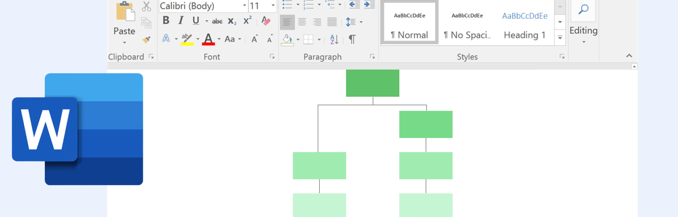
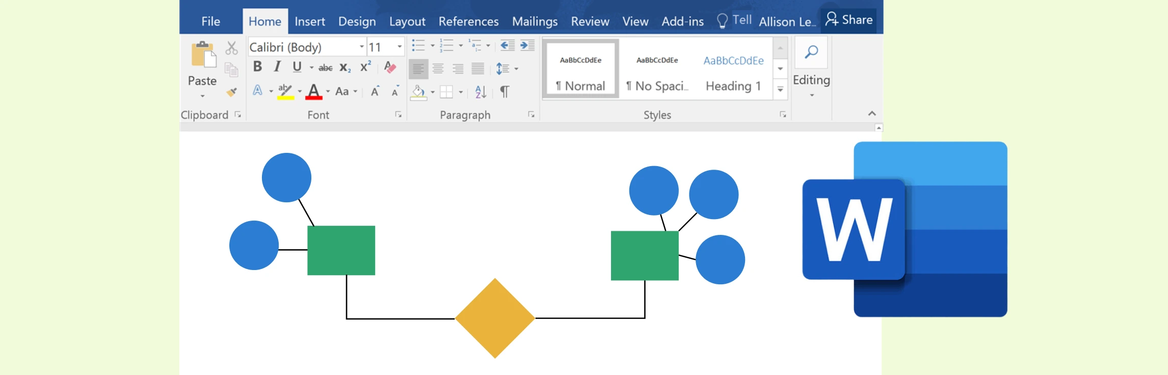
Creating an organizational chart in Microsoft Word is a quick way to visualize reporting structures and team hierarchies without needing specialized software. Whether you’re preparing a presentation, documenting your company structure, or sharing team roles, Word’s built-in SmartArt graphics make it possible to create a simple org chart directly within your document. In this guide, we’ll walk you through the steps, share tips to make the process smoother, point out Word’s limitations, and explore a better alternative if you need more flexibility. Read More
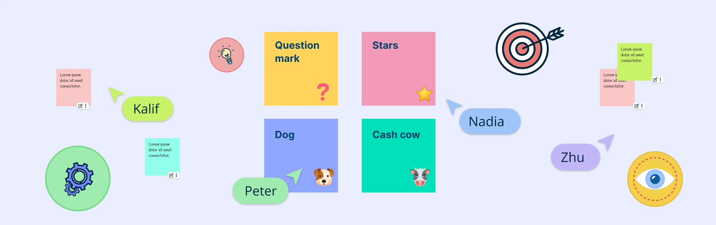
A buyer persona is a semi-fictional profile of your ideal customer, built from real data and informed assumptions. It goes beyond demographics to include motivations, challenges, buying behavior, and preferred communication channels. Accurate personas form the foundation of effective marketing, helping you move past generic profiles to craft messaging, products, and experiences that resonate. This guide shares buyer persona examples to inspire targeting strategies for both individual consumers and complex B2B decision-makers. Read More
Buyer Persona Meaning A buyer persona is a semi-fictional profile that represents your ideal customer, based on a mix of real data and educated insights about their demographics, behaviors, motivations, goals, and challenges. Instead of describing your audience in broad strokes, a buying persona zooms in on a specific type of customer by giving them a name, a role, and a backstory so your team can easily visualize who you’re talking to. Read More
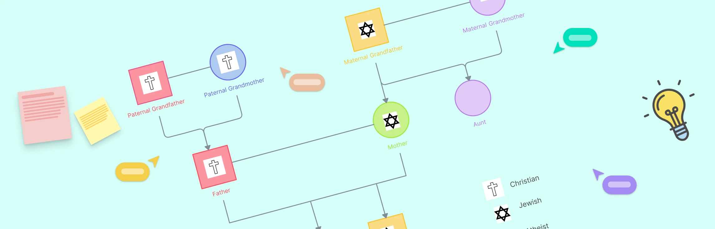
What is a Cultural Genogram? A cultural genogram is a visual family map incorporating heritage, migration routes, and cultural attributes alongside traditional lineage charts. It builds on standard genograms by adding layers for language retention, ceremonies, and customs across generations. Professionals apply cultural genograms in therapy to explore how heritage influences client behavior, in academic research to analyze migration and assimilation patterns, and in organizational diversity mapping to highlight workforce ancestry and tradition. Read More
What is the BCG Matrix Analysis BCG matrix analysis is a strategic tool developed by the Boston Consulting Group to evaluate a company’s portfolio by plotting each product or business unit against two axes: relative market share and market growth rate. The analysis highlights which offerings drive growth, generate steady cash flow, or consume resources without adequate return. Read More
Traditional onboarding relied on in-person orientation sessions, printed training materials, and on-site introductions. The shift to a distributed workforce sparked demand for a digital and remote onboarding process. Virtual meetings, online learning platforms, and collaborative workspaces quickly replaced conference room briefings and desk visits. Read More
What is a Mad Sad Glad Retrospective The Mad Sad Glad retrospective is an agile practice designed to help teams articulate their emotions during the reflection process. This method categorizes feelings into three distinct areas: Mad, Sad, and Glad. By focusing on these emotions, teams can gain valuable insights that contribute to both emotional well-being and continuous process improvement. Read More
What is a Mad Sad Glad Retrospective The Mad Sad Glad retrospective is a model that guides participants to categorize sprint experiences into three buckets—things that made them mad, sad, or glad. Originated as a simple emotional check-in for agile teams, this structure helps surface morale issues and emotional undercurrents early on. While effective for highlighting general feelings, the retrospective mad sad glad technique may limit deeper analysis when overused. Read More
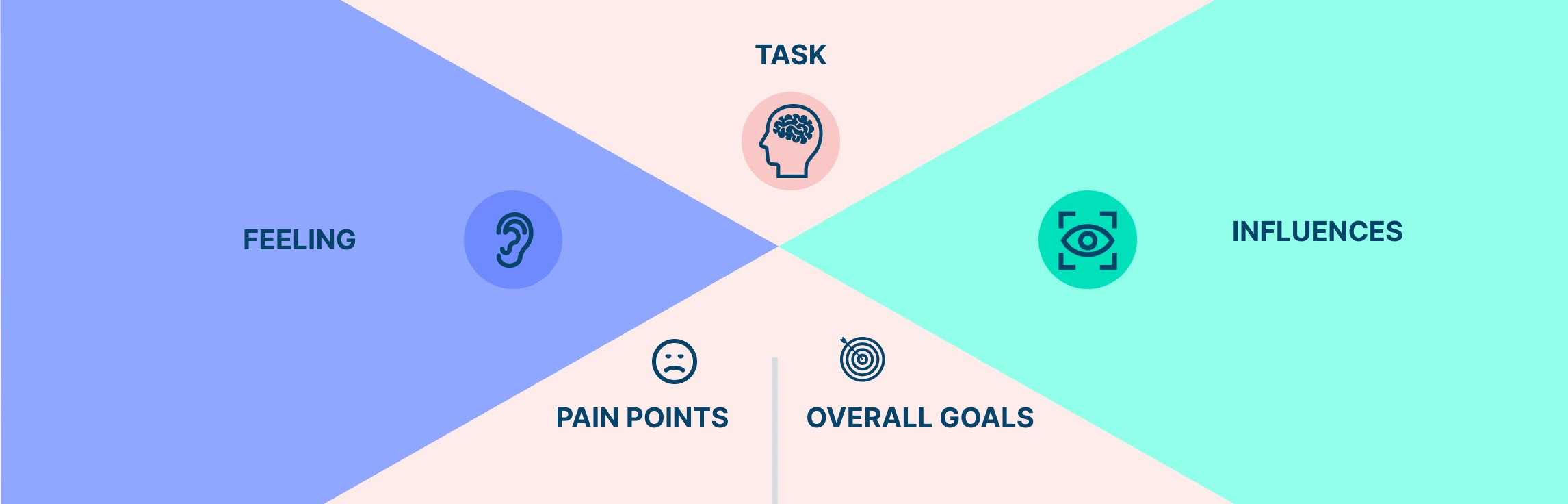
What is an Empathy Map Exercise An empathy map exercise is a process used in design thinking workshops to build consensus around real customer attitudes, behaviors, and needs. This is done by plotting what users say, think, do, and feel, on an empathy map, allowing teams to build a shared understanding that drives user-centered ideas. Read More
What is a Customer Empathy Map A customer empathy map provides a visual tool for capturing what customers say, think, do, and feel. It helps teams build deep empathy with real customer perspectives, informing design, marketing, and product decisions. Originally rooted in UX research, the empathy map has evolved into a comprehensive customer research framework. Read More
A user empathy map is a collaborative visualization tool that helps articulate what is known about a specific type of user. In design thinking, a UX empathy map helps teams understand users by capturing what they think and feel before creating detailed personas. This enables UX and product teams to keep their decisions focused on real user needs. Read More
There is no formal distinction between the terms ‘Empathy Chart’ and ‘Empathy Map’ and the two are often used interchangeably for user research. Empathy map is the standard, well-defined framework, while empathy chart is not officially recognized. We’ll go through each, and look at a breakdown of their differences to help you understand how to use them in practice. Read More
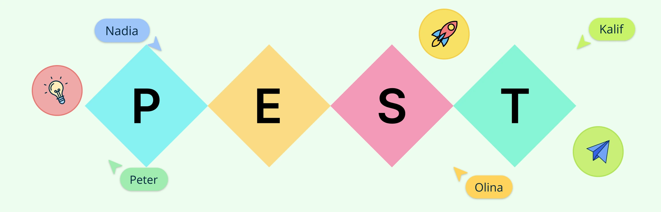
PEST analysis in strategic management empowers organizations to align long-term objectives with external realities and anticipate emerging challenges. By systematically scanning these four domains (Political, Economic, Social, and Technological), teams can mitigate risks, capitalize on opportunities, and enhance decision quality. Read More
PEST analysis in marketing focuses on evaluating how Political, Economic, Social, and Technological factors influence campaign performance, target audiences, and channel strategies. Whether you’re launching a new product or refining an existing strategy, mastering PEST in marketing is key to staying adaptable in a fast-paced environment. Read More
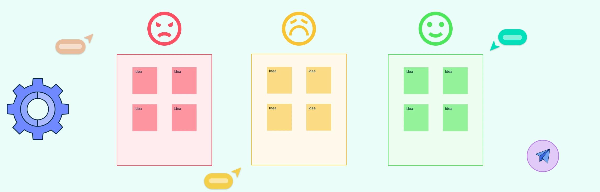
What Is Reverse Brainstorming? Reverse brainstorming is a creative methodology that starts by asking participants to identify ways to worsen a problem or obstruct a desired outcome. By deliberately generating negative actions, causes, or scenarios, teams can later flip each idea into constructive, positive solutions. This inverse approach of reverse brainstorming encourages deeper exploration of pain points and uncovers hidden factors that might never emerge during conventional brainstorming. Read More
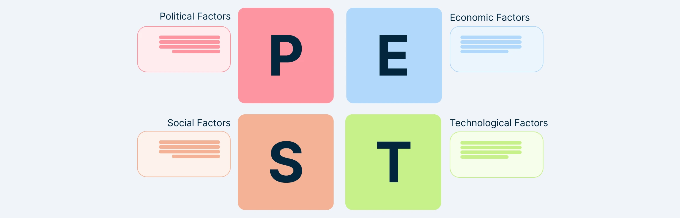
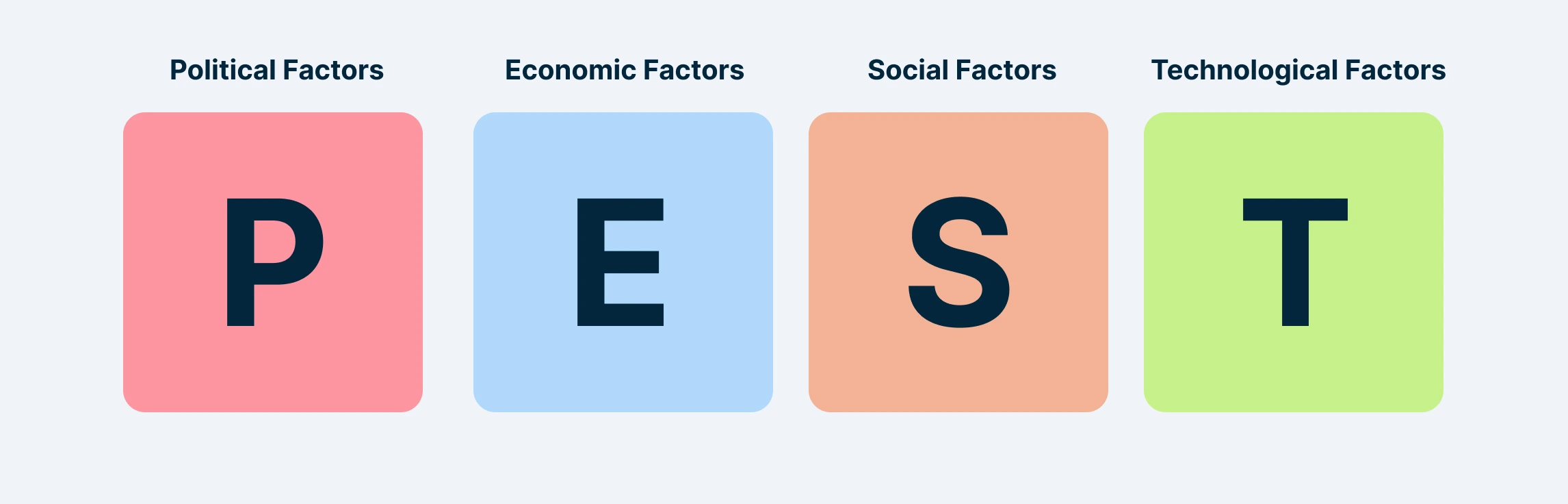
Key PEST Factors The four key PEST factors assessed in a PEST analysis are Political, Economic, Social, and Technological. By analyzing these factors, organizations can identify opportunities, anticipate risks, and develop strategies that adapt to changing conditions. Read More
PEST Analysis Definition PEST analysis is a strategic framework used to identify and assess the external macro-environmental factors that may impact an organization’s performance. It categorizes these influences into four key factors: Political, Economic, Social, and Technological, providing a structured approach for evaluating potential opportunities and threats in the external environment. Read More
What is an SOP An SOP (Standard Operating Procedure) is a set of step-by-step instructions that outline how to perform a specific task or process in a consistent and efficient manner. It serves as a guide for employees, ensuring that operations are carried out correctly, safely, and in compliance with industry standards or regulations. SOPs are essential for businesses and organizations because they: Read More
Creating an empathy map is an essential step in understanding your audience deeply and designing experiences that truly resonate with their needs. By visualizing a user’s thoughts, emotions, attitudes, behaviors, and pain points, you gain valuable insights that help shape products, services, and strategies effectively. Read More
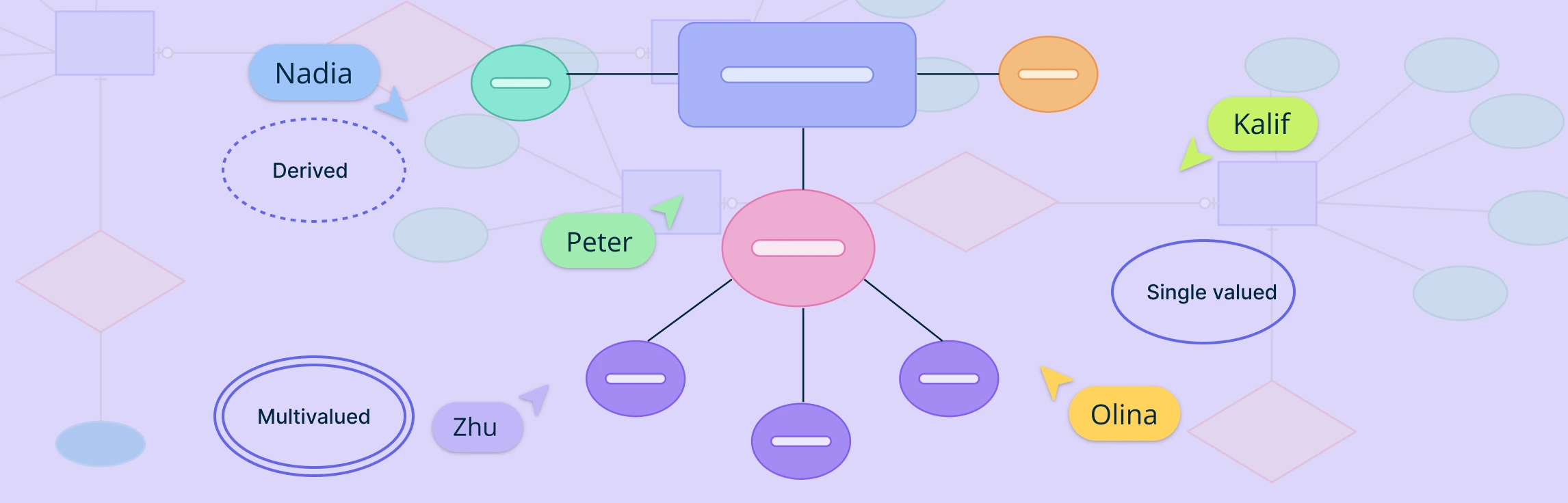
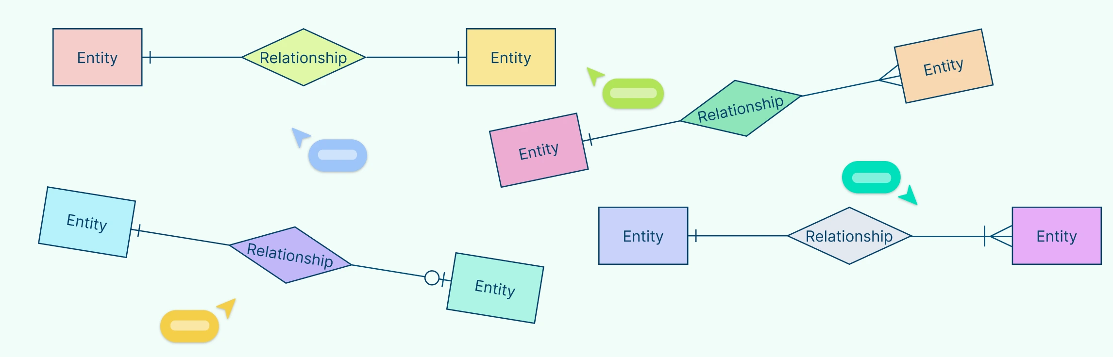
Attributes in ERD play a crucial role in defining and distinguishing entities within a database. From simple attributes that store atomic values to composite attributes that break down into smaller components, these elements help structure data meaningfully. Understanding attributes is essential for maintaining data integrity, optimizing queries, and ensuring effective relationships between entities. This guide explores the different types of attributes in ERD, their importance, and best practices for utilizing them in database modeling. Read More
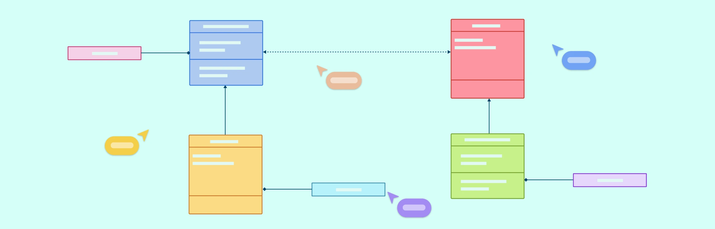
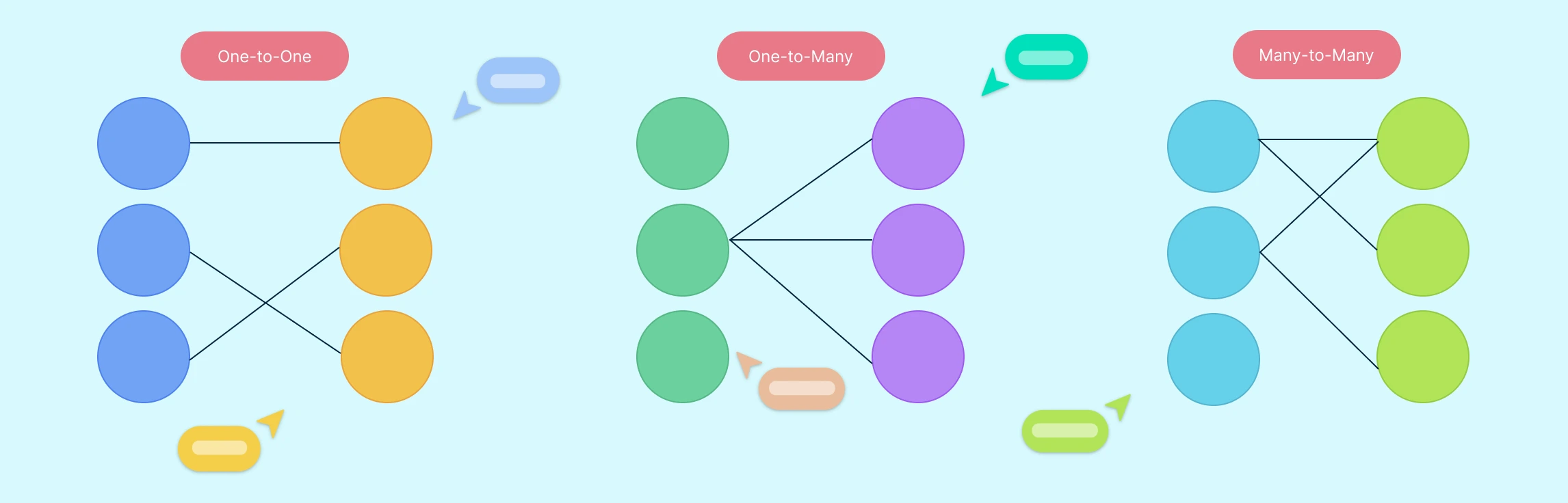
Entity-Relationship Diagrams (ERDs) are the foundation of modern database design, offering a visual representation of how data is structured, connected, and maintained. As businesses and organizations rely increasingly on efficient data management, understanding ERD relationships is essential for designing scalable, well-organized databases. Read More
If you’re a social worker, a social work genogram is more than a basic family tree; it maps relationships and patterns to guide better support. This comprehensive social work genogram guide highlights how genogram social work enhances understanding and intervention Read More
Crow’s Foot notation is a powerful and widely used method for visually representing relationships in database modeling. Its distinctive symbols such as dashes, circles, and the ‘crow’s foot’ shape help define the connections between entities, making database structures easier to interpret. Read More
While Microsoft Word offers a practical way to create ER diagrams using its shapes and SmartArt features, it often falls short in functionality and efficiency compared to specialized tools. Creately, on the other hand, excels as a dedicated diagramming platform with intuitive tools, customizable templates, and collaboration features designed for professional-grade ER diagrams. Read More
Entity Relationship (ER) diagrams are the cornerstone of effective database design, acting as a visual language that bridges the gap between abstract concepts and structured data models. At the heart of these diagrams lie ER diagram symbols and notation styles, which transform complex relationships into easily understandable representations. Whether you’re a novice stepping into the world of data modeling or an experienced database architect aiming to refine your craft, understanding these ER diagram symbols is crucial for building clear, efficient, and scalable data structures. Read More
Agile UX Design is all about blending the best of Agile methodology and user-centered design to craft amazing user experiences. It’s a flexible and collaborative approach that puts users at the forefront. In this exciting and fast-moving field, retrospectives play a vital role by providing a dedicated space for teams to look back, assess their work, and find opportunities to improve. Read More
Retrospective meetings are crucial for teams to reflect, learn, and plan for success in today’s fast-paced work environment. In this article, we’ll provide valuable insights and practical tips to help you have meaningful discussions and set actionable goals that drive results. Whether you’re a team leader, project manager, or team member, this guide equips you with the knowledge and tools to enhance team collaboration and achieve progress through retrospectives. Read More
Collaboration is key in today’s interconnected world. Cross-functional teams bring together diverse individuals to tackle challenges and spark innovation. But effective collaboration can be a challenge. That’s where retrospective meetings come in. Retrospective meetings are a valuable tool for fostering collaboration in cross-functional teams. They provide a space for teams to reflect, discuss what’s working, and improve. In this blog post, we’ll explore how retrospective meetings drive collaboration and success for cross-functional teams. Let’s get started! Read More
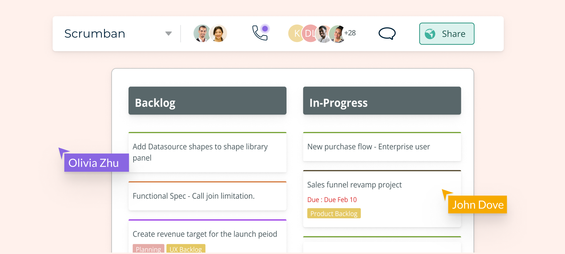
Project management is a crucial step in ensuring the success of a project or process. While in the past there were only a limited number of methodologies to follow, today there are many established and verified frameworks practiced in Project Management… In this article, we will explore one such framework called Scrumban, an emerging hybrid system that combines the features of two widely used agile methodologies, Scrum and Kanban. Read More