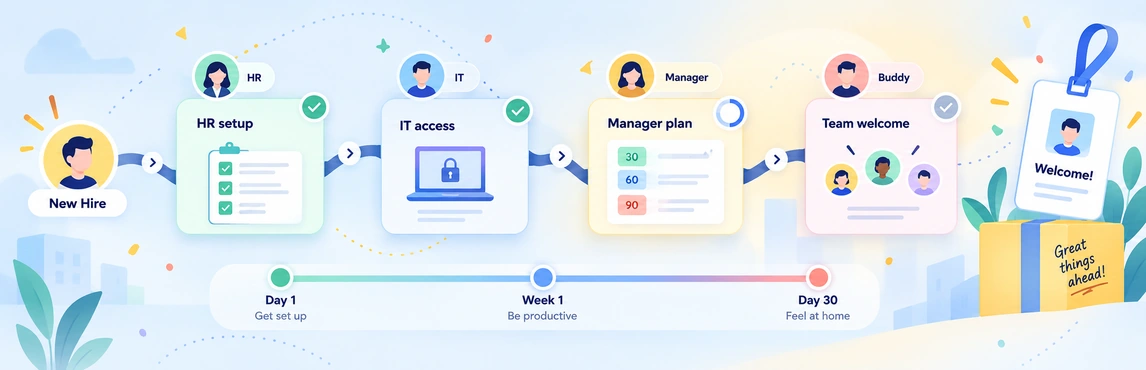
Employee onboarding coordination in Creately Atlas starts with a clear view of the position a new hire is joining, their manager, and the team around them. Before day one, confirm those details with the hiring manager and People Ops. Use that shared context to prepare introductions and handoffs across HR, IT, and the business.
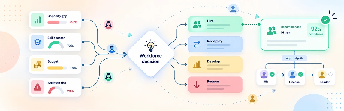
HR workforce decisions in Creately Atlas connect a staffing request to the roles, skills, and teams it affects. When a manager asks to backfill a position, start by reviewing the work that still needs doing and the alternatives available. Your recommendation should explain the preferred option and the evidence behind it.
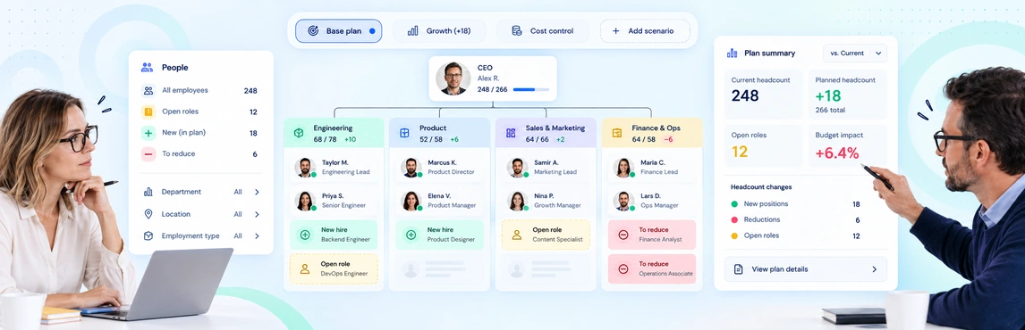
Workforce and headcount planning in Creately Atlas helps HR leaders review where roles fit, which capabilities a team needs, and how a proposed change affects the reporting structure. For your next planning meeting, compare two concrete options: backfill a vacant manager position, or distribute the work across existing teams. Keep the starting data and planning period the same for both.
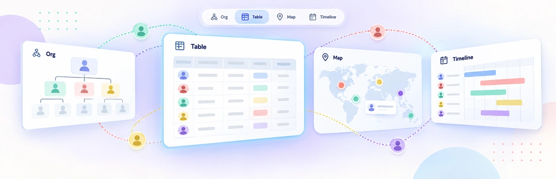
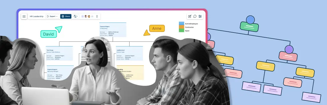
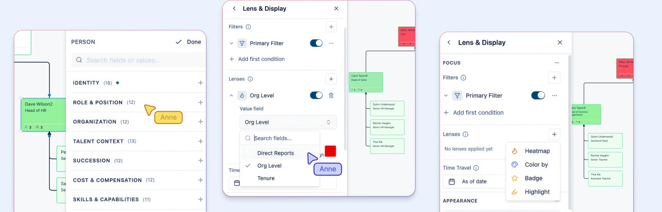
Workforce planning views in Creately Atlas help People Ops prepare the right organizational detail for each discussion. A department head may need reporting lines and vacancies, while HR leadership needs a proposed structure and its implications. Start with the question the meeting must answer, then choose the fields and view that support it.
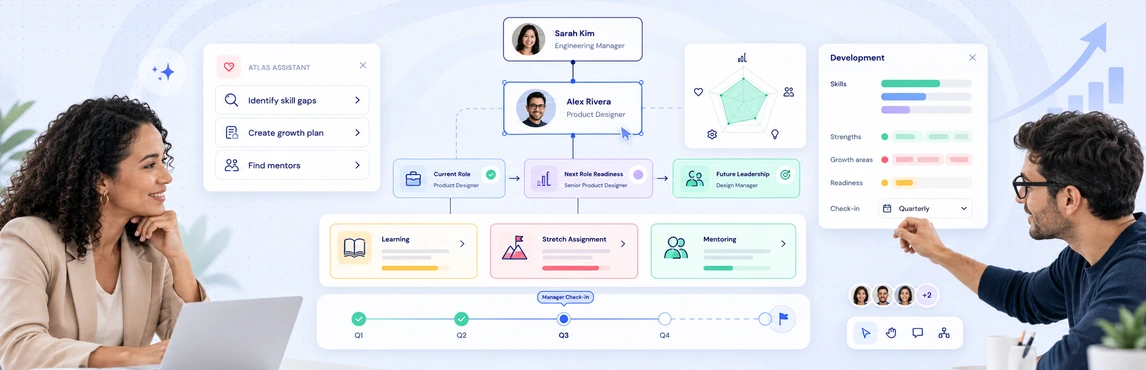
Employee development planning in Creately Atlas connects talent discussions to the organization around each person. HR leaders can evaluate where skills need to grow, which critical roles need successors, and how a proposed team change affects development priorities. Start with one team and a specific decision, such as preparing a successor for a department lead.
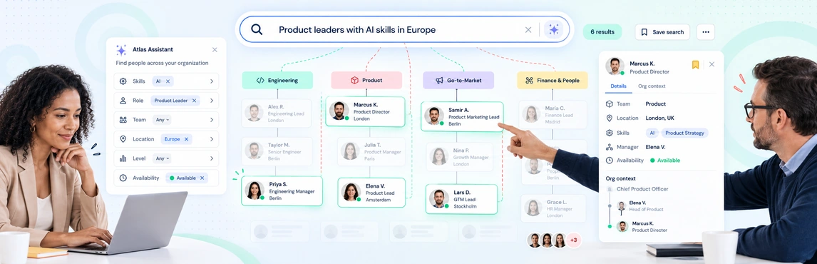
Org-wide people search in Creately Atlas helps HR leaders connect a person to their role, team, and reporting structure. Start with a practical question: who has the skills for an upcoming initiative, and where do they sit in the organization? A useful evaluation follows that question from the source data to a result you can check with the team.
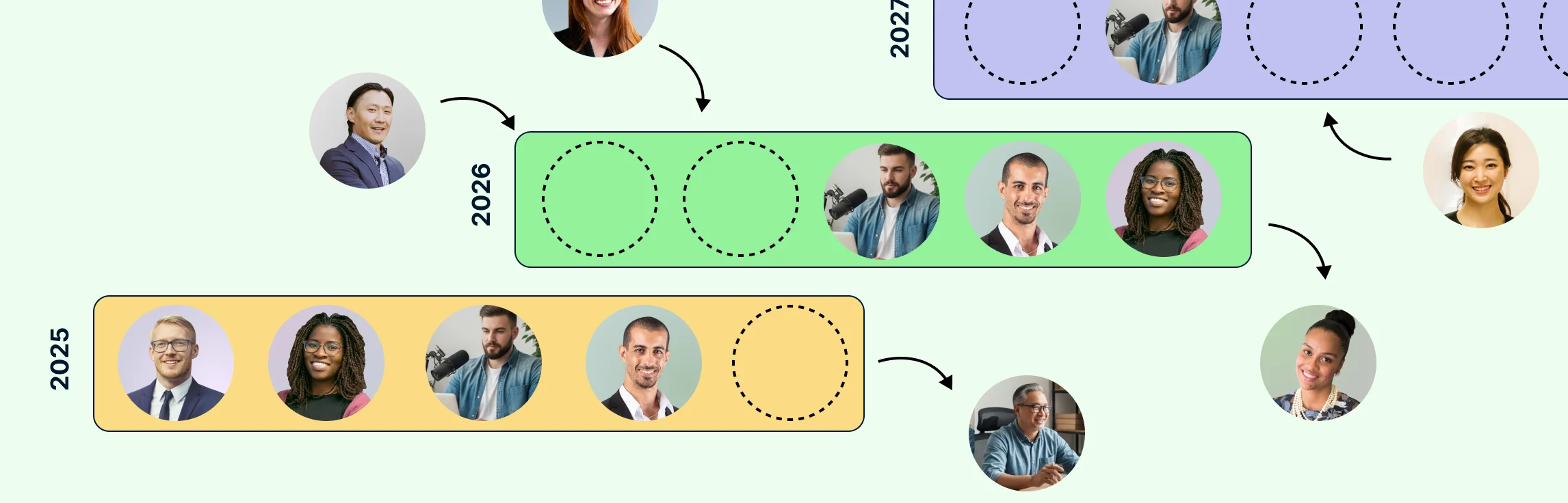
Headcount scenario planning helps HR leaders answer one question before budgets, recruiting activity, or restructures move forward: which workforce option best supports the business under the conditions we actually expect? The practical method is to start from one approved baseline, model several future states, and compare how each option changes capacity, manager load, vacancies, hiring timing, and organizational risk.
HR teams use org charts for workforce planning by connecting the current organization, the future structure, and the hiring plan in one visual model. The chart shows which roles exist, which positions are open or proposed, where each hire belongs, who approves it, and how the change affects reporting lines and team capacity across the same people-and-position model.
If you’ve ever tried to plan a department’s growth using three different spreadsheets and a stale slide deck, you know how hard it is to make confident decisions when the structure, roles, and hiring assumptions live in different places.
This guide explains how to close that gap by using org charts as a live workforce-planning surface. Instead of treating the chart as a static directory, teams can use it to compare the current organization with future-state scenarios, connect workforce decisions to succession risk, and turn headcount planning into a clearer executive conversation. In Creately Atlas, reviewed CSV imports, separate people and positions, and 201 fields across 15 packs support workforce analysis and proposed org changes.